Thursday, June 30, 2011

Zanesville Superlatives 2

I wrote yesterday about some of the work now on display at the Zanesville Museum of Art in the show Superlatives: Comtemporary Ohio Quilts.  Today I'll talk about two other artists in the show.

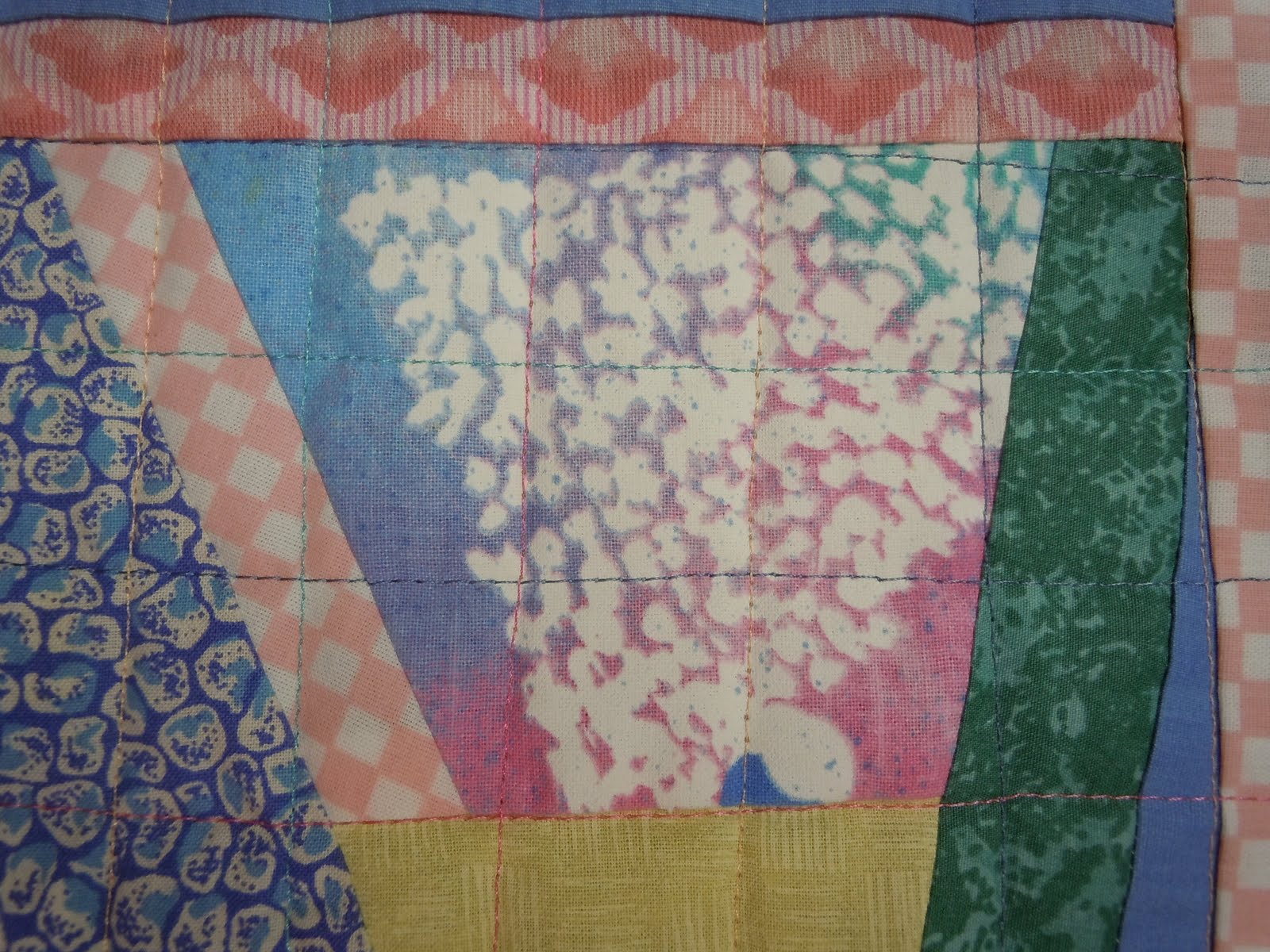
Sandra Palmer Ciolino was represented one-and-a-half times, you might say.  In addition to her own six quilts, she was the machine quilter for one of Nancy Crow's screenprinted pieces on display.  Her work is gorgeous, as you can see in the detail shot below, which shows about a 4" width.  She explains that this photo was taken before she went over the entire quilt with tweezers to remove the cat hairs.  
  
Nancy Crow, Structure #6, machine-quilted by Sandra Palmer Ciolino (detail)

My favorite of her work in the show was this quilt, which I had the pleasure of seeing, partially finished, on Sandy's design wall earlier this year.  She's a piecer from the classic school, her intricate designs complemented by equally intricate machine quilting.  (Sandy will be teaching machine quilting at the Crow Barn this fall.)

Sandra Palmer Ciolino, Martello 2, 2011


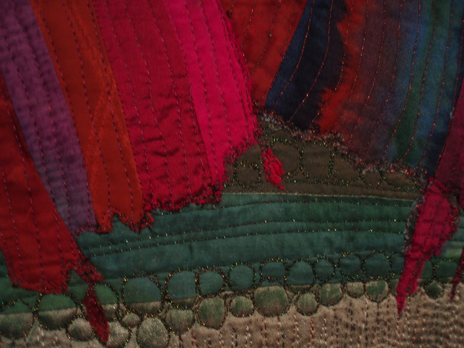
I mentioned yesterday that the big draw in this show was Nancy Crow, much more famous than anybody else in the exhibit.  But the best piece in the show, in my opinion, was made by Sue Cavanaugh, whose shibori-dyed pieces have been winning prizes and admiration for several years.  This year, Sue won the Lynn Goodwin Borgman Award for Surface Design at Quilt National for the second time in a row, for a piece very similar to those she had on display in Zanesville.

Sue hand stitches tight pleats into her whole-cloth backgrounds, then paints dye over the top.  When she releases the stitched resists, sometimes she leaves the threads in the fabric as a counterpoint to the later layer of hand quilting.  In past years her work had quite a bit of color, as shown in the piece below.

Sue Cavanaugh, Ori-Kume #4, 2008

But recently she's been using a lighter hand with the dye-paint, yielding pale expanses with the most subtle patterning.  Her Quilt National piece this year was on the small side, 41 x 52", but the piece in Zanesville was huge, 94 x 164", commanding the room and astonishing the viewer.  Wow!!

Sue Cavanaugh, Ori-Kume #22, 2010

Photo du jour

under the bridge

Wednesday, June 29, 2011

Zanesville Superlatives 1

Last week I was in Ohio for a family get-together and took a day trip to Zanesville to check out  Superlatives: Contemporary Ohio Quilts, with work by seven Ohio quilters. 

The big draw in this show is Nancy Crow, arguably the premier art quilter in the world, and she sent an interesting variety of work.  Two relatively recent pieced works from her current Constructions series, two screenprinted works (a technique she has recently learned and been experimenting with), and two relatively old pieces, one from her Chinese Souls series and this from her Color Blocks series.

Nancy Crow, Color Blocks #69, 1995

The work is spectacular, but I was a bit disappointed by the varying styles and series.  Not enough quantity or variety to constitute a retrospective, where you could trace the development of her ideas, yet not enough cohesiveness of the work on display. 

The exhibit catalog mentioned that one of its objectives was "to view quiltmakers as artists who may create many quilts.  Like painters or potters, most quilt artists change their style and practices to suit their evolving vision and skills."  Yet without artist statements, curator notes or other clues, it's hard for viewers to detect and appreciate the subtleties in such variety. 

I was surprised by one of the quilts displayed by Deborah Melton Anderson, another of the featured artists.

Deborah Melton Anderson, Imagining the Seasons, 2011  (detail)

The piece is constructed from many little folded "neckties" -- an adorable and appealing technique.  I had seen and enjoyed some of Deborah's necktie pieces several years ago at a gallery in Columbus and assumed that this work was from that vintage.  But no, this one was new, so I had little idea of how it fits into the "evolving vision" referenced in the catalog.


Deborah Melton Anderson, Hourglass II, 2005

Here's another of Deborah's quilts that I liked, using traditional block patterns.  But again, I couldn't tell how it fit into her "evolving vision," since it was made in 2005 and the quilt hanging next to it, with the same sensibility, was finished last year. 

A third artist in the show was Rebecca Cross, whose technique is to shape silk organza into elaborate pleats and protrusions while shibori dyeing.  Some of her organza extravaganzas are affixed to backings, others hang free-form and weightless in space. 

Rebecca Cross, Cleave, 2009  (detail below)


Rebecca Cross, Untitled Installation


I'll write tomorrow about other artists in the show.  It continues at the Zanesville Museum of Art through July 14.

Photo du jour

sign of the week

Tuesday, June 28, 2011

Monday, June 27, 2011

Collaboration project 6

Several years ago my sister and I made a long-distance quilt.  She bought seven fabrics that went well together, kept three and sent three to me.  The seventh was the "theme fabric," and she used it to make 30 block centers and 30 block elements.  The block centers each consisted of a trapezoid, cut three inches tall and four or five inches wide, at different angles.  The block elements consisted of striped panels made up of the theme fabric plus some of the other fabrics. 


She then sewed some of her fabrics to the block centers in log cabin fashion, and sent the blocks to me.  I sewed some of my fabrics to the growing blocks, and sent them back to her.  At some point the striped elements got added to the blocks.  After a couple more back-and-forths each of the 30 blocks was about the right size, and I squared them up and sewed them together into a quilt top.


At which point I said to her, what are you going to do with this quilt?  And she said, I don't want it, I hate these colors.

But you bought the fabric!  I know, she said, but the devil made me do it -- I loved the theme fabric and got carried away.

Well, I was totally on the same page -- loved the theme fabric, but didn't like the colors very much.  It seemed way too babyish and pastelly, and neither of us had any pastel babies who needed quilts.  So I layered it, quilted a very rudimentary in-the-ditch grid around the edges of the blocks, and stuck it on the bottom of the pile of quilts on the guest bed for a long time.

I acquired a granddaughter, but she was too old for a pastelly babyish quilt.  My sister acquired two grandsons, but the quilt seemed too pastelly for either of them (they were tough guys from birth).  The quilt stayed at the bottom of the pile on the guest bed.  Finally my sister acquired a baby granddaughter, and it seemed as though the time was right to haul the quilt out, finish it and give it away already.

When I surveyed the quilt I realized how much I've learned about technique in the last fifteen years.  The quilting had not been as careful as I would be today, but there was enough of it in place, and it wasn't that bad, so that it seemed really silly to rip it all out.  The batt was a puffy polyester rather than the flat cotton I would use now.  So puffy, in fact, that when I added more quilting lines there were lots of tiny pleats in the backing. But it's a beautiful, babyish, pastelly quilt that Kate is going to be able to drag all over creation without fear of offending its makers.  Sorry, dear, it isn't a masterpiece quilt, but feel free to take it out in the yard any time you want. 

Since my artistic theme for 2011 is collaboration, and since the quilt was finished this year, I decided to call this one of my collaborative projects.  Hey, it's my project and I can define it as loosely as I want!

I am still intrigued by the concept of a long-distance quilt.  I still love the log cabin method, and I find it particularly conducive to this type of multiple-artist construction.  As we made the quilt, it was fun to see how we each worked in different styles.  For instance, when my sister worked on the blocks, they tended to become non-rectangular, echoing the angular shapes of the central trapezoids.  When I got them, I tended to make them rectangular again.  The finished blocks ended up reflecting both styles -- the perfect ending to a collaboration.

Here's Baby Kate with her new quilt.


Photo du jour

hydrant

Sunday, June 26, 2011

Saturday, June 25, 2011

Photo du jour

Dad and the Christmas bear

Today would have been my father's 98th birthday.  Here's one of my favorite photos of him. The Christmas bear now lives at our house.

Friday, June 24, 2011

Quilt National report 10 -- something different

I've been attending Quilt National in person for probably 20 years, and reading the catalogs even longer, and one of the things you can usually put money on is the "gimmick" quilt.  (And before you get upset, I use that term solely to describe a category, not to denigrate.  I guess I could also call it the "different" quilt.)  Without even consulting my catalog library, I can recall some of the favorites from the past:

a 3-D skeleton that sat in a chair

a quilt made of wood squares, with perfectly matched growth rings making a pattern (giving new meaning to the term "quilt blocks")

a seven-foot sphere

a quilt made of bread bags

a quilt made of flattened aluminum Coke and Pepsi cans, arranged into a huge American flag and machine-stitched

a little 3-D diorama of ladies sitting around a table (or were they quilting around a frame?)

a quilt that covered a faux bed made of large twigs

The gimmick quilts are sure crowd-pleasers, or maybe more accurately, crowd-teasers.  A lot of viewers get incensed -- that's not a quilt!!! -- but they sure do look at, and talk about, and remember the pieces! 

As I reflect on the gimmick quilts that stick in my own mind, I realize that many of them are 3-D.  Even though we're comfortable leaving behind many of the tropes of traditional quilting, the flatness of the old-fashioned quilt seems to be hard to abandon. A cynic wanting really hard to get into QN might be well advised to make a 3-D piece, and might even double down with a 3-D quilt made from strange, non-fabric materials.

But this year's Quilt National didn't really have a gimmick quilt, just one more piece of evidence that this may be one of the most serious and straightforward QNs in a long time.  There were two pieces that were a bit different, and deserve comment.  I've already written about the first, made by Naomi Adams, which won the award for Most Innovative Use of the Medium.  The other "different" piece in the show is this one:

Jayne Bentley Gaskins, Solitude

The central image in this piece is entirely thread-painted, and is shaped and stuffed so that it becomes a bas relief, standing about three inches up from the backing.


I found this piece intriguing, even though I often dislike both "gimmick" art and pictorial quilts.  While many fabric treatments seem poorly suited to photorealism, somehow the thread painting worked very well in this case.  And the "gimmick" of 3-D seemed to be natural rather than contrived.  My hat is off.

Photo du jour

red post

Thursday, June 23, 2011

Wednesday, June 22, 2011

Quilt National report 9 -- modules

I've whined in the past about how hard it is to quilt huge pieces, and how my solution these days is to finish quilts in separate panels, then join them with hand stitching.  Here's a detail shot of my Quilt National piece(76" square), showing how I did it.

I was interested to note that other QN artists took the same approach, quilting their work in modules and joining them later.  But the methods of joining were widely divergent.


At one end of the spectrum, Pat Pauly quilted her large piece (77 x 65") in two sections and joined them invisibly.  I believe the join goes along the spine of the big pink leaf, but even from up close I couldn't see exactly how she did it.  Great workmanship!!

Bonnie J. Smith made her piece (48 x 51") in three modules, each one with traditional quilt binding, then butted the edges and affixed them invisibly to a single backing fabric. The heavy black bindings made an obvious division of the composition.  Here are detail shots of the edges.


(Please imagine that the top part is black and the bottom is red.  My camera was having a hissy fit and refused to produce accurate images.)


At the other end of the spectrum, the modules and the interesting fracture pattern were the design focus of the entire work. Wen Redmond made a fascinating piece through a process that I don't fully understand, described as "photograph melded with painted canvas, digitally fused and printed, mounted with heavy stabilizer, hand tied book binding."  The modules are of different sizes.

Here's a detail of how she joined the modules. 


Photo du jour

mockingbird

Monday, June 20, 2011

Sunday, June 19, 2011

Quilt National report 8 -- quilting

As you might expect, most of the work in Quilt National was machine quilted, some minimally, some lushly.  I gravitate toward dense and lavish quilting, and found lots to take detail shots of.  Here are some of the most impressive examples.

Paula Kovaric, Global Warming, The Great Unraveling
the quilting makes a map of the Arctic

Sara Impey, Tickbox Culture
the entire quilt is covered with machine-quilted letters, about two inches square

Diedre Adams, Facade VII

Shoko Hatano, Color Box #13

B. Michele Maynard, Vera Loves Her Gun

Lisa Call, Structures #113
The stitching lines are about 1/8 inch apart.

But maybe you prefer a more minimalist approach to quilting.  In that case, you would love this piece -- clearly the least quilting per square foot in the show.

Glenys Mann, Memory Cloth #11: Worn

Those little dimples across the center of the photo are hand stitches, so tiny as to be practically invisible, maybe an inch apart horizontally but the rows are several inches apart vertically.  They do hold the quilt together very nicely. 


Photo du jour

blue garage

Saturday, June 18, 2011

Photo du jour

in the garden

PS -- no sign of the week this week -- been there, done that in March

Friday, June 17, 2011

Art I wish I'd made


I've looked at a lot of art in my lifetime, and really liked a lot of it.  But there's a subset of art I like, and that's art I wish I'd made.  Art that strikes such a chord of recognition and empathy that I can almost put myself into the head of the artist as she worked, understanding her thoughts, her inspiration, her work process.  Or at least I feel that I could. 

That's the way I felt when I saw the work of Teri Dryden, now on display at Hudson Home in Louisville.  Teri makes collages out of old books, tearing them apart to salvage their covers and spines, and occasionally some bits of text or diagrams.  Then she puts them together into spare and mysterious compositions that deconstruct and honor the tradition of books and published knowledge.

Personal Property (detail below)


Constant Counsel (detail below)


Good Housekeeping

Coloring Book

Black Mirror

Did this show send me home wanting to tear the cover off a book and make a collage out of it?  You betcha!  (Well, I already do exactly that now and then, but now I want to go make a whole lot of them, and I wish they would look as good as Teri Dryden's!)