Sunday, June 10, 2012
Saturday, June 9, 2012
Friday, June 8, 2012
Textiles in a Tube 5
One more red piece from Textiles in a Tube! (Or at least it has a little bit of red in it.)
Susan Lenz, Five, detail below
This is the piece for you if the heat gun is your favorite fiber art tool. I'm not sure exactly how it was constructed, but melting was clearly the big moment in the process. I liked the intricate free-motion machine stitching, the funky colors and shapes, and the weird little curlicues around the edges.
But wait -- how did this one get in here? No red at all, and indeed, red would certainly clash with this forward fuchsia.
Kit Vincent, Bel Canto 2, detail below
I liked the strong, assertive shapes and lines in this quilt, the subtle texture of the dyed and discharged fabric, the dense quilting, and those delicious blue spots.
Stay tuned for the prizewinners in Textiles in a Tube 2. And if you find yourself in the vicinity of Greenville SC between now and July 15, I hope you can drop in and see the show in person at Riverworks Gallery.
Thursday, June 7, 2012
Textiles in a Tube 4
More red today from Textiles in a Tube, at Riverworks Gallery in Greenville SC.
Sandra Rude, Aspen III, detail below
I liked the near-photographic realism of this jacquard handweaving, having always been a sucker for brilliant fall foliage. Although the piece is small (16 x 24") it draws you deep into the forest, with mysterious depths seen behind the trees.
Mary Ruth Smith, Crossover, detail below
Perhaps you remember seeing this embroidery in my blog a few months ago. It was shown in Form, Not Function: Quilt Art at the Carnegie, which is my local art quilt show, and I raved about it. When I saw it among the entries for Textiles in a Tube, I had a brief ethical argument with myself about whether it was kosher for me to accept a piece that I had seen and admired so recently, and of which of course I remembered who the artist was.
Had there been multiple jurors, I might have sat back and kept my mouth shut, leaving others to accept or reject, but it's silly to recuse yourself if you're the only one there. And I didn't think it would be fair to reject a piece on the grounds that I knew it was great.
So here it is again -- a beautiful stitched piece, almost translucent, delicate up close but with a strong overlying figure that appears when you step back. The thread is fine and the stitches are myriad, their intricate patterns giving the effect of patchwork with printed fabrics.
Deborah Levine, It's Never Black and White, detail below
This triptych is made up of three monotypes on recycled fabric, overstitched with the thread taken from the fabric's previous life. I admit it, it was the detail shot that got this piece into the show. I love the way that previously sewed thread holds the snarls and kinks from its first use, and the delicate curved lines of the black thread complement the angular red shapes.
Wednesday, June 6, 2012
Textiles in a Tube 3
A strange thing happened as I juried Textiles in a Tube 2, now on display in Riverworks Gallery in Greenville SC. Again and again, the entries I chose turned out to be red!
I don't think I have a bias toward red; I can come up with a plausible argument in favor of loving just about any color you can mention (well, maybe not brown....). I even went back and looked at the images I had rejected to search my soul as to whether I was just on a color roll, but no, wherever there was a choice I just liked the red ones much better than the blue ones or the green ones.
So heck, that's what you're going to see. The gallery people did say it makes their job so much easier when there's a color predominance, because just about anything will be happy next to just about anything else. Here are three red quilts that I loved:
Pat Pauly, Breaking Silence, detail below
Pat's mix of hand-dyes, commercial fabrics and screenprinting makes a dense and complex layering of images, abstract and evocative.
Gail Baar, ColorForm 13, detail below
Gail's spare composition is well balanced, confidently colored, beautifully crafted and has a solemn presence. A good mix of neutrals and colors gives it gravitas.
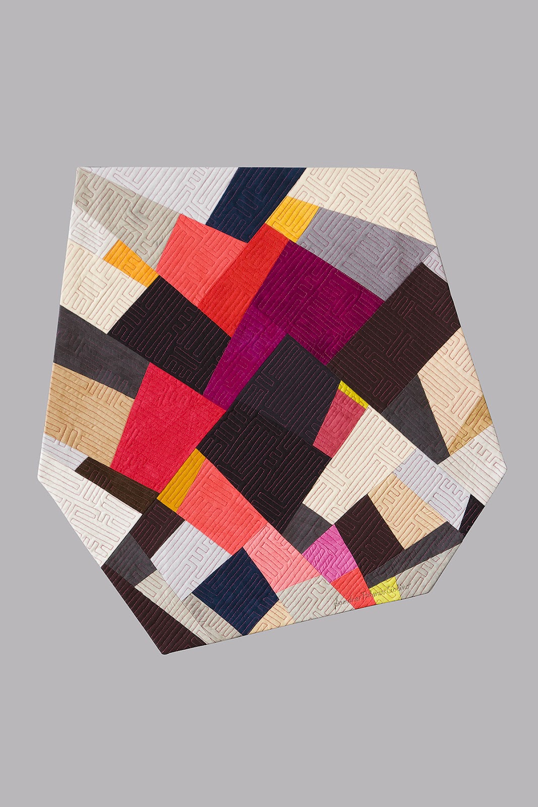
Sandra Palmer Ciolino, Picking Up the Pieces, detail below
This is a small piece but its irregular shape gives extra character. Again, the nice mix of neutrals gives more oomph to the brights. Beautifully crafted and quilted.
And it's red.
I'll show you some more reds from the show tomorrow.
Tuesday, June 5, 2012
Textiles in a Tube 2
I mentioned yesterday that I was intrigued by how big a piece of art could emerge from a 36 x 3" mailing tube in the Textiles in a Tube 2 exhibit. The grand prize for expansiveness has to go to Shelley Brenner Baird for her installation.
Shelley Baird, Textiled, installation view, details below
This piece consists of 1008 fabric circles, each a tad under three inches in diameter, dyed and screenprinted. Each one came backed with double-sided tape, and the gallery people stuck each one to the wall on a grid, a process that took many, many hours.
I liked the sheer audacity of making a piece of art that would command half the gallery, but I shouldn't have been surprised -- last year Shelley took best in show in Textiles in a Tube for her fabric accordion book that also took over an entire wall.
Shelley Baird, A Long Story, installation view, detail below
Both these pieces are similar in feeling and subject matter -- they're both complilations of mysterious fragments of text and imagery, telling stories that we can only guess at. I'm intrigued.
And I have to wonder whether Shelley is taking this show as a personal challenge to see how much space she can pack into a mailing tube. What will she come up with next year?
Subscribe to:
Posts (Atom)