

Tuesday, August 31, 2010
Sunday, August 29, 2010
Tokyo Art
The Mori Art Museum, located on top of a 54-story office/retail/residential/hotel tower in Tokyo, is one of the very few places in Japan to see contemporary art. It has been open only since 2003 and does not have a permanent collection, but functions as a Kunsthalle to present revolving exhibits. The show I saw last month was super!
Yoshioka Tokujin, according to the artist statement, likes “recreating undeterminate phenomena, such as light, snow, storms and wind, which do not have a distinct shape or color.” To recreate snow, for instance, he built a room out of clear plastic and filled it halfway with feathers, then uses two electric fans to blow them about. The fan comes on for 35 seconds, then goes off for a couple of minutes while the feathers gently settle into drifts.
 Yoshioka Tokujin, Snow, 2010
He also makes huge slabs of optical glass that resemble blocks of water and produce magical refraction patterns as you look at or through them; one of these, at 4.5 meters long, is the world’s largest single piece of optical glass.


 Kuribayashi Takashi, Forest from Forest, 2010


As spectacular as these earlier pieces were, the best part of the show was the stop-action animation films made by an Indonesian artist group called Tromarama. If you think it takes a lot of work to do clay-mation, you should see what these guys do! For instance, they animated one film by carving 402 woodcuts into plywood, but one piece constituted many, many frames of the film – they would make one gouge, photograph it, make another gouge, photograph it, and repeat until the entire figure emerges from the black-painted wood background!
 Tromarama, still from Serigala Militia
They also did a film that used 12 kilograms of buttons and 1 kilo of beads, all painstakingly arranged into pictures and designs. Another film used 210 pieces of batik on cotton, each about 6 x 18 inches. (And we know how time-consuming it is to produce a batik to an exacting pattern!)
This is termite art at its most mesmerizing.
 Tromarama, still from Zsa Zsa Zsu
 Tromarama, stills from Extraneous
Yoshioka Tokujin, according to the artist statement, likes “recreating undeterminate phenomena, such as light, snow, storms and wind, which do not have a distinct shape or color.” To recreate snow, for instance, he built a room out of clear plastic and filled it halfway with feathers, then uses two electric fans to blow them about. The fan comes on for 35 seconds, then goes off for a couple of minutes while the feathers gently settle into drifts.

He also makes huge slabs of optical glass that resemble blocks of water and produce magical refraction patterns as you look at or through them; one of these, at 4.5 meters long, is the world’s largest single piece of optical glass.


Yoshioka Tokujin, Water Block, 2002

Yoshioka Tokujin, Waterfall, 2005-6
Kuribayashi Takashi made two monumental installations depicting borders. In the first, you enter a large room to find yourself below a low ceiling of warm-tinted translucent washi paper. As you stoop to walk into the room, you notice and head for several holes in the ceiling; when you poke your head through the holes you realize that you’re now just above the floor of a forest made from white paper trees. Why did the white-white paper seem so golden from below? Who knew that the ground is only paper thin, and there’s a whole world down there where people can walk around and perhaps peek up at us?

 Kuribayashi Takashi, Forest from Forest, 2010
In the second, a mountain almost as tall as the ceiling has a small "water" surface at the top. The boundary between water and land seems arbitrary and almost irrelevant in this view.


Kuribayashi Takashi, Islands, 2010
As spectacular as these earlier pieces were, the best part of the show was the stop-action animation films made by an Indonesian artist group called Tromarama. If you think it takes a lot of work to do clay-mation, you should see what these guys do! For instance, they animated one film by carving 402 woodcuts into plywood, but one piece constituted many, many frames of the film – they would make one gouge, photograph it, make another gouge, photograph it, and repeat until the entire figure emerges from the black-painted wood background!

They also did a film that used 12 kilograms of buttons and 1 kilo of beads, all painstakingly arranged into pictures and designs. Another film used 210 pieces of batik on cotton, each about 6 x 18 inches. (And we know how time-consuming it is to produce a batik to an exacting pattern!)
This is termite art at its most mesmerizing.


Saturday, August 28, 2010
Art-A-Day


August 28 -- at the fruit market
Thursday, August 26, 2010

Wednesday, August 25, 2010
Another April quilt date report
Sally Field, who sent a picture last week of the little piece she did with the April quilt date, sends another of the finished work.
 She writes: "Just finished my Intersections. I think of it as a road map. The
piece finished at 18" x 12.5". The more I did on it the better I liked
it. It is the first thing done (and
completed) in quite a long time. Felt good to be back at the machine.
Thanks again for your tutorial."
She writes: "Just finished my Intersections. I think of it as a road map. The
piece finished at 18" x 12.5". The more I did on it the better I liked
it. It is the first thing done (and
completed) in quite a long time. Felt good to be back at the machine.
Thanks again for your tutorial."
Sally, thank YOU for sending in the picture. I'm so glad it turned out well for you -- I like the way you have quilted in ghost lines to complement the ones pieced in. Now that you're back at the machine do something wonderful.

Sally, thank YOU for sending in the picture. I'm so glad it turned out well for you -- I like the way you have quilted in ghost lines to complement the ones pieced in. Now that you're back at the machine do something wonderful.
Tuesday, August 24, 2010
Show entries and hanging rods
Thanks to everybody who commented on my earlier post about juried fiber art shows and their requirements. Today I have more thoughts in response to your comments.
Martha Hall wrote, "I was reading the rules of another show this week, and they require you to send your own rod or hanging device? Really? They've been putting up an annual quilt exhibit for all these years and they don't have poles or a hanging system? That's going to be a pain in the neck to pack."
On this issue I have to come down on the side of the show. If the show is Houston or Paducah, yes, they have a hanging system that is used every year -- but it's a pretty minimal "pipes and drapes" affair. That works sort of OK for displaying bed-size quilts but less satisfactory for smaller pieces, which either must be suspended up there near the ceiling or pinned lower down to the drape.
Pipe-and-drape isn't always viewer-friendly. The common layout is to make three-sided boxes facing an aisle. You can only see one of the three quilts in that box straight on, and that one only from six or eight feet away (so no peeking at the details to see how she made it). The other two quilts are visible only at an angle, although you can get up close and see what's happening on the side near the aisle. It's difficult to get decent lighting onto all three of the quilts, so at least one is in the shade. And there's usually a big bulge at the top of each quilt where the 3-inch pipe is threaded through the sleeve.
And speaking of viewer-friendly, I vividly remember being at the big Lancaster show a decade ago when a huge crash reverberated through the hall. I spun around and saw a whole section of pipes going down like dominoes and people shaking in fear because they almost got hit. It took all day to get the exhibit back in shape and I can't imagine it did the quilts any good.
If the show is in a museum, however, the quilts will be displayed on a wall and will require hanging rods.
I have been associated with the Form, Not Function show at the Carnegie Center in New Albany IN since its inception, and we have always asked artists to provide hanging rods. Occasionally somebody didn't include one, and we never penalized them. The museum had some lath strips in the back room and we would cut one to fit, but that added time to the hanging.
I was told last week that the Schweinfurth Art Gallery in Auburn NY, home of Quilts = Art = Quilts, has its own rods to use for the show, which I think is quite generous. I wonder how many rods they own, and what happens if your quilt is 44 inches wide and they only have one that's 45 inches long. Will they saw off an inch and replace the eye hook on one end? Or will they hang your quilt with a half-inch of wood sticking out at each end?
I suspect they'll do the right thing and saw down the rod, and over time as all their rods shrink an inch or two every year, they'll have to buy new wood. But I know this will take a fair amount of money and a lot of time, not to mention a lot of storage space. It may also be tricky to come up with hanging devices for odd-shaped quilts. I commend the Schweinfurth for doing it, but don't expect it of every venue.
Yes, it can be a pain in the neck to pack long rods, but having shipped many quilts in my life and seen many, many more as we packed and unpacked them at the Carnegie, I don't think it's as bad as Martha may think. First, you usually want to ship your quilt rolled rather than folded, and if it's taller than it is wide, your rod will just slip into the box alongside the rolled quilt. Second, you can often use a telescoping rod such as a drapery fixture. Third, if you have a special situation you can call the show organizer and ask for a dispensation.
Last year I had to do that with my piece in Quilt National '09. The quilt itself folded into a package not much larger than a shoebox, but needed to hang from loops on a visible rod, 110 inches long. When we shot photos I had cruised Home Depot and found a nice copper pipe the right length for $10 and almost bought it, but decided not to -- if the quilt got into the show, it would probably cost me $30 to get the $10 pipe to Athens OH! We used a plain wood rod for the photos, and when the quilt got into the show I called Kathleen Dawson, the QN executive director, to discuss the problem. She was totally cheerful and understanding, and the obvious answer was that she would go to the Home Depot and buy the same pipe I had cased out here.
Artists whose first experiences in exhibiting were the big traditional quilt shows may be spoiled because we could just fold up the quilt and ship it in a box and they did the work of hanging. Yes, that was easy, even if the quilts often had folds and bulges when they were displayed. But those of us whose preferred show venues are galleries or museums have gotten used to providing our own hanging systems. It's something more to worry about, but you do eventually figure out the best way to do it.
Monday, August 23, 2010
Doing the right thing
Several years ago I had only begun taking classes from Nancy Crow and thus I was taken aback when she said to me that a certain seam was "all wrong" and needed to be redone. The fix consisted of less than 1/8 inch. My first response was "you're crazy" but as the day wore on I realized she was right, ripped out the seam and resewed it.
That day was a watershed in my transition from a talented amateur to a serious artist. I had always subscribed to the mantra "good enough is not good enough" in my profession, but until that day I had not done so as an artist. From then on I resolved that I would make things as good as I could in my art, even if that took time and effort.
Which is a long way to get to how I spent yesterday afternoon.
Several weeks ago I was well along on quilting a piece when I went to brush away a bit of what seemed to be black lint. Oh, the klong when I realized that the lint was actually some kind of gooey foreign substance that left a spot on the pale yellow of my quilt! Scrubbing it with a wet washcloth accomplished nothing. My next plan was to put the quilt away and work on something else -- maybe the spot would disappear. (I firmly believe that in the entire history of textile art this has actually happened at least once.)
 But when I came back after my world travels, the spot was still on the quilt, pale brown and about the size of a bit of short-grain rice. It was in the unquilted portion, so it was relatively easy to fold back the batting and backing and scrub it with soap and a toothbrush, but the spot didn't yield.
In my pre-serious days I would have cussed a few times, then carefully planned my stitching to pass over the spot and hoped that it would be camouflaged from view. I toyed with that idea for several days but this afternoon I realized that I just had to do the right thing, which of course was to cut the spot out and sew in new, clean fabric.

Rather than rip out any of the quilting, I decided to slice right through the spot and piece in another narrow strip of red-and-white striped fabric. I opened a seam so the repair would be as small as possible. I chose to slice the top parallel to a nearby strip so it looked like part of the original design (the ruler runs right through the spot).


To make sure I had plenty of fabric for the mend, I cut a new piece of yellow fabric at the same angle as the original piece but an inch bigger in either direction. Then I cut a new piece of stripes and stitched the new piece back into place. It was cumbersome to fold the top away from the batting and backing, and to work so close to the huge bulk of the quilted portion, but with a lot of pins and patience everything worked.
 The "new" quilt has one more horizontal stripe in the corner but no spot. The repair took less than an hour and I know that had I not done the right thing, I would have seen that spot every time I looked at the quilt for the rest of my life and regretted not fixing it. Can't say whether I would have made the same decision had the spot appeared in the middle of a quilted section, but I'm so glad I was able to fix it with so little trouble. Nancy would be proud of me.
PS -- note to self -- don't make any more quilts with wide expanses of plain, pale yellow. It's like wearing a white dress to cook spaghetti.
That day was a watershed in my transition from a talented amateur to a serious artist. I had always subscribed to the mantra "good enough is not good enough" in my profession, but until that day I had not done so as an artist. From then on I resolved that I would make things as good as I could in my art, even if that took time and effort.
Which is a long way to get to how I spent yesterday afternoon.
Several weeks ago I was well along on quilting a piece when I went to brush away a bit of what seemed to be black lint. Oh, the klong when I realized that the lint was actually some kind of gooey foreign substance that left a spot on the pale yellow of my quilt! Scrubbing it with a wet washcloth accomplished nothing. My next plan was to put the quilt away and work on something else -- maybe the spot would disappear. (I firmly believe that in the entire history of textile art this has actually happened at least once.)

In my pre-serious days I would have cussed a few times, then carefully planned my stitching to pass over the spot and hoped that it would be camouflaged from view. I toyed with that idea for several days but this afternoon I realized that I just had to do the right thing, which of course was to cut the spot out and sew in new, clean fabric.

Rather than rip out any of the quilting, I decided to slice right through the spot and piece in another narrow strip of red-and-white striped fabric. I opened a seam so the repair would be as small as possible. I chose to slice the top parallel to a nearby strip so it looked like part of the original design (the ruler runs right through the spot).


To make sure I had plenty of fabric for the mend, I cut a new piece of yellow fabric at the same angle as the original piece but an inch bigger in either direction. Then I cut a new piece of stripes and stitched the new piece back into place. It was cumbersome to fold the top away from the batting and backing, and to work so close to the huge bulk of the quilted portion, but with a lot of pins and patience everything worked.

PS -- note to self -- don't make any more quilts with wide expanses of plain, pale yellow. It's like wearing a white dress to cook spaghetti.
Sunday, August 22, 2010
Show entries and jurying
More of my responses to the readers who commented on my earlier post about show entries. Thanks to all who took the time to read and share such thoughtful remarks.
Barbara Lardon wrote: "I read an article from the jurors of a major show. They said that each quilt gets three seconds when they go thru the initial photos. If they do not catch their attention in that time they are discarded. Then in each viewing after they add a bit more time until they are down to the final few and then and only then do they look at details. That bothered me a lot."
I suspect you're describing Quilt National and perhaps Quilt Visions, not some of the smaller shows. A lot depends on whether the jurors initially get together in the same room or whether they each look at the entries online at home, and later discuss their choices via conference call. Clearly the latter approach gives a juror more time to scrutinize even the pieces that don't yell "I'm wonderful" in the first three seconds. And assuming there's an efficient method to collate the jurors' first votes, it allows much more time to talk about the pieces that are still in the running.
On the other hand, leisurely discussion of the short list does make the process vulnerable to the persuasive powers of the juror who is most articulate, most passionate, or highest on the food chain. By contrast, the three-second approach, I understand, usually has no discussion at all, just a ranking system whereby first impressions eliminate a large proportion of the entries. Having changed my own mind many times as a juror because of the comments of my colleagues, and vice versa, I tend to like a system that allows more works rather than fewer to be talked about.
I believe that detail shots are important in telling the jurors more about how a piece was made and whether the workmanship is good, bad or indifferent. But I think it's OK to make a first judgment based on the full view only. If a piece has poor design or insufficient visual impact, it doesn't really matter whether it's quilted by hand or machine or how well.
Nina-Marie wrote: "I believe some of these shows use entries as a way to raise money for the show itself. The more entries -- the more revenue. That said, now the jury needs to look at all those entries -- in QN they have to whittle near 1,000 entries down to a show under a hundred. How are they going to do that? Using some of these complicated rules as a way to disqualify seems to have become part of the solution."
You're absolutely right that entry fees go to support the show. Even if you don't have to pay rent and insurance for your space, and if the staff support is already on the payroll of some sponsoring organization, you have to pay jurors and/or judges, give prizes, print postcards and other publicity material, buy refreshments for the opening reception, perhaps buy ads to promote the show to both entrants and visitors. If you print a catalog, you instantly add five figures to your expenses. Entry fees are one way to recoup these costs, but I suspect it's a rare show that collects enough on entries to cover its costs.
I don't think shows use complicated rules to help whittle down its entries -- they use jurors. It takes a lot less time and effort for a jury to eliminate a quilt on its merits than it does for a staff person to vet each entry in hopes of finding a gotcha.
Saturday, August 21, 2010
Art-A-Day


Friday, August 20, 2010
Show entries and photography
Much chatter in the fiber art blogosphere these days about quilt show entries, as many of us are getting ready to enter Quilt National and a few of the smaller art/quilt shows. On Terry Jarrard-Dimond's blog I've learned more than I wanted to know about JPEGs vs. TIFFs and the potential dangers of image degradation as you use your picture over and over for multiple show entries (or other purposes). Also discussion of how strange it is that many quilt shows prohibit, on pain of death, any color correction or other tweaking of an image, while shows in other art disciplines don't seem to care.
All this makes my head hurt.
I have chosen as an artist to work in fiber, not photography. It chops me to be told to worry about the nuances of image quality when I should be worrying about the nuances of my quilting stitch.
Now one valid response to this whine is to say get over it, photographing your work is important if you want it to be seen in public -- whether than means in a juried show, in a gallery, or on your own website/blog. Photography, whether you do it yourself or pay to have it done, is a vital part of marketing your work, and you remain ignorant at your own peril. I know this is true, and I have always used professional-quality photographers for my work.
But another valid response is to say that some show organizers are asking entrants to jump through way too many hoops, and the "reasons" behind these requirements may not stand up to scrutiny.
For one, the requirement that all images be a certain size and/or resolution. (Please forgive me in advance if I don't use the exact technical terms in discussing these issues. I told you already, I'm neither a photo wonk nor a computer wonk, and I kind of want to stay that way. I hope you will know what I'm talking about.) Yes, it's nice for jurors if all the images fill the screen neatly, but it's hardly going to kill them to see different images at slightly different sizes. And images can't all be the same size, even if people follow the directions perfectly -- if you're supposed to have the longest side no more than 1800 pixels, a square quilt is going to end up a lot bigger on the screen than a long, skinny one.
And yes, maybe it's nice if jurors can see every quilt photographed perfectly -- no momentary frustration because one is a touch fuzzy or the left corner isn't properly lit, no momentary eyestrain because one is shown on a black background and the next one on pale gray.
But I would like to think that jurors have enough good sense and discernment to look at the quilt, not the photo. Does that touch of fuzz make it impossible to tell a good quilt from a bad one? Is that left corner the difference between accepting and rejecting the piece? I get the feeling that sometimes jurors penalize good quilts simply because of bad photography, and if so, shame on them.
Many of the high-end shows such as Quilt National and Quilt Visions publish catalogs with juror statements, which I always read carefully for insights into what's going on in the field. Or at least that's what I want to read. But for a while I noticed that many juror statements said little about art and much about photography; indeed a few of the statements seemed like insulting lectures to us dummies who dared to offend the jurors' rarefied sensibilities by sending in less-than-perfect slides or images.
Here's a Quilt National juror statement from several years back: "Slides that were too dark or those showing backgrounds (such as people or furniture) lost their chance of being considered." Yes, it's amateur hour when somebody holds the quilt up for photography rather than pinning it to a nice clean wall, but what if the quilt was really great? Take off points, sure, but to automatically disqualify it? I don't think that's the proper role of a juror.
How about the show requirement that images have no color correction or cropping? I do agree that it's bad practice to make your quilt square by cropping; the last time I juried a show we were frustrated by not being able to see the edges of the quilt to learn more about construction and finishing. Yet I wonder if jurors really like to see everything that's going on in the margins of the original image, like the ropes suspending the bar from which the quilt hangs or the edge of the gray felt backdrop. (That's the way I sent my images in to Fiberart International last year, because they demanded no cropping at all.)
I don't understand the big deal about color correction. Even though I wouldn't know how to do this if I wanted to, I take the word of others who say that sometimes without color correction the image doesn't properly represent the quilt. As an object lesson, see my post from yesterday about the purple sweater.
But who cares? If a quilt has good design and good workmanship, does it matter whether it's a bluish red or an orangey red? I've often seen entry images where the detail shot differs greatly in color from the full shot; the jurors may remark on it but it never stopped us from accepting or rejecting a quilt on its other merits. The quilt shows up and the organizer says "I thought from the photo it was going to be blue, not green" -- so what? Don't tell me the jurors so closely calibrated their choices that a green quilt will ruin their plan.
And finally, the requirement that images be submitted in two different resolutions, one "for jury" and one "for print." This might be for two reasons -- the show wants to use the higher-quality images either to print a catalog or to provide to publications for coverage of the show. Fine, but why not request images from the people who are accepted instead of from everybody? It's just like requesting artist statements from all entrants, even though the statements will never be seen by the jurors, because they'll eventually be needed for the catalog or the wall labels. Or like requiring you to send in not just your CD of images but a printout of color thumbnails. Since the thumbnails are labeled with your name, you know that's not used for jurying, but presumably is a help for the people who are going to hang the show.
Translated into English, these requirements mean "our time is more valuable than your time, so race around and give us something we probably won't use just so we don't have to ask you for it after you're accepted."
Quilt National can get away with it, because they're number one. But can other shows afford to annoy their potential entrants with unreasonable demands? Maybe artists should vote with their feet -- and follow up with a letter to the organizers saying "I'm choosing not to enter your show because I don't have a color printer and it was just too much hassle to get my friend to print out these stupid thumbnails that you won't need till next year even if I'm accepted." Hey, maybe it's not too late to send that letter to that show I didn't enter last spring for precisely that reason.
Thursday, August 19, 2010
Designer mending -- the tutorial
I’ve written before about my love of mending, especially when I can turn a patch into a “designer detail.”
 Recently my brother visited, bringing a couple of beautiful cashmere sweaters with big holes in them. Being a conscientious objector in the fashion wars, I don’t often have the opportunity to fix cashmere, so this was fun.
 Start with a backing. For this project I used black Kona cotton; I have also used nonwoven interfacing. Cut the backing considerably bigger than the hole. Flip the sweater inside out, place it carefully on a flat surface without stretching, and baste the backing to the sweater outside the margins of where the designer patch is going to go.
 Cut a patch out of ultrasuede, plenty big to cover all edges of the hole. Pin it to the right side of the sweater making sure the pins don’t pull the patch out of shape. With a star shape it’s easy to pin over the points and not pierce the ultrasuede at all. With other shapes maybe you can pin over the corners.
For this star shape, which requires only straight line stitching, I used a walking foot. (For circles or hearts I would probably use a darning foot and drop the feed dogs for free-motion stitching.)
 Pull the bobbin thread to the top where you plan to start sewing. Grab both top and bobbin threads and hold them firmly behind the presser foot. Pull gently on the threads as you begin to sew (note my thumb in the photo) to make sure the patch stays where it belongs and doesn’t get pushed out of place under the presser foot.
Sew around the patch once or twice. Depending on the shape, you might want to add some stitching in the center of the patch as well as the edges; the more it’s sewed down, the more stable it’s going to be when finished.

Pull the thread ends to the back of the sweater and bury them by running your needle carefully between the backing and the ultrasuede.

 Wear with your head high. Your sweater is better with its patch than it was to start with. You could even do this without the underlying hole. (PS -- how does this sweater turn from blue to purple to blue and back again??? Beats me.)
 Recently my brother visited, bringing a couple of beautiful cashmere sweaters with big holes in them. Being a conscientious objector in the fashion wars, I don’t often have the opportunity to fix cashmere, so this was fun.
I thought others might enjoy a tutorial in designer mending. (It works on acrylic as well as cashmere.)

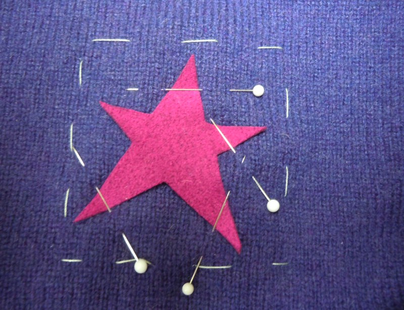 Cut a patch out of ultrasuede, plenty big to cover all edges of the hole. Pin it to the right side of the sweater making sure the pins don’t pull the patch out of shape. With a star shape it’s easy to pin over the points and not pierce the ultrasuede at all. With other shapes maybe you can pin over the corners.
For this star shape, which requires only straight line stitching, I used a walking foot. (For circles or hearts I would probably use a darning foot and drop the feed dogs for free-motion stitching.)

Sew around the patch once or twice. Depending on the shape, you might want to add some stitching in the center of the patch as well as the edges; the more it’s sewed down, the more stable it’s going to be when finished.

Pull the thread ends to the back of the sweater and bury them by running your needle carefully between the backing and the ultrasuede.

Trim the thread ends, then trim the edges of the backing close to the stitching.

Wednesday, August 18, 2010
August quilt date report
Terry Jarrard-Dimond reports in:
"Here is my quilt I made for our quilt date. This is what I would make but I'd make it 60" x 60"."

(The typographic observer observes: doesn't that sentence above look really weird with the two " symbols at the end? But it's grammatically correct. Go figure!)
So Terry -- if you hadn't done the quilting you could have just said it was 60" x 60" and I would have believed you! And this gives me a really good idea for my next big quilt... won't take too long to piece...
Thanks for sending this beautiful baby quilt to me.
Tuesday, August 17, 2010
April quilt date report
A couple of people report they had fun with the April quilt date, piecing fine lines.
Sally Field sent a photo of a study that she hasn't quilted yet.
 "I have not been at my machine to really work at something for a long, dry period," she wrote. "I tried your method of slice and splice. I have made a small piece (about 18 x 14 untrimmed) and have had a good time with it. I probably will not do much of this type of work but it did get me back to using the machine again."
"Definitely not my style but had fun with it. Can see a usage for inserting small bits here and there. Also I'm not a person who can do 'simple'. I have to keep adding and adding. Had a photographer years ago tell me that my quilts were intricate."
Here are a couple of images of Sally's quilts you might like to check out. Here hers is the third one on the page; unfortunately here you have to scroll down past 15 other artists to find her work, but you do get to go past some nice stuff on the way.
I would say the quilt date has served its purpose for Sally -- you don't have to marry every guy you go out with, and if this got her over a dry spell then it sounds like a success. (By the way, Sally, keep making more and more cuts and this technique could easily satisfy your desire for intricacy!)
By contrast, Sandy Ciolino liked the quilt date so much she's finished her third piece and is still working with the concept.
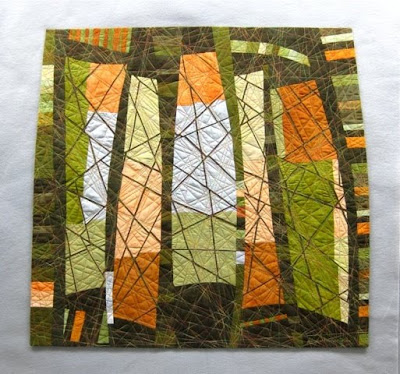 Sandy Ciolino, Fractures #3: Intersections
Thanks to Sally and Sandy for sending in these pictures. This seems to be the most popular quilt date so far and I'm glad that my boyfriend is making other people happy, too. I'm willing to share him!
Sally Field sent a photo of a study that she hasn't quilted yet.

"Definitely not my style but had fun with it. Can see a usage for inserting small bits here and there. Also I'm not a person who can do 'simple'. I have to keep adding and adding. Had a photographer years ago tell me that my quilts were intricate."
Here are a couple of images of Sally's quilts you might like to check out. Here hers is the third one on the page; unfortunately here you have to scroll down past 15 other artists to find her work, but you do get to go past some nice stuff on the way.
I would say the quilt date has served its purpose for Sally -- you don't have to marry every guy you go out with, and if this got her over a dry spell then it sounds like a success. (By the way, Sally, keep making more and more cuts and this technique could easily satisfy your desire for intricacy!)
By contrast, Sandy Ciolino liked the quilt date so much she's finished her third piece and is still working with the concept.

Thanks to Sally and Sandy for sending in these pictures. This seems to be the most popular quilt date so far and I'm glad that my boyfriend is making other people happy, too. I'm willing to share him!
Monday, August 16, 2010
Buffalo art (who knew!)
We got off the plane in Buffalo on our way to Auburn NY for the Nancy Crow show, and of course our first stop was the ladies' room. And what did we see just inside the door but an enticing poster for the Albright-Knox Art Gallery, complete with address and opening hours. Checked our watches and thought this might be a good stop before we hit the Thruway to drive east.
And what a good decision that was! The Albright-Knox, which I had never heard of, turns out to be a gem of a museum with perhaps the highest quality-per-picture ratio of any gallery I've ever visited. We walked first into the modern art wing, and it was the Greatest Hits Collection: a Jackson Pollock, a Mark Rothko, a Robert Motherwell, a Willem deKooning, an Agnes Martin, a Clyfford Still, the biggest Robert Rauschenberg I've ever seen, a Jasper Johns, an Arshile Gorky, a Jo Baer, and Arthur Dove, a Georgia O'Keeffe, and all of them fine pictures, not just early or mediocre works.
 Jackson Pollock, Convergence, 1952 (left) and Robert Motherwell, Elegy to the Spanish Republic No. 34, 1953-4
And speaking of Clyfford Still, turns out that the Albright-Knox owns the largest public collection of his works and 29 of those paintings are on display through the end of August. Still was no fan of the organized art world, but after the Albright-Knox bought a picture from him in 1957 he showed up and was pleased at how well he was treated. A couple of years later the museum gave him a big solo show, and again they treated him right -- so he gave them 31 paintings! (Moral of that story -- be nice to people, even if they're crabby old curmudgeons.)
I've seen a lot of Still's work over the years in one place or another, and he's not an easy artist to like. Many of his shapes are jittery and awkward and you're not sure what you're supposed to be seeing. I am particularly fond of the paintings where little things are happening on the margins, as though the camera was pointed way off to the side and caught only a glimpse of some activity that must forever be a mystery.
 Clyfford Still, 1951-L No. 2, 1951
 Clyfford Still, November 1950 No. 2, 1950

Clyfford Still, November 1954, 1954
We walked through a stairwell on our way to the Still exhibit and found it transformed into a workroom where a team is installing a Sol LeWitt wall drawing.
 I also discovered a new artist whose name I'm going to remember: Sarah Sze, an American sculptor who made a half dozen little metal fire escapes that were perched here and there on the walls.


Sarah Sze, Second Means of Egress (Orange), 2004 (with hand for scale)

Alberto Giacometti, Man Walking (Version 1) 1960, and Piet Mondrian, Composition No. 11, 1942
There are also a bunch of very nice European paintings and sculpture, checking off lots of the big names -- Matisse, Picasso, Giacometti, Monet, Cezanne, Schwitters, Mondrian, Van Gogh, as well as my new boyfriend from Berlin Karl Schmidt-Rottluff. But it's the mid-century American art that steals the show. If you're anywhere near Buffalo make a detour and check out this great museum.
And what a good decision that was! The Albright-Knox, which I had never heard of, turns out to be a gem of a museum with perhaps the highest quality-per-picture ratio of any gallery I've ever visited. We walked first into the modern art wing, and it was the Greatest Hits Collection: a Jackson Pollock, a Mark Rothko, a Robert Motherwell, a Willem deKooning, an Agnes Martin, a Clyfford Still, the biggest Robert Rauschenberg I've ever seen, a Jasper Johns, an Arshile Gorky, a Jo Baer, and Arthur Dove, a Georgia O'Keeffe, and all of them fine pictures, not just early or mediocre works.

I've seen a lot of Still's work over the years in one place or another, and he's not an easy artist to like. Many of his shapes are jittery and awkward and you're not sure what you're supposed to be seeing. I am particularly fond of the paintings where little things are happening on the margins, as though the camera was pointed way off to the side and caught only a glimpse of some activity that must forever be a mystery.


Clyfford Still, November 1954, 1954
We walked through a stairwell on our way to the Still exhibit and found it transformed into a workroom where a team is installing a Sol LeWitt wall drawing.


Sarah Sze, Second Means of Egress (Orange), 2004 (with hand for scale)

Alberto Giacometti, Man Walking (Version 1) 1960, and Piet Mondrian, Composition No. 11, 1942
There are also a bunch of very nice European paintings and sculpture, checking off lots of the big names -- Matisse, Picasso, Giacometti, Monet, Cezanne, Schwitters, Mondrian, Van Gogh, as well as my new boyfriend from Berlin Karl Schmidt-Rottluff. But it's the mid-century American art that steals the show. If you're anywhere near Buffalo make a detour and check out this great museum.
Subscribe to:
Posts (Atom)


