Sunday, October 31, 2010

Craftsmanship -- good or bad? Part 2

I wrote last week about craftsmanship and whether we as fiber artists should perhaps value it a little less than we do.  Some of the comments under that post made me realize that I did not make my point clearly enough.

When we're talking about traditional quilts, then craftsmanship is generally the most important element to be judged.  Yes, traditional judges like pleasant design and will take off points if a quilt is butt-ugly, but what they really like, I suspect, is lots and lots and lots of tiny stitches, points that match, perfectly stuffed binding with stitched miters at the corners, and no thread ends.  Even in modern quilt shows, such as the big ones in Paducah and Houston, which have "art" or "contemporary" categories, design may be equally important, but craftsmanship is still a huge issue. 

That's the major reason, in fact, that I no longer enter shows like Paducah or Houston.  Not that my craftsmanship is shoddy -- au contraire -- but I don't want to be in shows where it is just as important as design.  I want to make work that is seen as art, not craft.  When your chosen medium is fiber and especially when your chosen format is the quilt, that's a hard objective to achieve.  One critical step in working toward that objective is to avoid places where you're in with traditional crafters.

I have identified a relatively short list of juried quilt shows that seem to focus on art more than on craftsmanship, such as Quilt National, Quilt Visions, and a few smaller shows, that I would like to be in.  Nothing against the more traditional quilt shows (in fact, I'm kind of sorry about passing up a chance to go to Houston this week, because I've always loved attending that show) but I don't want to enter them any more.   I want to play in a different ballpark, one where if you know what a mitered corner is you keep it to yourself, and it is in that context that I pose the question of how we ought to regard craftsmanship.

I've been keeping my eyes open as I read art reviews to see how the critics discuss craftsmanship.  Here's yesterday's New York Times:  "And where other artists might have chosen to delegate the manual labor, she was intent on doing the bulk of it herself..."
 
Do we detect a whiff of disapproval because the artist DIDN'T delegate the manual labor?  Or if not, at least a mild gee-whiz surprise?  Think of other artists who famously delegated the manual labor in their work.  The most prominent may be Donald Judd and his hands-free perfect manufactured minimalist boxes.

In fact, this spring there was a whole conference, in Portland OR, called "Donald Judd: Delegated Fabrication."  The conference promotional material said it would focus on "issues of authenticity and fabrication that continue to have lasting implications for artists today..... The simple question of how one maintains the integrity of the work even while at the same time taking advantage of skill sets of different people is a question that is at the heart of many different contemporary practices including designers, architects, historians, film makers as well as artists."

Donald Judd, Untitled, 1993

Donald Judd, Untitled, 1984 


Other contemporary sculptors also delegate the actual making of their works to others.  Think Richard Serra and his huge Cor-Ten steel ellipses, Jeff Koons and his shiny metal balloon-dogs.  When you see the work in a museum, there's only one name on the wall sign, and it sure isn't the actual maker.


Richard Serra, Band

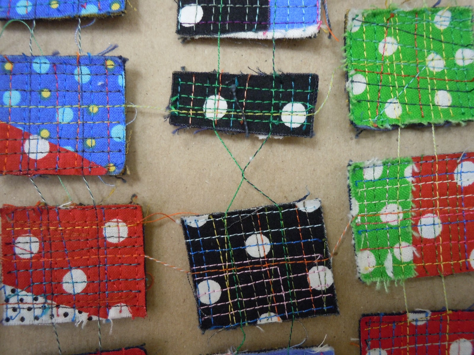
By contrast, in the fiber art world the artist is expected to make every bit of the work, or at least the important part.  If I want to enter Quilt National it's OK for me to hire somebody to quilt my work, but not to piece it.  (Which is another fascinating subject for discussion, but not today.)  And many of us fiber artists wouldn't have it any other way.  We love the making, and most of us greatly value the skill and craftsmanship we put into that making.  And in even the most prestigious quilt/art shows, such as Quilt National and Quilt Visions, the jurors and judges generally share that mindset.

So are we shooting ourselves in the foot?  By refusing to separate the idea from the execution, the plan from the fabrication, the concept from the craftsmanship, do we as fiber artists distance ourselves a bit from the mainstream art world?  I wish I knew.  What do you think?

Saturday, October 30, 2010

Art-A-Day

October 24 -- wind

October 25 -- tortoise shell

October 26 -- rain at last

October 27 -- shadows

October 28 -- against the fence

October 29 -- the last rays of summer

October 30 -- grain elevator

Friday, October 29, 2010

Craftsmanship -- good or bad?

When I asked blog readers to comment last week on three fabric works, without knowing they were made by world-famous sculptor Louise Bourgeois, one person said she liked the design of the one shown here but “I don’t think it’s Quilt National worthy since it doesn’t present a mastery of any technique save fabric selection.” Another thought the pieces “show very little creativity and little technical ability.”

I had similar thoughts about technique when I looked at those particular three pieces, although other pieces that I showed images of in a subsequent post were more ambitious. Another blogger who saw the exhibit catalog, presumably with better photos, was impressed by the craftsmanship.

But that leads me to a more important consideration – what’s with technique and craftsmanship anyway? Is it essential to great art these days? Is it acceptable but not necessary? Or is it maybe even an impediment?

A couple of years ago a curator at a mainstream art museum was judge at a quilt art show. Some fellow quiltmakers and I had the opportunity to speak briefly with him and we asked him how craftsmanship entered into his deliberations. His answer: “not at all.” He said he was looking for ideas, not technique (which was clear from the fact that his best in show was minimal in the technique department).

We were shocked. General practice among quilt art shows is to hold craftsmanship quite high on the scale of virtues. I’ve heard many jurors and judges say things like “good technique won’t get you into the show in the absence of good design, but bad technique will get you out of the show all by itself.”

It’s common in the quilt art world to sneer at the Quilt Police, the mythical tradition-minded judges who can’t see beyond the number of stitches per inch and will reject a quilt, even if it’s spectacular, because the miters aren’t sewed shut on the corners. We sneer because we recognize that technique must serve design, and that sometimes it’s more appropriate to have three stitches per inch than twenty.

But I have personally believed that good technique should be the default, and if you choose to flout the “rules” you should have a reason. I don’t mind a quilt (or other fiber art piece – please forgive my non-inclusive language) that droops, frays, bulges or has non-sewn-shut miters, if I think the maker did it deliberately in the service of art rather than because she didn’t know how to do it the “right way.”

After my encounter with the curator/judge, however, I decided to think seriously about his position. I would try hard to divorce my evaluation of design and overall artistic worth from my evaluation of craftsmanship, and challenge my own assumptions about the worth of good technique. I was willing to consider that perhaps my own standards – ingrained since age 5 when my grandmothers taught me to sew and made me DO IT RIGHT – were a personal choice, not a universal value. I was willing to admit that while I was personally never going to make sloppy work, to use a nice pejorative shorthand, it was OK for other artists to be sloppy, just as it’s OK for some people to be Lutherans and others to be Wiccans, and we should tolerate each other’s choices.

I must report that my experiment in tolerance wasn’t totally successful. After a while I had to admit that I could not make myself totally open-minded about technique. I don’t know enough about other art mediums to give a good example, but in the realm of quilt art I still think, for instance, a 2-D piece ought to hang flat against the wall, have square corners and no visible thread ends unless it’s obvious the artist chose to do otherwise.

At the time I felt quite confident that my “prejudice,” if you want to call it that, was a good thing. Now I wonder whether that good-girl prejudice, shared by so many of us in the fiber art world, might be one reason we have a hard time leaving our comfortable little niche and crossing over into the wider world of just-plain-art. I will continue to think and write about this subject. Meanwhile, what do you think?

We just think we have new ideas...

When we visited Greece a couple of years ago we saw a 13th century Byzantine church in Pyrgi on the island of Chios.  The guide explained that while churches were not permitted to be decorated outside, the builders couldn't stand to just make plain old masonry.  Instead, they separated the courses of large, light-colored stones with smaller "plinths" of red brick.  It's called cloisonne masonry, for the jewelry style in which metal compartments are filled with different colors of enamel, leaving the little compartment walls visible as borders around the colors.


I thought the design looked exactly like the quilts in my Crazed series, which I swear had begun long before I saw the church!

Crazed 3: Red Tide (detail)

Crazed 1: Tricolor (detail)

Wednesday, October 27, 2010

Happy Halloween

I hate Halloween with a passion and haven't worn a costume in 50 years. But I volunteer every week with abused children ages 5-10 and was told that I HAD to wear a costume to the party tonight. There is no force on earth other than these little kids who could make me put on a costume, but I succumbed.  Problem is, I didn't know what to wear.  So last night I put out a desperate cry for help to my 3,000 closest friends on the Quiltart email list

I thought it needed to be an outfit that I could say "I am a _____" rather than just some weird clothes that don't match. And I didn't want to have to go out and buy anything. 

Seven minutes after I posted my call for help the responses started flowing.  Dozens of people wrote in with ideas -- that's what I love about this list; they're so willing to help in one's hour of need.

If I'd counted votes, I would have dressed as a gypsy.  Several people thought, rightly, that it wouldn't be too difficult for a not-young, not-thin woman to come up with some flowing skirts, scarves and jewelry and look not-too-awful.  And I could have, had I owned something that could pass for a crystal ball and had I not engaged in denial and put off wardrobe planning until about a half hour before I had to leave.  Others suggested Mother Goose, with apron and gathered cap.

Many of my correspondents recalled clever costumes they'd used in the past. 

Jennifer Martin wrote, "One year I went as the laundry fairy. I wore regular clothes and pinned missing socks all over myself. I also wore a cheap $5 tiara and carried a cheap wand. I also carried my stuff that day in a laundry basket instead of my regular tote bag."

Patricia Cox: "I sewed a stuffed doggie to the edge of my pant leg, added a collar and leash and went as a dog walker. As I walked it looked like the dog was chewing off my pant leg."

Julie Schlueter:  "Super easy is black and white. Wear all black and white clothes, funkier the better. Do one half of your face black and the other white."

Cynthia Wenslow:  "I went as the Spirit of Autumn. I wore a dark green pant suit and cut out a zillion leaf shapes from colored construction and copy paper and taped them all over my pants and jacket and hair with painter's tape doubled over on the back. Some eventually fell off during the course of the evening, but I just told everyone it was only natural that leaves fall in autumn!"

Helen Howes:  "I drew two red dots on my neck and went as the Vampire's Victim."

Janet Windsor:  "Jeans & sweatshirt with socks and underwear spray basted on -- Static Cling; and the ultimate -- I wore whatever I wanted and went as a Party-Pooper!"

Much as I appreciated the wit of these costumes, I was afraid it would go over the heads of the six-year-olds.  And much as I empathized with Janet's final suggestion I knew I had to do something.  My solution was to be a fairy godmother.  Some of the Quiltart people had suggested that, with creative embellishments  such as velvet capes, chiffon scarves and crowns.  In the end, in keeping with my aversion to costumes, I went with the absolute minimum: long skirt, high heels, Mardi Gras beads, a headdress and of course a magic wand. 

The headdress was a length of tulle tied in a knot around my head and embellished with iridescent curly ribbon.  The magic wand was a dowel, a cardboard star covered in aluminum foil, and more curly ribbon.  Total prep time: 20 minutes. 

So how did this getup go over with the kids?  Within one minute of walking onto the premises, one of the little girls had grabbed the wand, pulled the ribbon off the star, torn the aluminum foil and reattached the ribbons halfway down the handle.  I did manage to keep the headdress on for a half hour, after which the little girls took turns wearing it and waving the wand.  The Mardi Gras beads never did resurface after somebody took them off my neck.  It was a huge success and required no explanation -- apparently every child over age two knows what a magic wand is and that somebody carrying one is a fairy godmother.  Next week I'm going to bring 10 yards of pink tulle and my iridescent curly ribbon and make headdresses for everybody.

So, a wonderful heart-tugging evening -- full of love for my Quiltart colleagues and these adorable children who have been dealt a bad hand but are hanging in there.  My life is so enriched by spending time with them on my lap.  Next year maybe I'll go as a gypsy.

Sign of the week

Tuesday, October 26, 2010

Six degrees of influence

I've been following Judy Kirpich's blog with great interest for the last two weeks as she has attended the master composition workshop at Nancy Crow's Barn.  This is the first master composition workshop in years that I have missed, and I was jealous of Judy and the others who had two excellent weeks of work and inspiration together.  Reading her posts brought back many of the feelings and ideas I've had from my years as a workshop junkie.

What makes workshops different from -- and arguably better than -- just locking yourself in your studio and sewing fourteen hours a day?  Well, on the most elemental level, you're unlikely to lock yourself in your studio and sew fourteen hours a day for two weeks.  Life intrudes.  One of the attractions of workshops is that you have fewer distractions, and peer pressure tends to keep you productive, and it's just so nice to be in a gorgeous space with a huge design wall that you'd really rather sew than watch Dancing With the Stars.

But on a higher plane, workshops are good because you put yourself in contact with other people in a concentrated, exhilarating situation.  You're exposed to other ideas, other techniques, other ways of solving problems, and those other people in turn focus on your work to offer critique and commentary.  We have paid to tap into the teacher's brain at a workshop, but we also get the opportunity to tap into our fellow student's brains by talking with them and seeing their work.

Like so many other blessings, this one is mixed.  Specifically, where does influence (good) become copying (bad) or even theft (awful)?  How do you process other people's ideas into your own work without pissing them off and/or violating your own principles?

At one end of the workshop spectrum is exact copying of somebody else's idea, whether it's using the teacher's pattern or process (think Ricky Tims' convergence quilts) or going home to duplicate the quilt of the person who sat next to you at the workshop. 

At the other end of the spectrum, there's the wonderful state of "influence," in which you take home not the pattern but the outlook.  For instance, I have been profoundly influenced by Nancy Crow because she taught me to focus, to work large, to be a more careful and rigorous critic of my own work, to be willing to rip out and redo the part that's close but no cigar.  My mindset resembles hers, thanks to her teaching, but I don't think my work does.

Somewhere toward the good end of the spectrum is another variety of influence, where you adopt some of another person's signature elements without adopting her imagery or ideas.  For instance, if you go to a workshop with a suitcase of commercial solid fabrics, and while you're there you lust over the beautiful hand-dyes brought along by the other participants, and decide to dye your own fabrics in the future, I wouldn't call that copying.  If you admire how somebody else uses odd shades of brown so masterfully, and realize that you shy away from brown, and resolve to learn to use it more confidently, that's not copying either.

But as you move a little farther down the spectrum, it may get harder to decide what's appropriate and what's too much in the way of influence.  I have always been struck by the generosity with which people at Nancy Crow workshops are willing to show and share their techniques and tricks.  I remember watching with awe as Lisa Call showed us how she quilts huge pieces, turning the work 180 degrees every half-minute or so, and as Bonnie Bucknam showed us how she quilted a huge piece in free-motion while recovering from knee surgery -- prctically immobile with her bad knee up on a pillow!  I remember Jayne Willoughby Scott showing me how she insets huge, narrow curved strips into her work, and Jan Myers-Newbury teaching us to inset-piece a perfect circle.  We've often stopped for impromptu tutorials as people show their finishing techniques or explain how they achieve a complicated effect. 

I think people who share their knowledge so openly probably do so with the realization, if not the downright expectation, that those who watch may want to use something of what they've learned.  But every now and then you run into somebody who is happy to show their work, yet flashes a warning on the bottom of the screen: don't try this at home.  That mystifies me.

Recently I heard a sad story about another Nancy Crow workshop, in which one participant showed her work to the others, who admired her beautiful machine quilting.  One person, who is no slouch at machine quilting herself, particularly liked an effect in which areas of horizontal lines were juxtaposed with areas of "bubbles."  They talked; the observer said she would like to try that herself and would the presenter mind?  The presenter said OK, but only if you write on your label that you got your inspiration from me.

Which the observer did.  But then, months later, the presenter noticed a picture of the quilt on a blog, and insisted that it be removed because SHE hadn't been given proper credit!  Well, news flash, the juxtaposition of two different quilting patterns was invented considerably before this person ever picked up a needle, and she didn't even invent the juxtaposition of horizontal lines with bubbles. 

Exhibit A for the defense, your honor, and I'm not claiming that I invented it either.

Kathleen Loomis, Fault Lines 4, 2009, detail

I just don't see the point of showing people your work, accepting their compliments, giving them permission to use your ideas, and then getting upset when they do.  The only way to keep your ideas safe from "theft," if that's the way you look at it, is to keep your artwork safe at home and never let anybody see it. 

I do understand that sometimes outright theft does occur -- if people copy your design line-for-line and enter it in a show, or make a carpet out of it, or put its image on coffee mugs and sell them.  I once juried a show where an entrant submitted a quilt that was a virtual copy of the best-in-show winner from the same show, two years back!  But that's not the case when somebody looks at your work and gets an idea from it.  I wish we could be more thoughtful in distinguishing among these various degrees of influence.

I'll be writing more about this later in the week.  Meanwhile, what do you think?

Monday, October 25, 2010

Hilary and me

I have just learned that the San Jose Museum of Quilts & Textiles is going to exhibit the Marbaum Collection, the quilts assembled by Hilary and Marvin Fletcher. I am proud to have a quilt in that collection and thought I’d tell you a little bit of how it came to be.

If you’ve been in the quilt world for a while, you probably know Hilary Fletcher as the project director of Quilt National from 1982 until her death in 2006. She was the one who organized the jurying, sent out the acceptance and rejection letters, unpacked the quilts, hung them, arranged for the tours and did all the other chores that make QN the preeminent art venue in the world for quilts.

I had a quilt in QN ’03, one of a long series of quilts on letters of the alphabet that I was making at the time. It was constructed of selvages. When it came time to enter QN ’05, I sent in three more alphabet quilts, two of which were also made of selvages. This time I got a rejection letter, but Hilary had written in the margin by hand, “Do you have an F for sale? Or would you be interested in a commission?”

Well, there was never a sweeter rejection letter. I think having a quilt in Hilary’s collection is probably just as prestigious as getting into Quilt National, so of course I jumped at the offer. We negotiated entirely by email and it took much longer to decide what the quilt would look like than to make it.

The quilt had to be relatively small, tall and narrow to fit in a certain spot in the front hall. And of course it was to be an F for Fletcher. My first suggestions were freehand designs.


Since I hate to draw, I “sketch” on the design wall instead with pins and yarn. In the second sketch I filled in the strokes with selvages to help visualize. (I love this method of sketching, because it’s so easy to change your mind – just move the pins, hike the yarn up a bit, and take a new picture. And it’s easier for me to drape and nudge the yarn into nice curves than it is to draw the curves on paper.)

But Hilary and Marvin weren’t thrilled by either sketch. After some thinking time they decided maybe they’d like type instead of a freehand-drawn letter. Being a typophile, I was very happy to oblige, but then we spent a long time figuring out which typeface to use. I suggested my several favorite faces and Hilary chose her favorite of the bunch, but still wasn’t totally happy. She and Marvin scrolled through the faces available on their computer and came up with Ravie – how would that work?

My first thought, upon reading that email, was to jump off a cliff. Ravie is a horrible excuse for a typeface, that is, if you expect it to actually convey meaning to a reader. All my lifelong love of type had been tied to the concept that type was used for communication, and readability was its prime virtue. By that yardstick, Ravie flunks.

But fortunately I had learned at some point in adulthood that when your first inclination is to jump off a cliff, or tell somebody they’re wrong, wrong, wrong and here’s why, it’s usually a good idea to think about it for a while. And after I thought about it for a while, I realized that the capital F in Ravie was actually kind of cute. It didn’t even take all that long to figure out that it was an F!

So I wrote Hilary back and said sure, we could use Ravie. But then one of the Fletchers got cold feet and wondered if the classic typeface we’d discussed before might be better after all. How to decide??? This was stretching on and on and not fun any more.

I wrote Hilary again and noted that Ravie scored zero in readability, while the classic font scored high, but we weren’t actually in search of readability. A quilt made with the classic font would be more like a sign, while one made with Ravie would be more like a picture. That analogy struck a chord with both Hilary and Marvin, and they decided they wanted the picture.

So I made “Jaunty F” using Ravie, and it will be on display in San Jose from November 16 through January 20. My artist statement reads in part:
Ravie, the font chosen for this quilt, is classified as a "novelty" typeface -- one that you could never expect people to read at any length, but attractive as a design in itselt.  As a typographical purist who holds readability as the highest of virtues, I have rarely given the time of day to such typefaces.  But working on this quilt gave me a new appreciation for the exhilaration and fun of a letterform when it doesn't have to carry the weight of readability on its shoulders.  It can be jaunty indeed.

Jaunty F

Sunday, October 24, 2010

Postage 5: Epidemic

I wrote yesterday about my system for sewing my postage stamp quilts together. The one I’m working on now, called "Postage 5: Epidemic," is the fifth in the series, and my general theory about series is that with each successive piece you try to master or explore something new.

When I sewed my first postage stamp quilt I had a terrible time with the columns twisting and getting tangled up, so when I did the second one I thought it would help to stitch each column onto a strip of Solvy, which would keep it from twisting and tangling. That was a good idea, until it came time to soak off the Solvy. I put the quilt into the bathtub and covered it with water. Came back in a couple of hours and lifted the quilt out of the water and hung it out to dry. Oops! The quilt was so heavy I could barely lift it up to hang from the shower rod. And the water in the tub was full of slimy thread ends. I was afraid to let it go down the drain, lest it permanently clog the pipes, so I spent more time than I care to remember fishing the threads out of the water, while the quilt dripped onto my shoulders all the while. Yuk.

I abandoned the Solvy and for the third quilt in the series, figured out that the columns would twist less if I secured them with two rows of stitching rather than one. Sure enough, that one went together smoothly and easily and I kept that method for subsequent quilts.

Postage 1: Regatta (detail) -- one column of vertical stitching

Postage 3: Memorial Day (detail) -- two columns of vertical stitching

In the fourth quilt of the series I wondered what would happen if I allowed the postage stamps to cascade onto the floor and pile up at random in a 3-D effect. I’ve only seen it “installed” once, the day we took the photos. It’s never been out in public although it’s been entered a couple of times.

Postage 4: Spaghetti Sauce


In this new quilt I wondered what would happen if I allowed some holes to appear in the grid.  I started off by sewing my columns the same way I always had, trying to arrange the postage stamps at regular intervals. But as I kept sewing and sewing and sewing I had time to think about what I was doing, and decided it might be interesting to vary the spacing on the columns to put some irregularity in the grid. So I sewed some of the columns with the stamps closer together.

From the beginning I knew I wanted to leave some of the spaces open, so I cut little pieces of tissue paper the size of the postage stamps and inserted them into the grid as placeholders. By the time I finished sewing the quilt together, many months later, I realized this was a dumb idea – because now I have to tear the tissue paper away! I should have just left space rather than sewing across tissue paper.

some of the tissue paper has been torn away, some is still there

Well, that’s the way you learn. Just like the Solvy, it seemed like a good idea at the time. Next time I’ll just eyeball it.

As this quilt was in process, I realized that the irregular grid might make for exciting design but it made for a flaming pain in the butt to sew together. Because the stamps weren’t aligned with one another horizontally, I couldn’t get my horizontal rows of stitching to go straight across. And in fact, as the errors compounded the farther I went, I realized that the quilt was not going to hang straight.

On four separate occasions, I had to hang the quilt up and inspect it. When I found places that were out of whack, I had to cut the stitching apart, let the columns hang free, mark where they should fit together, and restitch. Here’s a picture of the quilt hanging on the design wall on one of these inspection visits. My design wall wasn’t wide enough for the whole quilt, so I could spread out only about 18 inches at a given time.


On each occasion, while I had the quilt hung up for inspection, I marked a horizontal line straight across with blue painter’s tape. That made it easier to align my columns for several rows of horizontal stitching, but despite my best efforts, the next time I would hang it up for inspection there were always bad spots that needed to be cut and restitched.

I typically go through a rollercoaster of emotions as I make a huge quilt. It starts out, of course, with wild enthusiasm – this is going to be the greatest quilt I’ve ever made. Then I get to the tedious middle part, and maybe even encounter technical difficulties, and start to doubt. By the time I approach the end I’m often ready to pitch the whole damn thing.

When I finished sewing on this quilt last Sunday I was (a) glad to be done and (b) seriously wondering whether it was worth having spent two months on. I hung it up on the wall again and started tearing the tissue paper away, which is going to take a l-o-n-g time. But after I got a fair amount torn away, I started feeling a little better about the quilt. I like the way the stitching lines go through space in the missing areas of the grid. I like the way the horizontal lines aren’t really horizontal.

Despite my system improvements, this column got twisted before it got sewed in place with horizontal stitching.  I kind of like the look!  Maybe I'll incorporate it into a future postage stamp quilt.  Amd I'll let you know how I feel when Postage 5 is finally 100% done.

Saturday, October 23, 2010

Art-A-Day

October 17 -- reflections

October 18 -- new plants

October 19 -- cleome

October 20 -- creek view

October 21 -- basketry

October 22 -- persimmons

October 23 -- smooth


Friday, October 22, 2010

The judges speak...

Yesterday I asked you how you would vote on these three works if you were jurying Quilt National. The vote was overwhelmingly NO. Some people pointed out correctly that the pieces aren’t quilted, so they would be ineligible, and that’s true, but most of you looked past that and rejected them on their design. Not everybody was as plain spoken as the reader who said “I think even I could whip all three of them up in a few hours without much thought,” but I got the vibes that many of you had similar thoughts, just expressed them a little more tactfully.

People didn’t seem to like them much for a gallery show, either. “They show very little creativity and little technical ability,” one reader said. “I'd vote no to both as none of these make me want to look at them again. Nor do they tell a compelling story,” another said. “I find all three pieces uninteresting in terms of design and color… They do not draw me in, or do they invite me to linger,” a third said.

One commenter said, “Kathy, I hope these aren't yours.”

Well, gentle reader, not to worry. They aren’t mine. They were made by Louise Bourgeois, described by the gallery mounting this solo show as “the most important female artist of our times.”

Bourgeois, who died earlier this year, had stashed away many pieces of fabric over her long lifetime, from clothing and linens used by herself and her family. In the last few years she pulled them out and cut and restructured them into “fabric drawings.” A show of these fabric works opened in London last week and other fiber art bloggers have commented on it (here) and (here).

Interestingly, the tone of some of these comments has been adoring – totally opposite from what my readers thought!  For instance, one wrote, “I find all of these pieces engaging and attractive on first view, and then despite their apparent simplicity – maybe because of their deceptive simplicity, I am intrigued to gaze on them longer. I think that it’s a question of the compositions, the balance and choice of colours, the intensity of them which detain me.”

Bourgeois had what we might charitably call an unconventional or uncharitably call a traumatic childhood, as suggested by her signature motifs of spiders, cages and genitalia. I find it comforting to read her statement, “I always had the fear of being separated and abandoned. The sewing is my attempt to keep things together and make things whole.”

Louise Bourgeois, Crouching Spider, 2003


I confess that when I set up yesterday’s “quiz” for you, I deliberately chose some of the least interesting (to me) images of those posted on the gallery’s website. Some of the other works might have gotten our votes for Quilt National, especially those riffing on her spider motifs.


Her pieces where she wove fabric into grid patterns are also interesting.

But what struck me about the show in general (at least the images shown on the gallery website, which I assume are representative of those on exhibit) was the importance of CONTEXT. When we see the images without knowing anything about the maker, they are described as uncreative and uninteresting. But when the viewer knows they were made by the most important female artist of our times, they’re described like this:

“Bourgeois’s fabric drawings are abstract yet acutely personal works, retaining allusions to the materials’ past incarnations… Stripy and chequered drawings that Bourgeois began making in 2002 weave thin strips of her garments together, bending the modernist grid…. Rather than being minimalist, these morphing geometries are supple and embracive, softly corporeal.” (quotes from the gallery press release)

If you visit the gallery site you can see several more of her fabric drawings, plus some sculptures -- well worth your time, I think. 

So what lessons do we take from this little exercise?

- that if you are a world-famous sculptor you can sew a couple of pieces of old fabric together and people will rave about them

- that if you or I made the identical pieces, people would not rave about them

- that fiber art shows, such as Quilt National, have different standards than the big-time art world – blind jurying being one important element

- that the big-time art world is totally built upon the foundation of reputation, connections, sales track record, and market trends

- that fiber artists kind of bristle when art made of fiber doesn’t play by our rules

- but that fiber artists may also feel validated in some respect when a world-famous artist chooses to work in our medium instead of her customary one.

Are we being defensive when we bristle? Do we love the work because of the famous name? Or does the emperor have no clothes? I don’t know. What do you think?

Thursday, October 21, 2010

You be the judge

Scenario A:  You’re on the jury for Quilt National and here come three images from the same entrant up on the screen.  How do you vote?  Why?


entry 1
entry 2


entry 3
Scenario B:  You're a curator of a gallery and the same three images come up for consideration for a solo show of "fabric works."  Do you give her the show?

I'm going to write more about this tomorrow but I want you to think about this without any context, just as the QN jurors see the images we send in.  Leave a comment with your vote.

Sewing a postage stamp quilt

I’ve been working on a new postage stamp quilt for the last several weeks and it is finally approaching completion. People have asked me how I sew these quilts together, especially as they have gotten bigger and bigger (this new one is probably going to be about 100 x 70"). Answer: it’s all in the system, and it took me two or three quilts and a lot of trial and error before I figured it out.

I start by making a lot of little quilted rectangles, aka postage stamps, and then sewing them into columns. Each column has two rows of stitching, to prevent the column from twisting as I work. That’s the easy part. The hard part is to join the columns by rows of horizontal stitching.

Why is it so hard? Because until the horizontal stitching secures everything in place, the long columns of little stamps are prone to get caught on table edges, tangle with one another, get out of order, wedge themselves into crevices and snag on small parts of the sewing machine. I minimize the danger by putting each column into a zip lock bag, with only two or three stamps let out at a time. But the bags themselves like to get caught on table edges, tangle, etc.

The key to my system is to prepare a totally smooth, huge surface for the quilt and the bags to slide on, with as few opportunities as possible for them to get caught on, behind or between obstacles.

I need a staging area in front of my needle where two or three bags can sit in wait, rather than fall into my lap and put drag on the quilt. So I build up a shelf-like surface with my long plastic rulers. I shove a sheet of Plexiglas flush to the back of the sewing machine so nothing can fall behind it and get caught.

I set up a little table up to the left of the machine and a card table on the far side of the sewing machine to extend the work surface.  Finally I spread a long plastic tablecloth over the entire surface and secure it with clamps and blue painter’s tape. This way the quilt has plenty of room to slide around as I sew. The new surface isn’t entirely flat, but that’s OK because the tablecloth bridges the irregularities.

My zip lock bags are numbered starting with 1 for the right-hand column as you would look at it hanging on the wall, proceeding across to 63 at the left. The first horizontal stitching is the top row. I arrange the pieces so the top of the quilt is to my left.  My stitching starts on the top right stamp and proceeds across the top row from right (as you would look at it on the wall) to left.

In this picture I’ve already sewed about two feet of horizontal rows and am about to start across a new row. The finished part of the quilt is arranged to my left, and the unfinished part, in the zip lock bags, is closest to me.  Visible in this photo is the top right corner of the quilt. 

Here we go, stitching on column 1, heading for column 2.  I'll pull the column 2 stamps around, align them properly with column 1, leave about a half inch gap between the columns, and sew across space to get from one stamp to the next.

As I sew across the columns, I push the plastic bags to the right of the needle and the already-stitched bulk of the quilt to the left of the needle. The quilt piles up behind the machine. When I get all the way across the row, I shift the bulk of the quilt a little to the left so the plastic bags clear the sewing machine, and pull the whole pile back toward me, ready for the next row.

This is probably way more than you want to know about how to sew a postage stamp quilt, and I still have some things to tell you about this particular quilt, so I’ll stop here and resume the story in a later post.