Monday, February 29, 2016

Fancy screwdrivers -- the scoop


I wrote last week about opening up the top section of my Bernina with what I flippantly called a "fancy screwdriver" and various commentators corrected to "Torx screwdriver," "hex key" or "Allen wrench."  I was moved to do some research and in case you're a hardware nut, here's the scoop.

The Allen socket aka hex socket was patented in 1910 but it is just one of many, many, many variants in screw/screwdriver shape that are designed to improve torque, reduce damage to the screw by reducing slippage, and allow access in tight spaces.  Courtesy of Wikipedia, here are a bunch of other designs:


The closest thing on this chart to the Bernina screw is the Torx, but maybe just a tad off.  The cross-section of the Bernina wrench is a perfect Star of David, with the lines between every other point drawn ruler-straight instead of dipping down a bit as in the Torx diagram.  Maybe it's some fancy European screw that didn't make it onto the Wikipedia schematic.

I guess I don't really care.  But don't run out and buy an Allen wrench if you want to open up your Bernina.

Sunday, February 28, 2016

Friday, February 26, 2016

Disaster averted


So I've been a Bernina owner since -- I can't exactly remember, but sometime in the 1980s -- and I don't believe I've ever taken the opportunity to look inside the top section of my machines.  I didn't think you could even go inside if you wanted to.  But this week I had an epiphany.

It started badly, when the top thread got itself terminally caught somewhere inside the tension disk/takeup lever area.  There was a nice long end to it, so I got a good grip and pulled, but nothing happened.  I moved the takeup lever this way and that way but nothing would dislodge the thread.  And of course the mechanism is so well shielded that I couldn't see what was happening in there, just catch glimpses of the frayed end.

I contemplated having to take the machine in to Roy the Sewing Machine Guy (without whom my fiber art career would be a disaster) just to get that thread out, because you can't get inside a Bernina, can you?

Wait -- there's a screw in the middle of the side panel.  Not an ordinary screw, of course, that might yield to one of my dozens of home screwdrivers, but a fancy six-sided-star-shaped screw.  Trust Bernina to be fancier than your ordinary machine.  Roy must have that kind of screwdriver, because he takes care of this machine.

I cussed.  I sulked.  I pouted.  I tried to think of when I could get to Roy's.  I searched around my sewing machine things, found a box full of old presser feet that I never use, and there was no fancy screwdriver in it.

Pouted some more.  Then I found, in the back of a storage compartment at ankle level, the big plastic box that all the Bernina stuff came in when I bought it.  A cute cabinet with doors and little drawers that is stashed away and totally empty because it's totally dysfunctional -- it falls over any time you try to access it with only one hand, and besides, its footprint, with those opening doors, is way too big for my sewing table.

But wait -- it wasn't totally empty.  It held... a fancy screwdriver!

So I unscrewed the fancy screw, got inside the machine and dislodged the thread.  Contemplated how beautifully the sewing mechanism is engineered and how elegantly it moves.


And while I was there, figured I might as well clean things up.  Used my trusty sewing-machine-oil-on-a-QTip method and removed three QTips' worth of disgusting dirt and crud.  Put it back together and I swear it runs more smoothly and quietly than it did before.

Resolution #1: throw out that stupid empty plastic box/cabinet that's taking up space in my storage compartment.

Resolution #2: keep that fancy screwdriver in a more accessible place and go in and clean the machine up every month or so.

Of course there's still the big question: why didn't Bernina just build this machine with a regular screw?


Tuesday, February 23, 2016

Now this is gnarly


OK, fess up, folks, which of you would save this piece of fabric?

I suppose a few of you answered yes, but that's just the semifinals.  Which of you would actually use it in a piece of art?

I am thrilled to report that not only did I save that sucker, I am USING IT!!!!

I wrote last week about my sudden desire to make work that is gnarly, not neat, and yesterday I realized that somewhere in my stash was a box of distressed fabrics that would go so well with my red postage stamp quiltbits.  And what did I find in that box, but some seriously beat up materials, which I am using as the face layer of some more quiltbits.

I am deliberately being NOT NEAT, and let me tell you what a liberating feeling that is.  How many times have you started quilting and realized that for some reason your top layer is bigger than the rest of your quilt sandwich?

The old Kathy might have taken out the stitching and redone it, or at least spent a whole lot of advance preparation time to make sure it never happened in the first place.  But the new Kathy whips out her scissors, slashes into that bubble, pulls the edges together and just sews over the top.  Or maybe she leaves the bubble in and sews in a pleat where the stitches cross a previous stitching line.

And it's not just bubbles and pleats that I'm embracing.  It's dark threads that somehow sneak in between the batting and the white top layer and show through.  It's frayed edges.  It's wrinkles and creases where the fabric didn't get sufficiently ironed before sewing.  It's everything the quilt police abhor.

I even have a vision for how all these pieces are going to go together in the end.  I'll keep you posted, but remember, this is a Quilt National entry year so I'll only be able to entice you (incite you??) with detail shots.


Monday, February 22, 2016

IHQ on display


I've been working for more than a year as a volunteer to catalog the International Honor Quilt, a project undertaken in the 1970s and 80s as a companion piece to Judy Chicago's great feminist work, "The Dinner Party."  It consists of more than 500 24-inch panels made by women around the world to honor other women.  Many of the panels honor famous women, but most are less well-known -- perhaps the maker's mother, grandmother, aunt, third-grade teacher or stitch-and-bitch sewing club buddies.

The collection was donated to the University of Louisville and it is now on display at the Hite Art Gallery of the School of Art.  I visited the exhibit this weekend with several members of the Surface Design Association.

The panels had been hung once before, for a short period of time right after U of L acquired them, just so people could see the whole collection.  There was no attempt to make an aesthetically appealing display, just to get everything up on the wall and have all the panels right side up (some are upward facing, others are downward facing).  Here's what it looked like as we were putting them up:

Now. a year later, there's a formal exhibit up (through March 19) and the people who hung it decided to go for fancier visual effects. Which I think came off pretty well!  Some of the groupings were thematic, such as this bunch of panels honoring the same woman in Quebec (I think she was the grandmother and great-grandmother of the various makers).

Other groupings were geometric, although in some cases like shapes or images were put together.


I think the new arrangement is a good idea.  It's difficult to display hundreds of small units of anything, especially when they're all identical in size and individual bits, no matter how attractive, tend to blend into an allover effect.  With these geometric arrangements, the individual panels still are hard to differentiate from one another, but the smaller groupings draw your eye and make you want to come closer and look.


Sunday, February 21, 2016

Friday, February 19, 2016

A new blog to amuse you


Every now and then I like to share a new blog discovery that has sucked me in to a black hole of back posts, just in case you need something a little exciting in your life.  Most of these discoveries come from checking out the sidebars on other people's blogs, where they post blogs they follow. You may have noticed that I don't post blogs that I follow, because it's a really long list, and changes frequently, but that doesn't mean I don't look at other people's lists.

This week's discovery came from the sidebar in Molly Elkind's blog, Talking Textiles, but it has nothing to do with textiles and only a little bit to do with great art.  It's called That Is Priceless,  and every day it presents an actual Famous Painting, with an altered title.  For instance:


Ralph Hedley, English
Sculptor Pretty Sure He's Going to Lose His Security Deposit For This, 1881


Kuroda Seiki, Japanese
When the NFL Experimented with Using Strippers as Refs, 1899


Nikolai Vasilevich Nevrev, Russian
Russian Monks Sending a Snapchat, 1880

Some of the new titles are sophomoric, some are raunchy and/or irreverent, and a few I just don't get, but I do reliably get a laugh out of most of them.  Don't you need 30 seconds of fun to start out your day?  Sign up for this guy's blog!

Thursday, February 18, 2016

Breaking some more rules


Longtime readers of this blog may recall how for some time I have been chafing against the "requirements" of the traditional quilt format.  Not sure exactly what psychological itch I am scratching, but I'm wanting to break more rules and explore new territory, while still sticking to my existing to-do list.  Recently, for example, I've been experimenting with very heavy machine stitching, even to the point of totally covering the underlying fabric base.

Last week, while I was lying in bed at 2 a.m. not sleeping, I thought about a way I could adapt this new technique to one of my longtime series, the "postage quilt" format.  I've made six very large and maybe a dozen relatively small quilts in this format, in which I construct a whole lot of tiny rectangles, each of them sewed individually as a little two- or three-layer quilt, and then stitch them together in a grid and suspend the whole thing in air.

Here's a detail shot of my original postage technique.  You'll notice each little quiltbit (these are 1 inch by 1 1/2 inch) is evenly and identically quilted, and the grid holds them together in a neat array.

But I realized, thinking in the dark, that I didn't have to be so damn neat about it!  I could hold the quiltbits together with much more irregular stitches, and in fact, I could use the new technique I had just been doing with my stitched pyramids, dropping a whole pile of threads on top of the fabric and scribbling on top of them to hold them down.

So I went down to the studio as soon as it got light, and set up an edition of postage stamp quiltbits.  With the addition of thread piles, the bits took on interesting texture as well as color variation.  Here's what they look like, not  yet sewed together into a grid:

Quite by accident, this batch of quiltbits ended up less rigid than in my previous projects, because the red fabric was a lightweight polyester instead of my usual quilting cottons.  So the bits are curling up at the edges and refusing to lie flat.  Which makes me happy, because they're going to end up looking a lot more gnarly when I sew them together.  That's exactly the look I'm shooting for.

I'll keep you posted!

Monday, February 15, 2016

Happy Valentine's Day from Isaac


Isaac was visiting on Friday and wanted to sew.  When I said yes he dove underneath the sewing table and found the box to lift up the pedal, and got himself all ready to go.  After he had worked on a new collage for a while I realized -- the day after tomorrow was Valentine's Day!

So I found a piece of beautiful hand dyed red fabric sitting on the work table, and cut out two hearts.  Found a piece of hand dyed hemp that had never been put away since I worked on a project, and cut it down to work with the hearts.  Told Isaac that he could make something beautiful for his Mommy for Valentine's Day.  Then he found some sparkly gold sequin fabric on the sewing table (do you begin to see a theme here?  when you never clean your studio you don't have to look very hard for your raw materials).

I changed to red thread, which occasioned an explanation of how the sewing machine uses two threads and the second thread comes from the bobbin.  He was particularly excited at the intermediate step when we had red thread below and green thread on top.


Then he sewed and sewed and sewed and sewed until the hearts were nicely stitched down.  He would sew to where he wanted a sparkly gold square, and I would cut it out of the backing and put it in front of the needle.  He sewed and sewed and sewed some more until he was done.

Last time we sewed, before Christmas, I sat next to him and supervised closely.  This time I worked around the studio unless he needed a gold square placed.  He's getting more independent, and as long as he stays scared of the needle and keeps his hands away, I don't think he can get into too much trouble left to his own devices.

Friday, February 12, 2016

Start with a piece of paper...


For a long time I  have recognized a fundamental difference between working on paper or canvas and working in fabric.  On paper or canvas, you start with a support of a predetermined size and shape, and have to decide at the very beginning how the composition is going to fit into that shape.  With fabric, your shape changes continually as you stitch pieces together.  If you have a beautiful red shape at the center of your composition, you're only a slice away from moving it to the edge; if your composition starts out squarish and you decide it would look better as a rectangle, you need only add more fabric or cut away some at one side.

As a result of decades of making art from fabric, I think I'm pretty good at composition, but have noticed in the past that whenever I have to make art to fit it's a lot harder.  I have written about this problem before in the context of making quilts, and acknowledge that my improvisational working style makes it even harder; my mantra is "sew first, plan later."  My inability to translate a composition into a space has not been helped by years of photography, where I have infinite capability to shoot and reshoot, adjusting the camera position to get the scene framed exactly as I want it.  (And if that doesn't work there's always cropping...)

Now that I am both taking a drawing class and drawing as a daily art project, my spatially challenged chickens are coming home to roost.  I am having a hard time getting my drawings to fit onto my paper.  Even when I spend time thinking about it and figuring out how big the drawing should be, I end up with it huddled over in one corner of the page or, more frequently, I run out of paper before I run out of drawing.


I guess the remedy for this is practice, practice, practice.

Wednesday, February 10, 2016

Yet another new project begins


For some reason I'm bouncing all over the place this winter, one day on one body of work and then the next day on another so different that it doesn't even seem to be coming from the same person. Later this year I'll have to get focused on my Quilt National entries, but for now I'm happy playing with a whole lot of different things.

This week I've started a new project which is sort of a charity endeavor, the product of one of those daisy chains of friends-of-friends.  My art pal Keith Auerbach knows a young couple in Portland OR, Payal Parekh and Geoff Bugbee, who have a business selling artisan screenprinted clothing and scarves.  Several months ago when they were visiting, they saw Keith's Photoshop wizardry and asked him if he would design some images that would be suitable for silk scarves.

Payal's father has a silkscreen operation in India that makes scarves and other fine textiles for high-end designers, and he took Keith's designs and translated them into reality, choosing fashion-forward colorways and borders that will become one-meter-square scarves.  The theme of this collection is horses, and Payal and Geoff hope to raise enough money through a Kickstarter campaign to produce the collection and market it to horse lovers and racing fans; the campaign will begin in late March with fancy cocktail parties in Louisville and Lexington, the twin centers of the Kentucky horse community.

When they were visiting Keith, they saw a little wall hanging that I had made for him using cut-up postcards from one of his photo exhibits. (I wrote about it here.)  They liked it, and as plans for the Kickstarter parties proceeded, they thought maybe it would be cool to have a paper quilt made from their scarf images.  I agreed to make one, impelled by visions of some free silk at the end of the road.

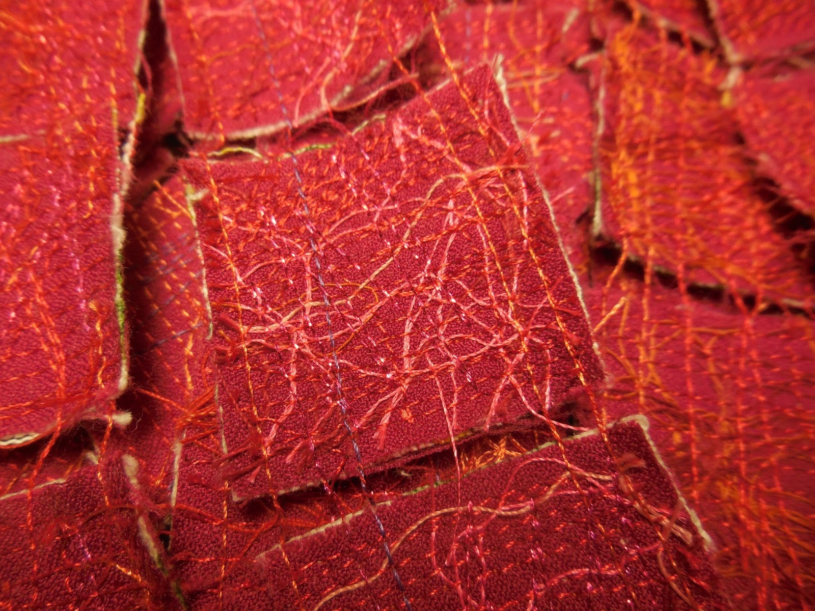
A postage quilt from Keith's postcards

So last week I was thrilled to get a big package from Portland with proof sheets, I guess you would call them, of the scarves in the collection.  They are printed onto heavy paper, which I have cut into three-inch squares in preparation for making my quilt.  The paper copies are gorgeous; I can't wait to see what they will look like in silk!

Working with paper has some important differences compared to working with fabric.  In some ways it's easier to cut and sew, because it's naturally stiff and doesn't fray.  But in other ways it's harder: you can't make mistakes, because needle holes can't be concealed, and you have to take extra care not to crease the paper.

And you can't just slap the bits up on the design wall for composition, since paper doesn't stick to the felt backdrop the way fabric does.  So I had to improvise, and came up with this system:


Start with a strip of adding machine tape, fold it up to make a little pocket, pin it to the design wall and add a thread to hold the paper squares upright.

I've got the quilt almost entirely laid out, and after a day of contemplating the design I'll be able to start sewing.  I think the construction will go exactly like it does in fabric, which means I won't have to be inventing any more new techniques.

Monday, February 8, 2016

Good news!


So the good news is that my quilt has been accepted into the Marie Webster show at the Indianapolis Museum of Art, June 24 to September 4, sponsored by SAQA.  The juror was Niloo Paydar, the museum's curator of textile arts and fashion design.

You may remember when I talked about this show earlier that Marie Webster was an Indiana designer who built a nice business selling patterns and kits for appliqued quilts in the early part of the last century.  Although that style and genre of quilts has never particularly appealed to me, I was challenged to find something in her work that I could translate into this century and explore on my own agenda of interesting concepts.

The quilt I chose as inspiration was this white-and-pale-blue number with a design of little kids looking at the moon and stars.

Marie Webster, Bedtime

I simplified the design to fit the much smaller size requirements of the show (my quilt is just 27 x 21") but pretty much replicated the two figures from the original.

I made this piece by heavily machine stitching the blue areas onto off-white canvas, leaving the unstitched fabric to bulge and ruffle. Then to make it fit the official SAQA definition of a quilt, which wants layers, I added a back and quilted that down with additional blue stitches.

Here's what mine looks like:

Zoe and Isaac Stargazing 


And here's my artist statement:

In Webster's time a proper quilt was neat, attractive, symmetrical, perfectly executed to show off the maker's needle skills. Not her design skills, because the quilter would purchase the pattern, or perhaps a kit, from somebody like Webster, and follow the directions.  In the intervening century, many quiltmakers have chosen to become their own designers.  Quilts have come off the bed and onto the wall as works of art, not just functional decor.  A proper quilt can have non-straight edges, non-right-angled corners, non-flat topography and raggedy edges.

So much has changed, but there's still room in contemporary quilting to depict the wonder of children contemplating the moon and stars.  My riff on Marie Webster's "Bedtime" changes all the techniques but keeps the images.


Friday, February 5, 2016

Second in a series


I wrote yesterday about a new piece that I made by heavily machine-stitching onto heavy fabric that I then folded and sewed into a pyramid.  Immediately I started on another one, working to improve the technique.

In #1 I noted that it was hard to get the heavily stitched fabric to stay in a crisp fold, so my plan was to build the folds into the fabric, so to speak.  Instead of cutting a single fabric base that would have to be folded into the pyramid, I cut the shape into four separate triangles and sewed them onto a lightweight fabric.  This way no matter how heavily I stitched over the fold lines, they would be much thinner than the rest of the form and presumably fold much more easily. This new technique also has the benefit of being "layers held together by stitching," which is good enough to get you into most quilt shows, whereas #1 wouldn't qualify.

I also noted that the cut edges in #1 were a little messy -- no matter how enthusiastically I stitched over the edge there were little eyelashes of cut threads sticking out.  So in #2 I folded the edges of the lighter weight fabric over the heavier, ravelly base fabric at the very beginning so that subsequent stitching would secure a totally ravel-free edge.

I liked the effect in #1 of laying down a contrast color and later covering it with lots of stitching in my main colors.  Rather than find scraps of contrast fabric, in #2 I simply chose a print fabric with several different colors.

At an early stage of the stitching, I searched through all my spools and bobbins and found those with just a little bit of thread left, then piled the threads onto my pyramid base and stitched them down.  It almost doesn't matter what colors you use at this stage; it's like underpainting, in which you will see only a slight hint of the color after the top layers of paint go on.

Here I've laid down all the contrast colors and am starting to overlay them with red, which is going to be the main hue of the finished pyramid.

Thursday, February 4, 2016

First in a series


Well, you need to know that for a long time I have been thinking about how to make fiber art in three dimensions.  And in the last year I have been experimenting with heavy machine stitching onto canvas.  So when I got an inspiration a couple of weeks ago I knew what I wanted to do.  The inspiration came from visiting one of my art pals who was taking his photographs and cutting and folding them into little pyramids.  Why not make stitched pyramids, I asked myself?

All the while I was finishing up a couple of quilting projects against deadlines I was thinking about how I was going to make my pyramids, and finally a couple of days ago I got to clear everything away from the sewing machine and get down to business.  And here's pyramid number one.


It's stitched onto a dark red cotton, beefier than quilt-weight.  I laid some scraps of greenish-gold hand dyed fabric onto the red to give a little color contrast, but they pretty much disappeared underneath the stitching.  You can't really tell the color of the base fabric except at the cut edges.


Haven't figured out whether this should be displayed sitting flat on a shelf, or on a skinny pedestal so the hanging threads can hang down, or maybe suspended from a cord.

As I was sewing the pyramid together, by hand, I found myself fixating on the process and realizing how I could do it better.  So after a brief break to make a new cup of tea, I immediately started in on pyramid number two.  I'll show you that tomorrow.


Monday, February 1, 2016

ART 101 -- success!!


I mentioned to you that I'm taking a drawing class this semester.  So far I've learned that I like line a lot more than I like shading, that I like pen a lot more than I like pencil, and that my skills of visual observation and memory need a lot of improvement.  So last week I was astounded to realize that I have actually learned something on that last count.

We were privileged to attend a little salon/soiree in honor of the violinist appearing with the Louisville Orchestra last weekend, Augustin Hadelich.  The high point of the evening was a performance, and though we were kind of crammed in to a small room with obstructed views, I did have a good line of sight to Hadelich's face.  He has a striking face, and his deep-set eyes were in shadow most of the time due to the overhead lighting.


I set myself a challenge -- could I pay close attention to that face and memorize the details so that I could draw him when I got home?  With that assignment in mind, I was able to focus on his features and force myself to articulate a description (I know I do better at analysis and memory when I translate visual impressions to words).  Then the next day I whipped out my little sketchbook and did this:


Now that I compare the sketch to the photo, I think the only thing I got wrong was the lower lip -- the vertical dimension is right, but it's a bit too wide horizontally.  If I had been working in pencil I could fix it, but since it's ink I'll let it stand.

You might think this is an insignificant accomplishment, but I am over the moon!  This is the first time in my life I have ever drawn a picture of an actual person that ended up looking like him.  Please join my celebration, even if you may think it's not much to write home about.