Showing posts with label museums. Show all posts

Thursday, April 28, 2022

Sanford Biggers at the Speed, part 3

I've written about the Sanford Biggers show in two previous posts.  Time for a wrap-up.

The piece I liked best in the show was a Tumbling Blocks quilt, with a minimum of paint, overlaid with a dramatic horizontal flame of orange-and-black chevron print.  A little bit of black paint made a curvy outline over the old blocks, a sort of half-silhouette of a key shape.

Sanford Biggers, Quilt 17 ( Sugar, Pork, Bourbon) 

My second favorite was a collage of old quilts, plus a section of curvy stripes made from sequins on a black painted background.

Sanford Biggers, Transition

I liked these quilts because they thoughtfully used large patterned shapes to contrast with and complement the smaller patterns of the vintage pieced quilts.  In both cases there was artistry in the composition and care in the construction.

Sadly, I did not see those features in most of the quilts in the exhibit.  The artspeak at the entrance to the gallery tells us "the quilts signal their original creator's intent as well as the new layers of meaning given to them through Biggers's artistic intervention."  I searched in vain for the new layers of meaning in most of the pieces in the show.

As I mentioned in my first post about this show, I walked in the door as a Biggers skeptic, based on a bit of past knowledge of his work, but would have liked to like this show.  Instead I was surprised at the strength of visceral discomfort that hit me in only the first two rooms of the gallery; all those beautiful antique quilts deliberately messed up with paint and tar to no apparent purpose.  Perhaps it wasn't the defacing per se that bothered me -- I've been known to repurpose old quilt bits myself -- but the slapdash quality of the defacing.  

I went to the museum with two friends, one an artist, one not.  When we compared notes all three of us just wanted to get out of there fast.  I wasn't there long enough to discover exactly what made me so unhappy, and for that I apologize.  

The show will be up through June 26.  I'd love to hear what other people think of it, whether I'm alone in my unease.


Saturday, April 16, 2022

Sanford Biggers at the Speed, part 2

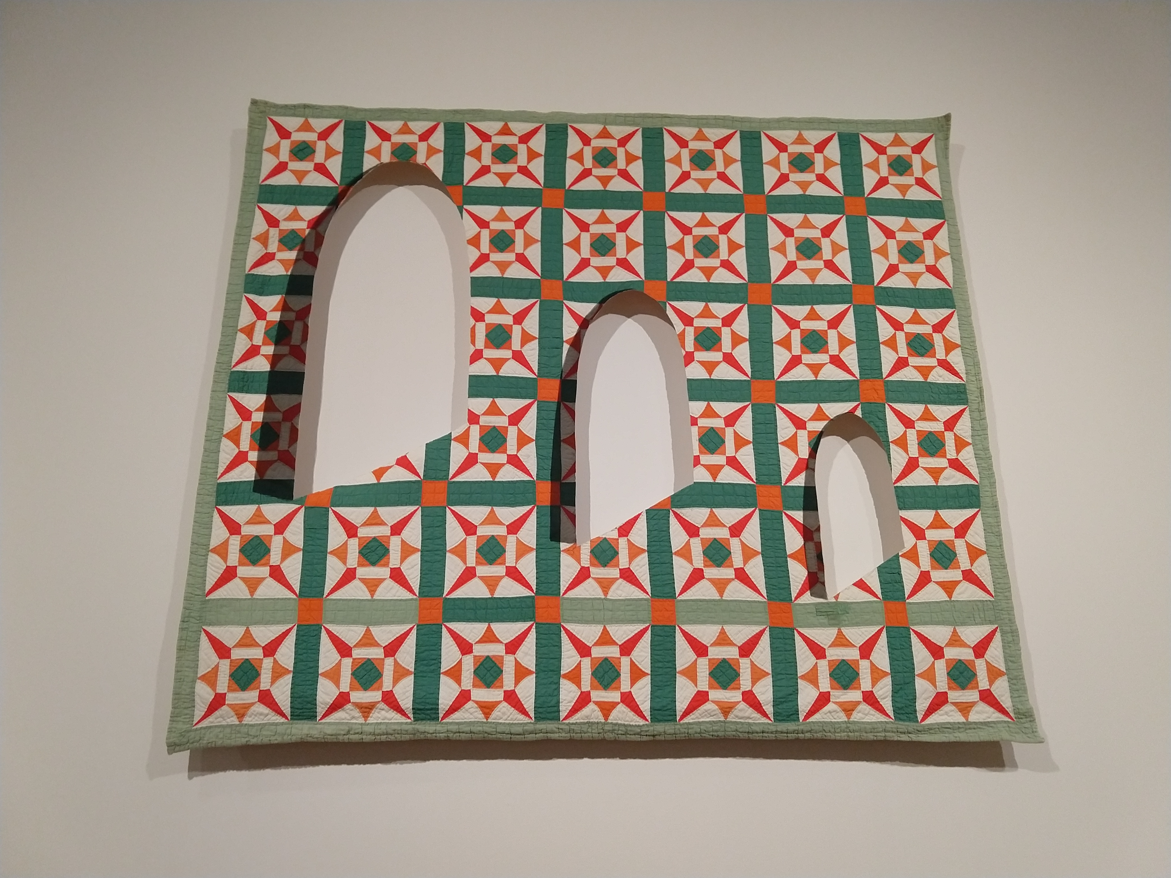
More comments about the Sanford Biggers show.  Not everything in the show featured messy paint applications.  One of the quilts, stretched on a wood armature, had dramatic holes, bordered with black organza to give a striking shadow illusion.


Sanford Biggers, Ecclesiastes 1 (KJV)
A similar see-through illusion appeared in an assemblage of six framed quilt sections, with some two-layer areas where the semiopaque frosted plexiglass was cut away to reveal a quilt about a quarter-inch behind.  

Sanford Biggers, Nyabinghi, detail below

Two of the quilts, both Tumbling Blocks, were overlaid with sequins and lame, glittering under the gallery lights.  No paint drips on these, just fabric collage.  

Sanford Biggers, Ooo Oui, detail


Sanford Biggers, Ooo Oui

Several pieces were made by stretching quilt sections into wood-framed constructions.  The first one we saw as we came through the exhibit was intriguing, made in part from American flag-motif quilts. 


Sanford Biggers, Reconstruction, detail below

But the next four or five, the same concept with slightly different construction shapes, all kind of looked alike, and the fact that they were hung too high on the wall to see most of the surfaces made them easy to walk past without stopping to look. 

Maybe I would have liked them better if all the "construction" pieces had been hung together for comparison, but they weren't.

I'll give you the wrap-up report in my next post.  


Tuesday, April 12, 2022

Sanford Biggers at the Speed, part 1

The current blockbuster show at the Speed Museum is by Sanford Biggers, an African American artist whose shtick is to paint on top of antique quilts.  I have been somewhat familiar with his work for several years; in 2017 one of his quilts was in another show at the Speed, and I wrote about it in a blog post.  

I found some things to like in that piece, but I had two big reservations.  First, Biggers made a big deal out of the false story that quilts were used as secret signposts along the Underground Railroad.  Second, it hurt to see a beautiful antique quilt in fine condition used as a canvas.  Surely he could have found a beat-up quilt to paint on!

So I approached the new show with some preconceptions, but resolved to keep an open mind.  I lingered over the artist statement at the entrance to the exhibit, interested to note that he has backed off from his fake-history Underground Railroad statements.  In 2017 the wall tag read "Some quilts were used as signposts for safe houses..."  Five years later, we read "he was intrigued by the heavily debated narrative that quilts in some way doubled as signposts..."  That's progress, I guess, and maybe in five more years he will acknowledge that this narrative is not heavily debated at all, just carelessly repeated by ignorant people.  

But enough nitpicking, let's look at the quilts.  I didn't keep a tally, but it seemed that most of them were in pretty good condition and were simply painted upon and hung on the wall without additional support.  Some were in poor condition, and augmented by patching in pieces from other quilts, or collaging swatches of unquilted fabric, including several kimono pieces, on top. 

Sanford Biggers, Hat & Beard, details


Sanford Biggers, Hat & Beard

Most of the quilts followed the same recipe: start with a quilt or quilt collage, paint loosely over the top, let the paint (or sometimes, tar) drip and blob.  Some of them had intricate and meticulous stenciled designs, but almost always some area of deliberate mess.

Sanford Biggers, Quilt 30 (Nimbus), detail below


I can't describe the whole show in just one blog post, and probably not even in just two.  So stay tuned and I'll have more pictures and thoughts soon.

Tuesday, September 1, 2020

Form, Not Function 5 -- something different


Every art/quilt show worth its salt has something a little different, something that doesn't follow the usual format of a flat-against-the-wall quilt.  This year's FNF, of course, chose one like this for its best in show; here are some more pieces that fell into this niche.


Shannon Conley, 33°20'N, 105°33'W, 64 x 34 x 6" (detail below)

It has been quilted and pierced, then scrunched and stiffened into a sconce-like form that opens toward the top.  The desert colors reflect the remote New Mexico location of its title (but I hope the actual terrain of the place isn't quite this wrinkled).

Katherine Gibson, Unwearable Cloak, 60 x 84" (detail below)

Gibson has neatly cut magazine pages into tabs, layered them and stitched everything to a fabric support.  I might have wished only for a bit more color to pep up the white expanse of the top half.  I hope the paper will hold up for this quilt to be shipped and seen at many more shows!


Wednesday, August 26, 2020

Form, Not Function 4 -- pictorial


This year's FNF had only a few pictorial quilts, two of which won awards.  One of those awards was the one given by my small quilt support group, River City Fiber Artists, which meant that I got to visit the museum early and choose. 

Longtime readers will recall that I generally dislike pictorial quilts as a genre, especially portraits.  I have long felt that fabric is not a good medium to depict photographically realistic images, but this year I had to admit that the quilt winning the RCFA award is perhaps the best portrait quilt I've ever seen.

Linda Anderson, Velvet Flowers, 31 x 51" (detail below)

For me, the challenge of portraiture in fabric is how to achieve the graded tones of facial features without the abrupt changes in switching from one fabric to another, the Photoshop-aided posterization process used by so many quilters to render photos into fabric.  I'm sorry I didn't do a better job of figuring out the process, but Anderson either painted or printed the faces, then quilted with a whole lot of threadwork, changing colors to enhance the realistic facial contours and skin tones.  Metallic thread made the image sparkle.

By contrast, look at this portrait:


Margaret Abramshe, Nan, 33 x 29" (detail below)


Here too the image is painted or printed, then quilted.  But here the quilting is all the same color, intended to highlight the contours rather than the gradations in skin tome, and is much sparser, giving a stylized look to the portrait.  The quilting line becomes an art element in itself.

Quite a different approach is seen in one of the honorable mention winners:


Kathy Nida, I can't Be Your Superwoman, 88 x 52" (details below)


Nida's work is instantaneously recognizable from across the room in any quilt show, with intricately rendered details in a sometimes-cartoony style.  A very different approach to figurative art in quilting.


Friday, August 21, 2020

Form, Not Function 3 -- because you asked...


I've had a few reader comments to the two posts I've made so far about Form, Not Function: Quilt Art at the Carnegie.  Wanted to respond to them before I go on with more discussion of the show.

About the Best in Show dress made entirely of yo-yos, Shasta wrote: "It reminds me that I have yo-yos I need to stitch together still." 

After I observed that I wished the jurors had not chosen three quilts with the same basic "recipe" -- big, improvisationally pieced, white, densely machine quilted -- Irene commented: "Maybe the jurors had nothing but that type of work to select from..."

Good point, but according to the Carnegie's web page, there were 265 quilts submitted by 110 artists, so I think they could have found something different if they had tried.  By the way, that web page has photos of every quilt in the show, not just the prizewinners, so you might find it interesting to spend a few minutes on a virtual visit.

Shannon commented:  "You could conceivably add Aryana Londir's piece to this list -- the color sense is different but the piecing approach looks somewhat similar.   After reading your post today I went back and looked at the show again to see if it felt too "heavy" in that particular approach.  After consideration, I'm not sure.  The overall show feels balances to me and there are several other additional (apparently) pieced pieces that don't have this style/approach.  I wonder to what extent this is a piecing style that is currently used by a large variety of artists?  I also wondered if it might be tied to the jurors.  I remember QN 19 when Nancy Crow was a juror the selected pieces felt enriched for those that had a Nancy-Crow-piecing style.  Not that that's necessarily bad, just perhaps an influence."

Shannon makes several points worth responding to.  First, Londir's quilt is definitely of the same character as the three I discussed in my last post: improvisationally pieced, machine quilted with parallel lines, the shapes predominantly right-angled.


Aryana Londir, What Day is Today?  41 x 24"

I like this quilt a lot -- how can you go wrong with the cheerful and dramatic German-flag color palette, plus just enough white to make it sparkle.  A nice balance of solids with commercial prints and what look to be discharged or dyed fabrics.

Shannon makes an excellent point about how the individual jurors and their own tastes can influence what's picked for a show.  Theoretically, having three jurors should make it more difficult for one to have a disproportionate say, but we all know that sometimes one voice is more equal than the others in the room.  I did not see the Quilt National show that Nancy Crow juried (it was QN 17, not 19) but I know that there were a lot of improvisationally pieced quilts in that show and many people suggested that Crow had mainly led the charge toward work in her own genre.  The fact that she, not the QN organizers, personally selected her two fellow jurors did nothing to dispel the faint aura of favoritism.

Longtime readers know that I am a huge fan and disciple of Nancy Crow.  I spent 16 weeks in her workshops over the years, taught at the Crow Barn, machine-quilted three pieces for her, and have credited her with turning me into a serious artist.  Probably because of her influence I love and teach improvisational piecing myself and I'm always happy to see that kind of quilt in a show.  But I confess that many times I find myself categorizing that kind of quilt as "look-mom-I-just-took-a-Nancy-Crow-workshop."

Longtime readers might recall that I was livid because QN 13 had only two quilts out of 85 that were pieced in the classic quilt format.  Now the pendulum has swung in the other direction, at least in this particular show.  This year's FNF isn't anywhere near as skewed in its selection as QN 13, and it's certainly a good show, with few if any duds and a bunch of solid, beautiful, well-made quilts.  I'll be talking more about several of them in the next few posts.  Meanwhile, thanks to Shannon, Irene and all my readers for your thoughtful comments.

PS -- Shannon has a very non-traditional quilt in the show, which I'll tell you more about.  Stay tuned!
Wednesday, August 19, 2020

Form, Not Function 2 -- improvisational piecing


There are only 19 pieces in this year's Form, Not Function show, so you can't help but notice when you seem to see the same one more than once.  Don't say to your friend, "Did you like that improvisationally pieced one, the really big one, with lots of white and all that machine quilting? It won a prize." -- because that only narrows it down to three.

Here's what won the second prize, in effect:

Susan Lapham, Playland #3, 85 x 82" (detail below)

It's densely machine quilted with horizontal lines barely an eighth-inch apart.  Yes, as the title suggests, there's a hint of playfulness but the subdued palette of off-colors gives a calm feeling despite the complex piecing, especially the tiny squares of black scattered on the large white areas. 

Honorable mention went to:

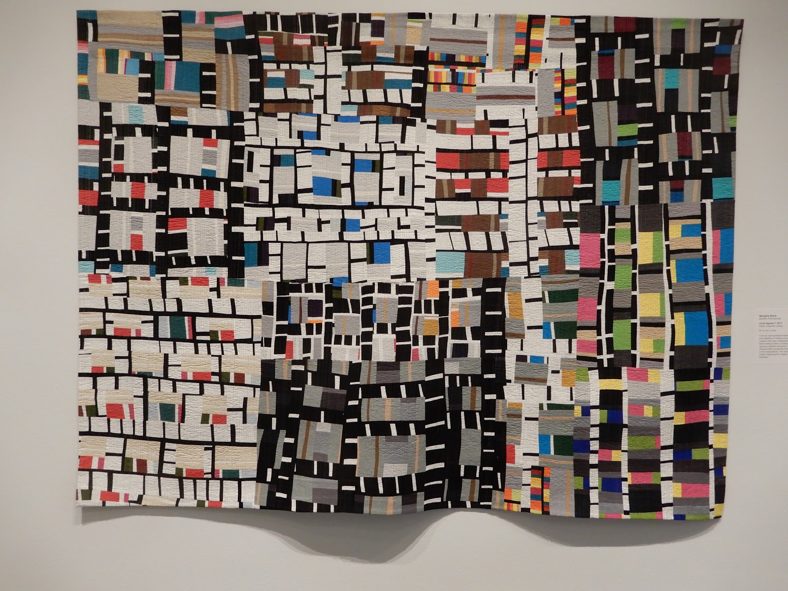
Margaret Black, Curb Appeal 7, 84 x 64" (detail below)

Black won a prize at last year's FNF for Curb Appeal 6, somewhat larger and more complicated than this year's entry.  (She also took best in show at Quilt National '17, before she embarked upon this series.) 

What's to say about this one -- it calls out to all of us who love to piece and cut and piece and cut and keep going forever.  Like Lapham's quilt, this one is densely machine quilted with parallel lines, except these go vertically.

And another honorable mention:


Susan Michael, All That You Dream, 75 x 64" (detail below)

It's the tiebreaker in the machine-quilting department, making two out of three with vertical lines.  The bold black-and-white palette gives a more assertive character and graphic quality than was seen in the other two quilts, with overtones of African prints and sparing accents of red and yellow.  Unlike the other two quilts discussed today, this one mixes fabrics, with canvas, ticking and some little shiny fabrics side-by-side with quilting-weight cottons. 

As one who does improvisational piecing with mostly right angles and dense machine quilting with parallel lines, I find it difficult to say anything bad about these quilts!  I'd be happy to have made any one of them.

All three of these quilts, especially the first two, suffered a bit from being displayed on white walls.  It was hard to tell where the quilt stopped and the wall started.  A gray or beige wall would have made them sparkle and sing.

More important, when one-sixth of the whole show consists of basically the same recipe, I have to wonder whether it might have been more interesting for viewers if the jurors had found a little more variety in approach and appearance.

Saturday, August 15, 2020

Form, Not Function -- Best in Show


Form, Not Function: Quilt Art at the Carnegie is a show that has been at the Carnegie Center for Art and History in New Albany IN since 2004.  It has bounced around the calendar several times for various reasons, including bad weather (it used to be in the winter) and coordination with Quilt National (so people could catch both shows on a single road trip) and this year, coronavirus.  But it opened today, despite everything, and the museum is ready for masked visitors every day except Sunday.  The show will be up through October 31, a longer run than usual, so maybe you'll be able to see it in person.

Best in Show went to Marty Ornish for her 3-D installation "She gazed at the carousel through rose-colored glasses."


Yes, it's made of yo-yos, a slinky one-sleeve halter-top dress cascading into a train that extends up the wall.


Ornish's artist statement says she works in "salvaged textiles and found items" and the yo-yos all appear to be made from Depression-era prints.  I wish I knew more about the provenance -- did she find the yo-yos in somebody else's discarded stash, or make them herself?  Are the fabrics authentic Depression-era or reproductions?  In any case, the result is stunning, and the subdued pastel palette is calm and soothing from afar and endlessly interesting up close.


As I drove home from the museum it occurred to me to wonder whether this technically qualifies as a quilt under the FNF definition: layers held together by stitching.  I guess technically it does, because yo-yos have a front layer and a back layer, and though the layers aren't exactly stitched "together" (the back of a yo-yo is entirely free of thread), you can argue that each yo-yo is "held together" with its buddies via stitching.  (I have served as a juror in FNF several times, and it's this kind of nit-picking that you fall into ex officio.)  Anyhow, the yo-yo quilt is a time-honored niche, so I would give it a pass even though it's not the standard "quilt" format.

And I'm so glad this year's jurors did, because this is a wonderful tour de force and so much fun to look at.  When I was at the museum on Wednesday to choose the prizewinner for the River City Fiber Artists award, we agreed that this piece should be a no-brainer for the Viewer's Choice.  I still think so!


Friday, March 20, 2020

"Fiber art" at the Indianapolis Museum 2


More work from the Indianapolis Museum of Art.  For discussion: Is it fiber art?

Michelle Grabner, Granny Square Afghan, detail below

No, it's not an afghan, it's a painting, in shiny enamel.  Shall we call this "fiber art" or "art about fiber"?

Fred Sandback, Untitled, detail below


It's four lengths of bright warm red acrylic yarn stretched between the corner of the room and a spot on the floor.  The wall sign says it "intersects the space it occupies, creating a geometric form that deftly defines pictorial planes and architectural volumes."  It also says that the placement in front of a window was deliberate, although I thought the red line was hard to see against the outdoors, and would have liked it better against plain walls.  Is this fiber art, or not?  Although it's 99% fiber, I say not.

Alyson Shotz, Wave Equation, detail below


A whole lot of piano wire, strung tight with silver glass beads between circular hoops.  I could almost get my camera to focus on the longest bugle beads, but there were also beads in different sizes.  A really ethereal installation, mysterious in how she got the wires to defy gravity and swoop upward to the bottom hoops.

Is it fiber art?  There are several beaders in my local fiber and textile art group, and beading falls in our definition of fiber art, but I don't feel entirely comfortable calling this beautiful piece "fiber art."  I can't tell you exactly why not.

Finally, here's one of my top three living artists; I was delighted to find not one but two of his works on display.  But only one of the three about which you can ask, is it fiber art?

El Anatsui, Duvor (communal cloth), details below

Understand that this piece is 13 feet tall, 17 feet wide -- that's a lot of metal liquor bottle caps and labels wired together.  Everyone who sees it, visitors and critics alike, uses fabric metaphors to describe how Anatsui's works drape and billow; even the title of this piece references cloth.

But it's metal.

So is this fiber art?  I want to say yes, because I want to be as much like this guy as I possibly can, and if I say he makes fiber art, and I make fiber art, then we're practically siblings, right?

What do you think, about Anatsui or any of the others in these posts?

Monday, March 16, 2020

"Fiber art" at the Indianapolis Museum 1


We visited the Indianapolis Museum of Art a couple of weeks ago to see the Yayoi Kusama infinity room, which took a stopwatch-timed 45 seconds, and then went on to the contemporary art collection for a more leisurely visit.  When I go to museums I always look for how mainstream artists incorporate fiber into their work.  Sometimes there's even enough that I would call it "fiber art."  Here's some of what I found on this trip.

Orly Genger, Len

It's two big rectangular piles of "looped and knotted" nylon rope, with "acrylic latex," whatever that is, apparently coating the rope.  Sorry, my camera refused to focus on the shiny surface, so no detail shots.  The wall sign says the sculpture "evokes the intimate processes of knitting and crocheting, but expanded to an epic scale."

Of course that made me crabby, because why does looping and knotting "evoke" knitting and crocheting, they're disrespecting us again, anything with yarn-like stuff makes them think of grandma.  But then I thought, well what is knitting and crocheting if not looping?  So maybe I'm not crabby.  What do you think? 

Either way, I say this is fiber art.

Nick Cave, Soundsuit, details below


Cave has made hundreds of these works, sometimes with a mannequin inside for display like this one, sometimes wearable for performances.  They're called soundsuits because when worn, they rustle and clink and clank and that sort of thing.  The headdress of this suit is full of random found objects, but the body is mostly crocheted doilies, with knitting underneath and a nifty hooked codpiece.  My internet research seems to say that Cave doesn't do his own handwork, but uses found doilies and fabric (although obviously somebody has to put it all together; wonder who?).  Definitely fiber art.

Antoni Tàpies, Dìptic amb collage, details below


Here the fiber is a hunk of an old basket, partly unwoven and affixed to a support described as wood but looking to me like plaster or ceramic.  I like the simplicity of the composition and the contrast between the dark and light halves of the diptych; I like the finger-in-the-sand glyph.  But I say this is not "fiber art," this is "art with a little bit of fiber."

More in the next post....