

Thursday, April 30, 2015
Tuesday, April 28, 2015
The Mending Project 1
Perhaps you have come across examples of a new variety of art, call it performance art, participatory installations or relational aesthetics, in which the artist has various social interactions with the public that constitute the "art." One of the long-time practitioners in this genre is Lee Mingwei, born in Taiwan, educated in the US and about to move from New York to Paris.
In one project, Lee cooked and ate dinner every night in the museum with a visitor. In another, he and a visitor spent the night in the museum, having a long conversation before sleeping, and the visitor left objects on the night table for the next night's visitor.
He also did installations in which he was not on premises, such as where different museum staffers would bring their own treasure collections to show and discuss with visitors; where visitors were invited to write letters to dead or absent loved ones; or where visitors could take a flower from the museum to give to a stranger encountered afterwards on the street.
Falling into the latter category is "The Mending Project," in which visitors are invited to bring a garment that needs repair, and an artist will mend it. When Lee first performed this project, he was the mender/artist, but in a show that opened last week in my local museum, the Kentucky Museum of Art + Craft in Louisville, he will be absent and a bunch of volunteers will serve as the artists.

Since I've always thought of mending as an art form, and one which I love to do, I had to sign up for the project. But going in, I confess to some ambivalence about various aspects of the operation.
First, what are the ethics of being asked to put on a show with one's name on it and then having the entire project executed by unpaid volunteers? (I'm still chewing over the same question in regards to my other big volunteer commitment, the International Honor Quilt organized by Judy Chicago.)
Second, is it bait-and-switch to offer to mend somebody's garment and not actually do so in a functional manner? We're hand-stitching with shiny polyester embroidery thread, which may hold up just fine for a little hole on the collar but isn't going to accomplish much if you ripped the seam on the seat of your pants.
I decided to attend the volunteer training program -- the only opportunity to actually meet Lee in person -- and sign up for a couple of shifts as an artist/mender, and see how I felt about it. I'll report on how it's going in subsequent posts.
Monday, April 27, 2015
A lot of knots -- update
I wrote a few months ago about a new technique that I came up with during a boring business meeting and how I fell in love with it. Time for an update, because I have become really excited about it and have made a bunch of little sculptures. Basically it's just tying overhand knots, one after the next, letting them pile up on one another and start to form remarkably solid bunches. Because the thread is so light and the knots are so firm, it's possible to make vertical "branches" that stand up straight or extend out horizontally.
At first my pieces were quite small and I mounted them in frames.


It's surprising how long it can take to make a little sculpture only a few inches tall, but I go into a Zen state and barely notice the time passing. I'm a happy artist.
Sunday, April 26, 2015
Photo suite 174 -- train trip
One of the things I love about Europe is train trips -- this one from Germany to Czech Republic and back.


Friday, April 24, 2015
International Threads challenges 4
I mentioned in my last post that one of our challenges for International Threads was "lines." Having worked with lines in dozens and dozens of different ways in the last eight years, I decided the only area I hadn't yet properly explored was curved lines. I had tried to piece very fine curved lines a couple of years ago with limited success, but on the small scale of our challenge pieces I thought I could do a good job.

Sargasso, 2015
I liked the result, and had fun putting the scales on the fish with free-motion quilting, but not sure that I am enthralled enough to go do more curves. Before I do, I'd need to have an idea -- for instance, if the curves represented waves I might consider a series commemorating my love of ocean travel. But it would need more meaning than that. Just "ocean" or "fish" doesn't have enough intellectual weight to carry the commitment of a series.
Thursday, April 23, 2015

Wednesday, April 22, 2015
International Threads challenges 3
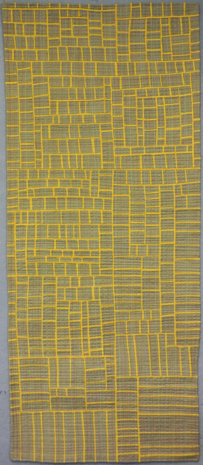
Our fourth and fifth prompts in the International Threads group were "pattern and repetition" and "lines." Neither of them seemed very exotic or challenging to me, as I have been working for years with pattern, repetition and lines. Also I was getting behind schedule on our challenges and the deadline was approaching.
When I was teaching at the Crow Barn in October I made a bunch of strip sets to illustrate my production methods, and to have something to stitch on while my students were working. As the clock ticked, it seemed like a good idea to sew them up into a quilt top. But I had resolved to learn something with each new piece, and I noticed that if you made some strip sets but didn't then slice them into relatively narrow strips, you would get a different, more open effect. (Note this especially in the lower right-hand corner.)

You might also note how the quilt has outgrown its bounds, indicated by the pinned-up selvages on the design wall. You might not think that without noticing it you could get eight inches too big when you're working on a marked grid, but you would be wrong. I eventually cut off some of the extra so as not to be too out-of-sync with the other pieces in the show, but I wasn't happy doing it; this composition seemed to be pretty good.
I have always been intrigued by the juxtaposition of densely fractured areas with sparser areas, as in the older quilt shown below. The little piece for International Threads was an opportunity to try it out in another style of piecing.

So here's the new piece:
Monday, April 20, 2015
International Threads challenges 2
The third prompt for the International Threads group was to juxtapose areas of large scale with areas of small scale. I was the one who came up with this prompt, and ironically it's probably the quilt I like the least of the entire series.
A bit of back story: a few years ago I made a quilt based on a Photoshopped picture made by my art pal Keith Auerbach (read about that here). It wasn't my best work; the composition was crude, there were technical problems with the quilting and I was unhappy with how much the black and blue fabrics frayed and the loose threads were visible through the adjoining white stripes.

I didn't think the quilt was worth finishing, but I loved the way the stripes worked together, especially the places where the regular pattern was interrupted and distorted. Ever since I have been meaning to make another quilt to explore what can happen with stripes.
Here's what I came up with. I used some of the leftovers from the previous piece for the large-scale stripes, but I cut the small-scale stripes out of a commercial striped fabric (boy, did that solve the show-through problem on that part of the quilt!).

I like the high contrast of the black and blue against the white and would like to use that again. And I like the interruption patterns. But I'm not sure I'll make another piece to turn this into a series.
Sunday, April 19, 2015
Photo suite 173 -- at Churchill's grave
During our recent trip to Europe we visited Winston Churchill's grave -- not in Westminster Abbey or any other majestic venue, but in the tiny churchyard at Bladon. The contrast between the greatness of the man and the calm and modest venue was profound and moving.


PS My late father was a huge fan of Churchill, since the two of them collaborated in winning World War 2. Today I celebrate not only winning World War 2 but my parents' wedding anniversary, from 1941. Here's to Dad and Mom, and all the other dads and moms who helped Churchill win the war.
Saturday, April 18, 2015
International Threads challenges 1
Earlier this year I wrote about my participation in International Threads, a group of eight artists in four countries. We had our first public show last week at the Prague Patchwork Meeting, and I'm just off the plane coming home from that visit and other stuff in Europe.
When we formed the group two years ago there was some discussion about what kind of work we wanted to do. I said I wanted the themes or prompts to be sufficiently open that I could use these small pieces (16 x 32") as a way to work with ideas already on my to-do list. For instance, I didn't want to have to make a Baltimore album type quilt, riff on the theme of Hello Kitty, or to make a faithful rendering of a photograph, because those approaches would never be on my artistic radar screen.
I am pleased to report that the format worked out exactly as I had hoped. I never "had to" make a piece that didn't advance my own personal agenda, and in fact some of them turned out to be important steps toward new approaches in my "real" work. Let me show you all seven pieces, over the next several posts, and tell you what I learned with each one.
The first prompt was "red," and I decided to use it to see if I could successfully use print fabrics in my fine line piecing. I'd previously worked with commercial stripes and a few small-scale geometric prints, but never with bold patterns like the big polka dots in this quilt.

I love this quilt, even though I don't think it was totally successful. The large prints like the polka dots seemed to work better than the allover prints that read as solids. But I liked the way the different prints each had their own bit of real estate and how their territories got all zigzaggy around the edges.
The second prompt was to use all gradations of gray and just a tiny bit of color. I'd been working with commercial stripes on a couple of huge quilts and accumulated quite a stash of neutrals. And I had been mulling over next steps in my fine line piecing -- I'd explored a lot of variations on the theme and was wondering whether I could do something dramatically different. I decided to eliminate the middleman and let the fine lines pile up on themselves without any intervening backgrounds.

I love this quilt even more than Red Fizz, so much that the minute I finished it I decided to make it again three times as large. The result was Linear B, 42 x 73", the same composition but big enough to have a real impact. I'd like to make it again, big, in a more colorful palette and play with the precarious balance of the pile.

I'll show you more of the International Threads quilts in subsequent posts -- stay tuned!
Wednesday, April 15, 2015
The typographic observer 11

(This is a restaurant where the menu lists "sammiches" so what's a serif between friends?)
Sunday, April 12, 2015
Photo suite 172 -- sidewalk stains
Last year I exchanged photos of "found art" every week with my art pal Uta Lenk (click here to check them all out). Apparently I spend a lot of time walking with my eyes on my feet, because I found lots of "art" on the sidewalk.


Friday, April 10, 2015
Sign of the week
My camera didn't want to focus on this label -- that's OK, I don't particularly want to think about it either.

Thursday, April 9, 2015
What I learned from my failed series
After I had abandoned several series over the course of a couple of years, I decided I was coming at it the wrong way. Instead of looking for a striking visual image, which might very well fail to have meaning, I would start with the meaning and search for a way to portray it.
That method had served me well in guiding my long series of quilts about the World Trade Center and the war in Iraq. So I tried again. I decided that one of the major ideas that kept recurring as I contemplated the world was the sense of losing control. Our environment was becoming more polluted, our infrastructure was going to pieces, our political system was becoming dysfunctional, the weather was becoming more erratic. I used the word "disintegration" as a heading for all these concerns.

I don't suppose this method would work for everybody. I have always recognized that my visual art starts with words rather than images; my "sketchbook" consists of a verbal description of what I want to accomplish. I rarely know what a piece is going to look like until I actually make it.
But it has worked for me: start with the meaning, find the visual. If you operate the other way around, start with the visual and find the meaning. In fact, I have used this thought process to talk with artist friends who feel stalled in a series. I ask them, What is this series about? Why is that important to you? What aspect of this quilt signifies the meaning (is it the color, the line, the composition, the character of the surface design)? Is the meaning coming across the way you intend it? Then circle back to the visual: If you did different things with the composition (or color or whatever) would that change or enhance the meaning?
Your mileage may vary, but if you're looking for a new series this approach may be worth a thought.
Tuesday, April 7, 2015
More failed series
I've been writing about failed series -- those that for various reasons didn't have enough momentum to launch past the third or fourth piece. In addition to those I've showed you recently, I have written in the past about my River Maps, my Landscapes, and my Planets.
In reviewing these chapters of my past, I've tried to come up with some unifying thoughts about how to tell whether a series is going to work or not, and when and why to abandon one that doesn't seem to made the grade.
First, I realize that a series has to work in two different ways: it has to have visual appeal (because who wants to spend lots of time making work that doesn't look good) and it has to have meaning. Meaning is more difficult to define and identify; it's more than just a slogan or a "message." It has to be a message, or a subject, that is special to you, that will satisfy you for a long time as you explore it.

My Landscape series failed because I could never quite figure out what it was about. I liked the visual concept, although I was going to have to pay more attention to the composition if I continued the series. But it had no meaning beyond the technical "five columns of stripes" description.
My Revelations series failed because its "meaning" wasn't deep enough to engage me; it had no personal relevance.
For me, failed series have most frequently come from lack of meaning. For others, perhaps the visual execution is the stumbling block. If you have a series that has stalled, try to figure out why -- is it meaning, or visual appeal, or perhaps a bit of both?
But don't be too quick to abandon a series. If it was interesting enough to make you think you might want to work on it for a while, it probably deserves a fair shot. I gave each of these series at least three tries; I explored a couple of different aspects, attacked some of the technical difficulties, thought about it a lot. When I finally gave up, I knew why I was giving up, and I knew I had done my best.
Or should I say I thought I had done my best??? Some comments left last week suggested that perhaps I should revisit some of the series I had abandoned. All I can say is that I will think about it. Thanks to you all for reading!
Sunday, April 5, 2015
Photo suite 171 -- Siena Duomo underfoot
The fabulous cathedral in Siena is famous for the elaborate tiling of its pillars and floors. With a nod to my friend Margaret Cooter, who last year did a big project documenting people walking in the Victoria & Albert Museum in London, here are people walking in the Duomo. Happy Easter!


Thursday, April 2, 2015
Failed series 2 -- layouts
Writing about series that were canceled early -- ideas that got the old college try but for some reason failed to jell. This series started in my first workshop with Nancy Crow, in 2003. We were strip-piecing, and this assignment was to make six strip-pieced panels, then cut and rearrange them into a composition. I loved the finished top; it used some of my all-time favorite colors (that lavender has appeared in many, many pieces) and I thought the composition was successful.

I never quilted it, although I can't remember why; I think I got sidetracked into finishing my alphabet series for exhibit. But after that show, I returned to the series and made two more pieces.
My thought here was to make several strip-pieced panels, then as I cut and rearranged them I made two compositions instead of one. They were twins, of course, with the same fabrics and strip patterns, but had different characters. They were the same size and intended to be displayed side-by-side, but as it turned out, one was accepted into a traveling exhibit and went away for a while. Meanwhile, the other one was shown a few places and even won the top award at an all-mediums show in a museum.

Layout 2 and 3: Two-Page Spread, 2004
By this time I had attached a meaning to the series: newspaper layout. I trained as a journalist and worked on a newspaper early in my career. My father was a newspaper typographer and I grew up with thoughts of different layout patterns.
The artist statement I wrote for this series read: "These quilts are about newspapers. From day to day the same stories keep reappearing – politics, war, weather, sports, scandal. Today’s newspaper is different from yesterday’s in its details, but not in its recurring themes."
I spent some time with one of the books my father wrote about newspaper design, writing down several ideas that could constitute more quilts in the series. For instance, "reverse pyramid" is a diagonal composition, describing how ads are placed at the bottom of the page, sloping up toward the top. But somehow the list of titles and diagrams never got translated into fabric. I got sidetracked into other series and priorities.
At first I thought I would be called back to the series after my father died, which happened in 2007. But I wasn't. In retrospect, I realize that the strip-piecing, a technique that I love and have taught in many workshops, is too closely associated with Nancy Crow, my friend and mentor. While Nancy has been a huge influence on me, her gravitational pull is so strong that I have struggled to develop my own voice instead of succumbing to the easy temptation of working with strip-pieced panels. I'm not sure I yet have the self-confidence to venture back into strip-pieced territory.
Bottom line: visually striking, emotionally and intellectually powerful, but too derivative to handle???
Subscribe to:
Posts (Atom)


