Saturday, December 6, 2014

Disrespected again


It's been a while since I encountered one of those totally off-the-wall, in-your-face rude remarks from an ignorant jerk who thinks handicrafts are the epitome of irrelevance, so it was probably a good thing to get my periodic bucket of water dumped on me.

This one came from an unexpected corner, an article in our local magazine about philanthropy.  It was one of those too-clever "flow chart" features that purports to help you decide which local charity you should contribute to.  It starts out by asking "Do you like people?" and if you say yes, you get three choices:  helping kids, helping whole families, helping overseas.  With each choice, the arrow directs you to a box with several charities.

The flow chart continues; if you don't like kids, how about animals? (Humane Society)  If not, how about trees?  (arboretum)  How about the arts?  (orchestra, opera, ballet, etc. etc. etc.)  Not nearly enough to fill a two-page spread, so we have lots of smart-ass sophomoric "repartee" to take up some space.

Finally we have made our way through every local charity they could think of, and getting back toward the starting point.  "Does injustice piss you off?"  If you answer "Fuming just thinking about it." it points you to the ACLU.  But if you answer "Nope." the next box reads, "Fine.  Here's what you're gonna do.  You're gonna donate to the local chapter of the Embroiders' Guild of America."  And to add insult to insult, they misspelled it!  (It's really Embroiderers', of course.)

Yuk, yuk, LOL!  Isn't that a thigh-slapper?  Isn't that the most bizarre and stupid thing you could possibly think of for a final put-down?

We are not amused.


Thursday, December 4, 2014

Packaging extravaganza


Getting ready to mail off some photos and I decided that it wasn't special enough to just send them off in the envelope from the photo store.  So I decided to make a little case from heavy watercolor paper.

First I decorated the paper with a wash of walnut ink and then writing in red and gray inks.  On the reverse, a dark wash of gray ink, just on the portions that are going to be visible when the case is opened.

Then I laid out the pattern for the case, which needed to be a bit larger than 4 x 6 inches, to give a little room to easily put the photos in and out.  Here's the plan:  The back and front segments are the size you need for your case -- for mine, about 4 1/8" x 6 1/8".  The top flap is the same width but doesn't need to be as tall as the whole case; I cut mine about a half inch shorter.  The turn-in flap needs to be about two inches tall.  The side flaps need to be about two inches wide.


The four segments in red have to be the depth you need for your case.  I cut mine 1/4" wide because I had a relatively skinny stack of photos to put in the case.  Before I cut the pattern out, I scored the paper where the folds were going to fall, using the blunt edge of a knife, working on the back of the paper.  I didn't crease the folds flat or burnish with a bone folder, just turned them about 90 degrees up and gently finger-pressed the folds so they would stand at right angles.

Fold the turn-in flap segment and crease that fold so it sits flush with the "front" segment.  Now turn the "front" segment up, nudging the folds on either side of the red segment into position so it's sitting in space above the "back" segment. Do the same with the two side flaps.

Now comes the hard part.  You need to insert the side flaps into the space between the "front" and the turn-in flap.  When I have made this kind of case in the past it was fatter, and the side flaps slipped into place with just a little urging.  But since this case was only a quarter-inch tall, there wasn't much give in the paper for the flaps to sneak in.  I ended up not only cutting a good inch off the side flaps -- they started out 3 inches wide -- but also cut triangles off the edges of the side flaps for more wiggle room.

But after a good ten minutes of cussing, fussing, trimming and trying again, the flaps slid into place and the case looked beautiful.  

Do try this at home, with a couple of warnings.  First, make sure you choose paper with enough heft to make a rigid, sturdy case.  If you use lighter-weight stock your case will be more vulnerable to unwanted creasing and limpness.  Second, make sure you have measured accurately so the case doesn't fit too tightly around its contents.  When I learned to do this at a workshop, we actually didn't measure our pattern; instead, we just placed our contents in a pile on top of the paper and made each crease around the edge of the pile, eyeballing the ease that needed to be added in.

You still have three weeks till Christmas, time to make a whole bunch of these little cases to dress up your gifts
 

Wednesday, December 3, 2014

Tuesday, December 2, 2014

Collage -- fun with abstraction


I wrote several weeks ago about my new rules for collage in the fourth quarter and how I hoped they would give me a shot of energy to get me through the year of my daily art.  I had felt in late summer that I was getting bored with my collages, so starting October 1 I decided to include every day something I had drawn, written, printed or painted.

And what surprised me was that when the handmade art came in, most of the appropriated images that have made up the major part of my collages seemed to go out.  Somehow the two kinds of marks didn't want to play with one another.  So for the first time in my almost-two-years of daily collage, I find myself making abstract compositions almost every day.

What a change!  Among other things, I have found that the huge piles of pictures torn from magazines and obscuring my desktop while awaiting use are not getting much mileage.  Perhaps I'll just have a ceremonial burning!  Instead I'm looking through magazines and newspapers to find expanses of solid colors or vague, out-of-focus patterns that read as solids.

For the first time since I started my daily collage, 23 months ago, my design and composition process feels the same as when I work on a quilt.  I'm manipulating shapes rather than images, and it feels a lot more familiar and comfortable.  Much as my foray into narrative representation has taught me a lot and given me a lot of fun, it hasn't been ME.  The abstraction is.

This self-scrutiny comes at a good time, just when I have decisions ahead about my daily art for next year.  Not sure exactly how I'm going to phrase the rules for 2015 but what I'm learning about myself will certainly influence the choice.

Meanwhile, here are some of my favorite collages under the new rules.

Check out all my daily collages here, if you're interested.


Sunday, November 30, 2014

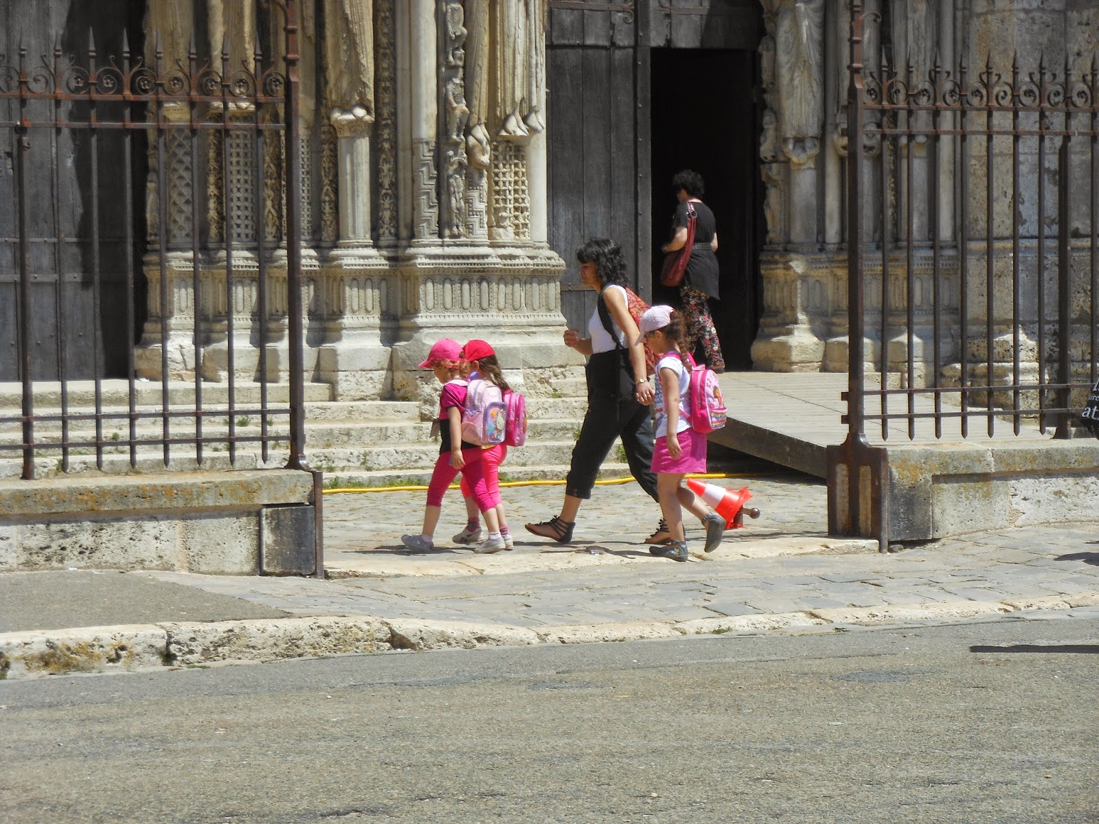
Photo suite 153 -- kids in transit


Rome

Chartres

London

Quirigua, Guatemala

Antarctica


Louisville

Wednesday, November 26, 2014

Bad ideas in baby fashion


Found these yarns in the clearance bin last week and wondered who had the brilliant idea to dress babies in camo -- particularly pink camo. Although maybe a pink camo sweater would complement the pink gun that you'll no doubt want to get her for her third or fourth birthday.

Besides, the color combinations are ugly, if you want my professional opinion.

For feminine weaponware, perhaps you would prefer this camo colorway, which has its own trademarked name: Muddy Girl Camouflage.