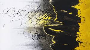
Two weeks from tomorrow will be my last daily calligraphy. After three years on this streak, it's time to stop. I have accomplished a lot with this practice, although not what I intended to do when I started. At that time I had just seen and fallen in love with the work of an Iranian artist, Golnaz Fathi, who used calligraphy, or maybe I should say marks that resembled calligraphy -- especially this painting:
 |
| Golnaz Fathi |
I thought that in a year of writing I could figure out how to achieve a similar effect, that it was just a case of finding the right ink/paint and the right brush/pen and developing a personal style of making letters. Turns out that in three years I have not yet achieved that goal, although I think I have come close a few times.
I have learned many things in those three years. First, that I am much more comfortable using a pen than using a brush. I keep buying new pen nibs to add to my already huge collection, jump-started with a whole lot of pens inherited from my father. But while he went for bold pens with wide or ball-shaped tips, I have been going smaller and smaller, in search of pens that are very flexible, going from narrow to wide in a single stroke as you add pressure. I love the old-fashioned look that you get from plain old script written with a small pen.
Second, that it's harder than you think to do asemic writing, the fancy-pants term for writing that doesn't have any meaning. To do this well you need a repertoire of symbols that look like actual letters but aren't. In three years I did a pretty good job of developing my own personal asemic script, which is also nicely suited to the thick-and-thin flexible pen.
Third, despite the literal meaning of "calligraphy" -- beautiful writing -- I have become quite enamored of crude, non-beautiful writing. It helps to have a pen or other writing tool that will produce irregular lines, maybe also some spatters, and that's not always easy. My favorite beer-can pen got old and died last year, and a couple of new ones haven't given the same effect.
Finally, the closest I have been able to come to the pictorial quality of Fathi's work has been by writing wet-into-wet. This technique will serve me well for next year's daily art: painting. I'll tell you more in later posts.


I just love this post. I have to admire your dedication to following and working on a coherent plan. I used to do calligraphy in school, on real vellum that we had to scrape all the fat off with open razor blades (health and safety would not approve, I do not remember any accidents with the half dozen or so of us who chose calligraphy for our A levels. I wish I had kept it up, children have lovely italic script but sadly not me. Look forward to your future plans/ideas. Irene in N Ireland
ReplyDeleteWhen I do catch-up on the Reading List under my blog I am always fascinated by what you have written, and your dedication to daily practices is inspiring.
ReplyDelete