
I am of two minds when it comes to asking other people for advice, especially in large groups (whether in person or virtual). There are people whose advice you respect, and there are those who just volunteer useless praise or counterproductive suggestions. It's easy to ignore those in the second group, but what happens when those in the first group don't agree?
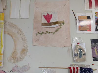
Last week I found a piece of embroidered silk that seemed to want to join the party, so I stitched it to the bottom corner of the linen. The original embroidered stems and leaves had begun to disintegrate, so it took a fair amount of stitching with almost-matching thread to secure the fabric and restore the design.


I also found a butterfly, cut from a vintage kimono scrap, but wasn't sure where or if it should go in the composition, so I just pinned it on. I posted it on instagram as work in progress. Two people whose opinions I respect suggested that it was finished (I think they meant without the butterfly).
Then I showed it to somebody else whose opinion I respect, and she was not happy. She said, and I see her point, that the two halves of the composition don't really play well together. The top half is big and bold, the bottom half is small, pale and delicate. She thought each half would be better off on its own.
Hmmm. I thought about it for a while and realized that it wouldn't be too hard to cut the piece in two, since the quilted tulip hasn't been sewed down yet. I mentally tried out different ways to do this, but none of them seemed great.
Then I thought that maybe the trouble was the right hand tulip, which took on too much weight because of its dark value. What if it were paler, to restore the focus to the original quilt tulip? And I realized that the easiest way to consider the alternatives was via photoshop.
So here are four possibilities. I put them out to you to share my thought process, not to put it up for a vote (I will happily read your comments but unfortunately the buck stops here and I'll be stuck with the final decision).
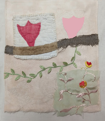 |
| Pale tulip |
 |
| Pale tulip + butterfly |
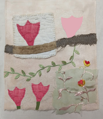 |
| Pale tulip, two new flowers |
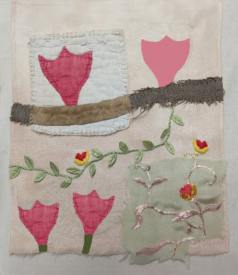 |
| Pale tulip, three new flowers |
I usually audition design decisions in person, pinning and repinning on the design wall; the advantage is that a possibility can stay on display for a long time and your opinion can change over time. But doing it on photoshop certainly is quicker, and allows a side-by-side comparison with all the versions, or at least as many as you can tile onto your computer screen.

Now I have a lot more to think about. And I guess I should really photoshop some possibilities from cutting the piece in two...


You don’t know me from a hole in the ground, but I’ve followed you for years, long enough to imagine I know you. So, here’s my suggestion. Think about DIFFERENCES. The tulips are all the same size, the two embroidered flowers are the same size. The spaces between things are similar. I think you need something BIG. You might also think about layers. What would happen if you put a very large sheer tulip into the background, for example. Good advice that has worked for me many times—if your design isn’t working, remove your favorite thing. You have accidentally married it and now it has far more power than it deserves.
ReplyDeleteKathleen -
ReplyDeleteI find Suzanne's comments interesting and will give me much to think about with my own quilts. I'll be interested to see what, if anything, you do with them with regard to this little composition.
As for me, I wondered if you considered moving the butterfly up into the top half? I have also found with my own work that sometimes you have to just step away for a while, then come back with fresh eyes.
Unless there's a lot more fabric above the original tulip that's not shown, my first thought is - top heavy, all the solid and bold is at the top. Adding the 2 tulips at bottom helps. I wonder about taking out the top pink tulip and putting the embroidered silk but there? Or the butterfly.
ReplyDeleteThat's interesting advice from Suzanne about taking out your favorite bit. Very close to advice from Wanda at Exuberant color - sometimes the problem block isn't the problem, it's the neighbors.
I would look at the piece in black and white and turned upside down.
ReplyDeleteThank you everybody for your comments. Every one gives me something to think about. Right now the tulips are in a bag and I am working on another piece. When I come back I'm sure some solution will present itself!
ReplyDeleteFYI the quilted tulip is not sewed down. The green vine and the dark red tulip are, but could easily be taken out. The embroidered fragment at lower right, and the little yellow flower just above it are sewed down forever -- they could be cut away from the rest of the composition (or more realistically, the rest of the composition could be unstitched, leaving the fragment attached to the linen napkin background).
Perhaps you have already made your decision about this piece-- the most striking element is the orginal tulip; by putting it on the top, it appears to 'squish' the bottom more delicate pieces. The bottom tulips add some variation but have you tried putting them on top? along with that more delicate embroidery? I am not that good at photoshop; I would take it to a copy shop, do several color copies and cut them up and re-arrange. Hope to see your finished piece soon
ReplyDelete