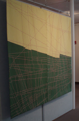
The quilt started with light over dark in my head before I even bought the fabric, and I don't think I ever questioned its orientation in the months it took to construct and quilt it. But a few of us spent an amusing couple of minutes the other night turning the QN catalog around, and decided it looked good in all four directions.
The one thing that seemed jarring to me about the green-on-top orientation, when I realized what I was looking at, was the angles of the corners. (Here's a head-on view of both orientations so you can see what I'm talking about.)
Because the quilt isn't perfectly rectangular, when it's hung green side up it slants down to the left, whereas the yellow side up slants in a touch from each of its top corners. When I saw it in person green side up I thought it was a bit out of balance. Now that I look at it on the screen it doesn't bother me at all.
Since I obviously have sleeves on both top and bottom of the quilt, maybe I'll change it up in future display situations.
(Note to Anonymous -- I put a bottom sleeve on my quilts to help them hang flat. The stick also gives it a bit more weight so the quilt doesn't flutter in the breeze or ripple at the bottom. Notice how straight it hangs in the photo at the top. The top sleeve does have my name and the name of the quilt on it, right side up, which should provide a hint to those hanging it, but either sleeve will work functionally.)


Kathleen,
ReplyDeleteI helped hang quilts in an exhibition recently, and we hung one upside down ... didn't notice there was an upside down house until day two!
We thought the maker had the sleeve on the wrong end ... but checked and found another one. The quilt was signed on the bottom, but didn't notice that in the heat of the moment either.
Judy B
Kathleen, when I sew 2 sleeves on my quilts, I always close the one at the bottom on one side, so it cannot be hang upside down, but you have the weight of the stick so that the quilt will hang straight.
ReplyDeleteGreetings from Switzerland
Edith
Edith -- what a good idea! (but it does close off your future options)
ReplyDeleteI've been reading up on Richard Pousette-Dart. He's usually lumped in with Abstract Expressionists but that's not precisely accurate. Anyways . . . the book I had showed the back of one of his paintings with the word "top" and an upward pointing arrow boldly written on one of the stretchers. That might help. Next time.
ReplyDeleteSuch a strong design, it reads well in any direction. With the green on top, you get a feeling of perspective - it looks like the lines go off into the distance because there are more of them. I like it with the division going vertically, too - in either direction.
ReplyDelete