Tuesday, June 16, 2015
Quilt National 12 -- best in show
I'm getting tired of writing about Quilt National so I'll wind up this extended series of reviews with the best in show quilt. I've been following Karen Schulz's work for some time, as she has been a regular in Form, Not Function, my local show. And I confess that I liked the quilts I saw at FNF better than the one I saw at QN.
Karen Schulz, Girl in the City with Blue Hair, best in show, QN '15 (detail below)
Karen Schulz, Stonehenge-ish, FNF 2014 (detail below)
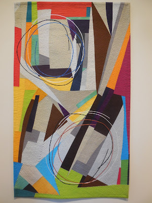
Karen Schulz, Improvisation: Two Circles, FNF 2015
She says in her QN artist statement, "My work is primarily concerned with the formal considerations of composition. The quilted line and the thicker couched line, both an integral part of my current efforts, grow out of the underlying structure."
In each of the three works, the composition is strong and striking; the piecing and quilting on all three works are impeccable. But for me, the more austere color palette of the QN piece takes away from its overall impact.
What do you think?
Subscribe to:
Post Comments (Atom)


I too like the Two Circles better than the Blue hair one.Thanks for you blogging on Quilt Nationals. It has been interesting.
ReplyDeleteYes, thank you Kathleen for your informative articles about Quilt National 15. x
ReplyDeleteI finally disagree with you on something! I prefer the subdued colors of the QN piece.
ReplyDeleteI have loved your posts about the show. And am glad you're moving on, too.
I like the QN piece. There is a quieter mood. The FNF piece is just a bit too busy for me.
ReplyDeleteAnd I am glad you are showing these photos and reporting for those who can't see these works.
Sandy in the UK
I am enjoying your posts about QN. Having not seen the best in show, I am hesitant to comment. What I do see is an implied diptyque with low contrast. I am not sure that this piece stands out for me as a "wow, stop me in my tracks and make me think" art quilt that I would expect as a best of show.
ReplyDeleteI'm not sure I would agree that this is a strong composition. Every time I have seen it on-line I am struck by how disjointed it is and with that strong dark section running smack through the middle, I lose one side or the other, never can see it as a whole. If that is what she was trying to portray - a sense of unrelated elements with nothing connecting them, then ok, she succeeded. Perhaps I would feel differently about it if, as you suggest, the color palette (or even value range) had been different.
ReplyDeleteI agree with you about the austere colors and without the title it wouldn't have as much meaning. I love the last one however, beautiful.
ReplyDeleteIt is refreshing to see so many thoughtful and thought-provoking pieces, and I thank you for taking the time to share so much of the show. I am inspired.
ReplyDeleteYou may be getting tired writing about QN but I have enjoyed each & every post. Thank you!
ReplyDelete