Monday, June 8, 2015
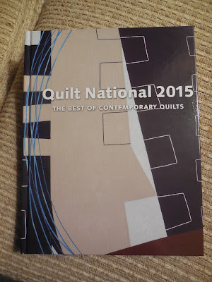
The Quilt National Catalog
I've been writing about Quilt National for a couple of weeks now with words and pictures of the quilts that have impressed me. Yesterday Sarah Ann Smith left a comment on one of the earlier posts that I thought deserved a reply that more people would read, so I'm doing this as a regular post instead of a comment.
She wrote: "I am glad to see the photos you have posted here. Honestly, QN has a reputation for a number of things (some great, some not so much), and it might do well to share more of the works online once it has debuted -- it would counter some of the misconceptions (including mine) and perhaps encourage those of us who only see the pictures of the winning quilts to enter. A larger field of entries will only make for an even better exhibit.
"As for the catalog, is it now professionally photographed? A few years ago the photos were deemed by many who were in the exhibit to be poor -- lighting/printing was way off in color and value; it may have been printing that was to blame -- but a shame that there was no opportunity to review the galleys and FIX the poor images. Since most of the works I've seen haven't been my cup of tea, I haven't shelled out the $$ to order the catalog, especially if it isn't well printed. It sounds like this year it is improved? I sure hope so!"
A lot of thought is provoked by this comment. First off, I agree that simply looking at the photos of the winning quilts may give a skewed impression of the whole show. Yes, there were only three representational quilts among the 14 winners, but even that doesn't indicate a juror bias, since two of the awards are given simply because the makers entered QN unsuccessfully for the greatest number of times before being accepted. It might be nice if all the quilts were shown online, but that would certainly cannibalize sales of the catalog and you can understand why the Dairy Barn is hesitant to do that.
Yes, the catalog is professionally photographed -- and I believe it has been so for many, many years. I was first accepted to the show in 2003 and we have always had to send in the quilts in October, within weeks of the acceptance letter, so they could be shot for the catalog. I know that some quilts have had lousy images in past catalogs. I've attended every QN for at least 20 years, and my typical routine was always to buy a catalog, then go around the gallery annotating it. Many of my old books have marginal notes such as "photo is way too dark" or "not really pink, more red-orange."
I don't know why they weren't able to get better color fidelity in the past, but perhaps the fact that they shot the photos, then sent most of the quilts back to the makers for six months (there is no storage space at the Dairy Barn) made it impossible to compare proofs to the actual artwork. (I know, you should shoot photos with a color standard card at the side...) And the fact that all pre-press work is done on computer these days adds another dimension for potential error.
I went to my bookshelf and discovered that I own every QN catalog since 1983. From 83 to 89 they were printed by Schiffer; in 1991 and 93 by Threads; from 1995 to 2011 by Lark Books; in 2013 by Dragon Threads; and this year it is self-published by the Dairy Barn.
This year I didn't notice any photo in the catalog that seemed off. In fact, the catalog has better views than you'll get in person at the Dairy Barn, thanks to the unfortunate new lighting system that focuses a small pool of very bright light at the center of each quilt, leaving the edges in shadow. The photos I took and am posting are nothing to write home about, for that reason. So I will particularly recommend that you buy a catalog. The only thing I might quibble with is that this year's book has no detail shots, so you do miss out on some of the subtler aspects.
As you can tell by my past purchasing habits, I'm a huge believer in buying the QN catalog. I think that any serious participant in or observer of the art quilt scene should keep up with what goes on in this important show, for the same reason that anybody in the movie biz needs to pay attention to the Academy Awards. You may not like the particular winners from a given year, but you do need to be aware of what's going on in your chosen field.
Subscribe to:
Post Comments (Atom)


My copy of the QN catalogue arrived a few days ago. Postage to Australia was almost equal to the cover price but it's a great reference point and will be compulsory reading for the [Quilt] Judging education program that I belong to. The photos are clear but seem lacking in texture compared to what I have seen online. Thank you for your comprehensive reporting.
ReplyDeleteI loved seeing your quilt at the Quilt Nationals last week. I attended QSDS and joined in the bus tour. When I walked in front and center was your magnificent quilt. The photo does not do it justice. I have followed your blog for quite awhile and enjoyed seeing your work in person. Congratulations. You deserved the honor of being in the show. All the quilts were great. I was humbled as my companion Rahel was looking at the quilts. Now we know why we were not accepted. I need to seriously step up my game. Which I will. Glad for mentor like yourself.
ReplyDeletethank you so much!!!
DeleteI've always felt that the awards were secondary--just getting a quilt into QN is the major achievement. It's the WHOLE SHOW that is so amazing, more than any one quilt.
ReplyDeleteAlthough. . .can anyone explain why they included the "banner" by Ellen Danforth? I can't see any artistic or technical value here. What an I missing? (I'm only seeing the book, not the actual piece.)
I for one thought many of the photographs in the catalog were dark and didn't do the quilts any favors. Of course it is always better to see it in person as I was privileged to do. I did buy the catalog but I think they should have used the artists own pictures as they have to be great to get in,.
ReplyDeleteI have to disagree with you on using the artists' photos for the catalog. While they do have to be decent to be juried in, they don't have to be great, and they certainly don't have to be publication-quality. I have always had huge quilts in QN, and the photos unfortunately reflect my jerry-built "photo studio" -- the edge where two sheets of batting come together because one sheet wasn't enough to cover the wall, the darker areas at the top because the lighting isn't perfect. I'm much happier with professional photography.
DeleteThanks Kathy for posting this! Informative!
ReplyDeleteThis past weekend I traveled to Athens to see the show. I'm very glad I did as it was a huge education and will definitely affect my work, mostly from a technical standpoint.
ReplyDeleteIt was my first time at the Dairy Barn and I do have to say that I thought the venue was lacking in a lot of qualities, mostly the lighting, as you mentioned.
I saw that they are trying to raise money to renovate and build an addition. Let's hope it improves the overall experience.