Monday, February 22, 2016
IHQ on display
I've been working for more than a year as a volunteer to catalog the International Honor Quilt, a project undertaken in the 1970s and 80s as a companion piece to Judy Chicago's great feminist work, "The Dinner Party." It consists of more than 500 24-inch panels made by women around the world to honor other women. Many of the panels honor famous women, but most are less well-known -- perhaps the maker's mother, grandmother, aunt, third-grade teacher or stitch-and-bitch sewing club buddies.
The collection was donated to the University of Louisville and it is now on display at the Hite Art Gallery of the School of Art. I visited the exhibit this weekend with several members of the Surface Design Association.
The panels had been hung once before, for a short period of time right after U of L acquired them, just so people could see the whole collection. There was no attempt to make an aesthetically appealing display, just to get everything up on the wall and have all the panels right side up (some are upward facing, others are downward facing). Here's what it looked like as we were putting them up:
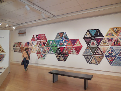
Now. a year later, there's a formal exhibit up (through March 19) and the people who hung it decided to go for fancier visual effects. Which I think came off pretty well! Some of the groupings were thematic, such as this bunch of panels honoring the same woman in Quebec (I think she was the grandmother and great-grandmother of the various makers).
Other groupings were geometric, although in some cases like shapes or images were put together.
I think the new arrangement is a good idea. It's difficult to display hundreds of small units of anything, especially when they're all identical in size and individual bits, no matter how attractive, tend to blend into an allover effect. With these geometric arrangements, the individual panels still are hard to differentiate from one another, but the smaller groupings draw your eye and make you want to come closer and look.
Subscribe to:
Post Comments (Atom)


At first, I was disappointed not to see all those triangle together, as in the first photo. That's quite impressive.
ReplyDeleteBut I have to agree, breaking up such a large project allows for better viewing.
It's similar to the Periodic Table my group made from 11 inch quilts--impressive to see the mass display, but hard to focus on details.
http://www.periodictableinfabric.com
I agree. The first image is quite compelling, but does not draw in the viewer as much as the smaller groupings. I like it that the groups are thematic where possible.
ReplyDeleteAs a follow up post, I’d love to know how these triangles were mounted. With the numerous configurations I think we could all learn a thing or two about the nuts and bolts on this exhibition.
ReplyDeleteOriginally each of the panels was outfitted with small velcro strips or squares. I don't know how they were hung on their world travels but the first time we hung the show in the U of L gallery we stapled black felt to the walls, then stuck the velcro to the felt.
DeleteThis time they used longish pins to impale the panels directly onto the painted white walls. I was not involved in hanging the show this time so I don't know how difficult it was to get the pins into the wall; I suspect it was a flaming pain in the butt. If I go back to see the exhibit again I'll try to remember to take a picture of the pin setup.