Thursday, June 30, 2016

SDA show 7 -- hand stitching


Have I saved the best for last?  I love hand stitching, and am always happy to see plenty of it in a fiber art show.


Susan Moss, Yes It's Been a Long Time (details below)


The warm background tones were put on with dye and fabric paint; the line drawings are stitched.  I love the jittery line of the stitching, making wonky pitcher and glasses.  I love the doodles at right and left, mystery marks that we don't understand, and the lettering at center that requires decipherment.  Not sure why the artist has let the text disintegrate; perhaps the speaker doesn't really want to share that sangria...

Diane Siebels, Untitled (detail below)

Just when I got to be able to recognize a Siebels quilt from the other side of the room (I've seen several of her huge profile heads in various shows over the last few years) she pulls a new technique out of the hat.  This is a whole cloth quilt, the design entirely applied with long hand stitches in heavier cotton and wool -- yes, even the roses, thorns and owl on the outer panels.  Hard to say if I like it better up close than from farther away; the imagery is subtle from afar and exciting in close-up.

Roz Ritter, The Great Unknown (detail below)

This is a picture of the artist in sixth grade, printed on several sheets of kozo paper and hand stitched.  I like the contrast between the blurry photo and the crisp stitching, outlining the plaid of her dress.  I'm not so sure about the overall presentation; is it a bit too casual, raggedy at the edges and simply pinned to the wall?  Do those hanging threads hang a bit too long, drawing the eye out of the scene and down to the floor?  Oh well, just look at the detail shot and fall in love.


Amy Meissner, Inheritance (detail below)

Meissner is well known for working with old textiles; here she started with an unfinished needlepoint panel and extended it into a large quilt with a timeless motto.  As a lover of repurposing beat-up and abandoned textiles myself, I thrill to this piece.

I love the fact that the original stitcher apparently ran out of beige yarn and finished up the southwest corner in pink, and that the canvas got all rhomboid with stitching; I love the manufacturer's ID stamped on the bottom of the canvas (can you see it? "Hiawatha Heirloom Super Canvas").  I like the way the new stitching blends with, yet contrasts with, the original.

I'm a little confused about the cranky cri de coeur; is she addressing the original stitcher who left this pathetic UFO for somebody else to rescue?  Or is she addressing her husband and kids or sloppy officemates?  Despite the ambiguity, or perhaps because of it, maybe this is my favorite piece in the whole show.  

The show, sponsored by the Surface Design Association, continues at the Schweinfurth Memorial Art Center in Auburn NY through August 21.

Wednesday, June 29, 2016

SDA show 6 -- machine stitching


After the interruption of telling you about the SAQA show at the Indianapolis Museum of Art, I'm resuming my longer reports on the SDA show at the Schweinfurth Memorial Art Center in Auburn NY, a show that I found much more interesting because of the wider variety of subjects and techniques.  Today I'll talk about machine stitching used as the main method of creating pattern and design.

Claire Jones, Whole Surface: Tranquil 1

Well, I'll admit it, maybe I'm biased toward this work because it's so similar to work that I have been experimenting with myself.  The artist has heavily machine stitched, to the point that the underlying canvas support is no longer visible.

She points out in her artist statement that she likes the distortion of the flat canvas and the fact that the stitching allows the form to be self-supporting, and I would make both these points in regard to my own stitched sculptures.  I like the biomorphic form in this piece and wonder what she has made in subsequent work in this series.

Shea Wilkinson, Data Set (detail below)

Here's another piece that gives me deja vu to my own work: an unfolded geometric solid that makes an interesting projection of a world map.  Although the different colors of the stitching represent different data variables, we're not told what they mean.  (Why do you suppose Europe has no warm colors whatsoever?  And poor UK doesn't even have any green or blue -- maybe it's because of Brexit.)

I like the way the work spreads out on the wall and yet retains a 3-D character; I like how Antarctica is perfectly centered in its own pentagon.

Bob Mosier, Inner City Block; a variation (detail below)

This large hanging is made entirely of machine stitching, and in a masterpiece of overachievement, it uses black, white and 11 values of gray thread to give subtle shading on the ziggurats.  The shading isn't totally realistic -- you don't see deep shadow on both sides of a cube -- so it gives a rounded effect, as if the stones have worn away under centuries of footsteps.  This took a LOT of stitching and a LOT of control.

Tomorrow I'll show you hand stitching.  The SDA show continues at the Schweinfurth through August 21.
  

Monday, June 27, 2016

Quilts I liked in Indianapolis


I wrote on Saturday that I was disappointed in the presentation of the SAQA show at the Indianapolis Museum of Art.  I want to clarify that I'm not critical of SAQA; the presentation and signage at the exhibit seems to have been the sole responsibility of the museum, not the show organizers.

While there wasn't a great deal of variety in the pieces on display -- because the requirement that everything be inspired by the century-old Marie Webster quilts, which were all quite similar in subject and feeling -- a couple of them were a bit different and worth a closer look.

Emily Bogard, Sunflowers & Spider Webs (detail below)

I liked this quilt for its use of many different materials and trims, and for the intricate machine and hand stitching that gave it tremendous texture.  The original Marie sunflower quilt that inspired several of the SAQA artists was quilted with spiderwebs, and Bogard's piece certainly took the web theme the farthest!

Judy Ireland, Remembering Justin (detail below)

Embroidered onto a single layer of translucent silk organdy, these deconstructed dogwood blocks feature hand stitching that is almost as visible on the back side as on the front.  Beads make a subtle focal point at the center of the blossoms.

Barbara Schneider, Anemone Dance, var. 1 (detail below)

Schneider used flowers and grasses to make a black-and-white monoprint, scanned the image and manipulated it to create the symmetrical image, then had it printed out for a whole-cloth quilt.  I loved the monochrome color palette, a pleasant contrast to the room full of bright flowers, and the graphic geometric patterns of the flower stems.  It was the most visually sophisticated piece in the show.

Saturday, June 25, 2016

Disappointed in Indianapolis


The SAQA-sponsored exhibit of quilts inspired by Marie Webster opened on Thursday, and I am sorry to report that I'm disappointed.  Not so much in the quilts, which were all attractive and nicely made, but in the presentation.

First, the premise: the Indianapolis Museum of Art owns a large collection of quilts by Marie Webster, an artist and entrepreneur who worked in the 1910s and 20s to design many applique quilts that were sold as patterns, kits or even completed tops.  They're very much of their time, or perhaps a bit ahead of their time, with clean, modern symmetrical designs on white backgrounds, mostly of stylized and elegant flowers.  SAQA artists were asked to make quilts inspired by a specific Marie design, but updated in some way(s) as a contemporary response.

Joanne Alberda, Morning Glories: A Joy Forever


Not surprisingly, most of the quilts were also flowers.  Several artists printed computer-manipulated designs onto whole-cloth quilts.  Many used raw-edge applique and thread painting; there was Tyvek and felt, beads and metallic thread.  Hardly any piecing, not much hand-stitching.  All on the small side, as called for in the rules.  Nothing in the least bit edgy, ironic or tongue-in-cheek.

Sharon Buck, Roses / American Beauty


But as you contemplate these photos, notice the terrible lighting that cast a heavy shadow over the top several inches of most of the quilts.  The small gallery used for this show has a soffit around the edge of the room, with the can lights suspended from the higher ceiling, so close to the soffit that it interrupts the beams.  I wonder how this gallery is used on other days; only the tiniest picture would hang low enough to be fully lit.

Arlene Blackburn, A Day at the Botanic Garden: Iris Study


As all of the artists were required to specify which Marie quilt was used as inspiration, the viewer might want to see the a thumbnail of the original along with the artist statement and info.  In fact, this idea was a frequent topic of conversation among the viewers I mingled with.  But when I suggested it to one of the exhibit organizers, she said that wasn't necessary because all the Marie quilts were on display upstairs and after you saw them, you would know how they influenced the quilts downstairs.

Well, to me that isn't a very good explanation.  How well can you remember each of the 25 works you saw in a different room of a museum to compare to the ones you're looking at now?  It's probably easy to remember that the five new sunflowers were inspired by the sunflower quilt upstairs, but how about a quilt showing anemones or wind turbines, also inspired by Marie's sunflower?  When you read that in the artist statements, wouldn't you like to consult a picture of the original and try to figure out what elements were carried over to the new interpretation?

And another reason: while the SAQA exhibit is free, the Marie originals upstairs require an $18 admission fee.  Some viewers might not want to pop for the admission fee, especially if they don't have a whole day to enjoy the IMA's admittedly great art.  And I thought it would have been gracious for the museum to allow the SAQA exhibitors to see the Marie exhibit for nothing, since it was the opening day and all.  Heck, they could have given us a special sticker that would allow the guards to identify and shoot us if we sneaked into the room with the Turners.

Sonia Brown Martin, Signature Daisy


I'll show you a few of the other quilts in another post.  The show continues at IMA through September 4.  (Don't be confused if you go to the museum web page to plan your visit; the show isn't listed under current or upcoming exhibits but yes, it's there, hidden away under the title "Bret Waller Gallery," without any photos.  I don't think we stand very high in the museum's estimation.)

Thursday, June 23, 2016

SAQA show opens at Indianapolis Museum of Art


I'm off to Indianapolis this afternoon for the opening of the SAQA-sponsored exhibit, "Dialogues," in which artists were asked for new interpretations of the century-old applique quilts by Marie Wilson in the permanent collection of the Indianapolis Museum of Art.  I have a piece in the exhibit, and will also be on a panel discussion as part of the opening festivities.

IMA is a big-time art museum and it's exciting to see that SAQA's focus on getting art venues for its exhibits in addition to the usual quilt shows is paying off.  I've heard wonderful things about the "Stories of Migration" exhibit at the National Textile Museum in Washington DC, and I hope the IMA show will be as well received.

I'll take notes and pictures and report back!  Meanwhile, here's my quilt from the exhibit:

Zoe and Isaac Stargazing (detail below)


Tuesday, June 21, 2016

Sunday, June 19, 2016

Sunday funnies 19


Happy Father's Day!  If your father is still with you, give him a big hug.

Friday, June 17, 2016

SDA show 5 -- other strange materials


Yes, it's sort of a fiber show, but expect all kinds of other materials, fiber-like or not, to show up.

Ellen Schiffman, Star (details below)

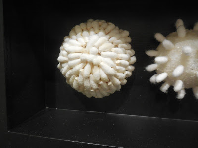
Here's a piece constructed of Q-tips, making an academic arrangement of specimens such as you might find in the natural history museum, presented in an important wooden case.  Each one is different; they could be sea anemones, crystals or the seedheads of dandelions ready to float away.  


I like this piece for its austere palette and formal symmetry, the variety of effects she has achieved by cutting and assembling the Q-tips in different ways.  And of course against the austerity and formality, there's humor.

Xia Gao, Breaths (detail below)

Austere palette and everyday materials again, obsessively transformed into an elegant presentation: start with stretched canvas, add a bazillion plain old metal pins.  The artist statement talks about "double-sided images," which makes me wonder whether the pictures might have been displayed away from the wall to see the pointed ends as well as the heads.

Just the slightest touch of red enlivens the left-hand piece of the triptych.

Next post:  let's see some stitching!!!

The SDA show, "Transgressing Traditions," will be at the Schweinfurth Memorial Art Center, Auburn NY, through August 21.

Tuesday, June 14, 2016

SDA show 4 -- plastic


Any time you see a fiber show that's looking for "new," "nontraditional," "edgy" or "innovative" work, you'll see stuff made out of plastic, sure as night follows day.  And nine times out of ten, the artist statement will say this is a commentary on consumer waste and environmental degradation.  Some might even argue that making quilts or weavings or whatever out of plastic has now become traditional, maybe even a cliche.  

So when you find some of these objects in a show, you don't really have to stop and think whether this is revolutionary or innovative, because it isn't.  You can cut to the chase: do you like the object, how it was made and how it looks?

Zona Sage, The New Black

I vote yes for this piece, which is made from plastic billboard signs, sewed together as a quilt.  The orange is striking, and I love the way the artist has sliced up the letters to make an abstract design, still recognizable as typography but also formally animated and balanced. Particularly nice is the way the shapes blend into one another across the seamlines, and how the figure and ground shift back and forth -- are we seeing orange on a white background or vice versa?  My only wish would be for this to be four times as big (it's about 30 inches across, as I recall) for real impact.

Emily Dvorin, Urban Ephemeral

I like this piece, too, a "basket" woven from plastic oxygen tubing, cable ties, acupuncture needle holders and some wire.  The medical materials are a bit off-putting, but the colors are light and bright and the green leaf-shaped doodads take the edge off the industrial vibe.

Christine Holtz, Ten Second Rule (detail below)

I thought this work, a big bag-like form made from junk food wrappers, was a little less successful.  I know we're supposed to take the message that junk food is bad for you and even disgusting in hindsight (the artist statement notes that the object is wedged in the corner "like a giant piece of discarded gum") but to me it just looked like a beanbag chair with a particularly busy print cover.  Been there, seen that.

Next post:  other non-fiber materials in the spotlight.

Friday, June 10, 2016

SDA show 3 -- more prizewinners


There were several quilts in the SDA show, but only one was spectacular, and it took third prize:


Gerri Spilka, Interactions #22: Hinged (detail below)

This was a very large quilt (I should have taken a picture with somebody standing there for scale) and impeccably designed and crafted.  I liked the strong, clear colors and the quirky shapes -- banjos?  melons?  It was densely machine quilted.

I'm not sure what makes it "transgressive."  The artist tried to finesse her way around this question by describing it as "stepping off from traditional quilting methods and composition," but haven't we all, in this corner of the art/quilt world?  Fortunately, I don't put a lot of importance on sticking to show themes. I'm just glad the jurors voted this one in.


Gwen Lowery, Aurora Corona 1 (detail below)

This piece, which took an honorable mention, is also very large.  It's densely machine stitched onto canvas, then stretched onto five panels, hung slightly separated.  She used a commercial embroidery machine to execute the watery, abstracted design, perhaps an aurora, perhaps an out-of-focus flower.

I was intrigued by this piece because I too have been experimenting with dense machine stitching onto canvas (read about it here).  But the effect is totally different: mine bulges and waves while Lowery's is perfectly flat.  How nice to find so much potential variation within a single technique.

The show, "Transgressing Traditions," is co-sponsored by the Surface Design Association and the host Schweinfurth Memorial Art Center in Auburn NY.  It's up through  August 21.  I'll show you more work next week.

Thursday, June 9, 2016

SDA show 2 -- second prize


Leslie Pearson, In Words Alone (detail below)

I think I liked this piece even better than the best in show, perhaps because the artist likes all the stuff I like.  From her artist statement:

"Be it handwritten letters, journals, old books, rusty metal, postage stamps, buttons, teeth, animal bones or bits of fabric -- my studio is filled with objects I've collected or unearthed.  I'm a scavenger for lost or forgotten things that have interesting textures, colors, and surfaces..."

This piece combines a body-like structure -- or maybe it's a tent or shelter --  made of gut stretched over a wire armature, with a snake of paper discs apparently cut from an old book.

I liked the contrast of the two materials, one dense and opaque, the other weightless and translucent.  I liked the casual curve of the endless tube, lifting up from the base and casting intriguing shadows.  Both sections were mysterious: the words of the book sequestered inside the tightly packed tube, the empty space inside the gut perhaps containing something ephemeral.

The show, "Transgressing Traditions," is co-sponsored by the Surface Design Association and the host Schweinfurth Memorial Art Center in Auburn NY.  It's up through  August 21.  Stay tuned for more work from the show!


Wednesday, June 8, 2016

SDA show 1 -- best in show


Had a great weekend attending the opening of the Surface Design Association juried show at the Schweinfurth Art Center in Auburn NY.  My piece "Unspooled" was not only in the show but got to be the postcard image, always a happy event.  There were lots of pieces in the show, and I am sorry to report that I was so busy listening to the juror and artists talk about the work, and of course to schmooze with people, that I didn't have time to properly look at every piece in the show.  So my report will be somewhat subjective.

First some remarks about the show theme, "Transgressing Tradition."  Some of the works were indeed nontraditional, using exotic materials or unfamiliar techniques.  But there was very little that was truly new (well, is there ever?) and every one of the exotic materials on display I've seen used in the past by other artists.  I do not say this as a criticism; in fact, I think sometimes show organizers bend too far over backwards to search out "new and different" when instead I wish they would be searching out "good."

I was more puzzled by the term "transgressing," which seems to have an overtone of naughtiness or outrageousness.  I didn't see much in the show that I would consider transgressive, but that's not a criticism either.  So never mind.  Just saying.

Here's the best in show:


Eszter Bornemisza, Next Page (details below)
It's a large piece, made from X-ray films held together in a stitched grid.  The top layer (the right-hand edge of which is folded forward and hangs free) shows a map of Budapest, Bornemisza's home town.  The bottom layer has a random array of letters, signs and symbols that you might find on a map,  There's a slight gap between the layers, hanging separately from the wall pegs, and the whole thing hangs an inch or so out from the wall so you get dramatic shadow effects.

You know I'm a sucker for grids, and for stitching across thin air to join pieces of stuff with space in between, so what's not to like about this piece?

I'll show you more from the exhibit in subsequent posts.