Showing posts with label calligraphy. Show all posts

Sunday, January 2, 2022

Daily art -- a new challenge for 2022

 Faithful readers know that I have been doing daily art for 20 years, revising my rules every January 1.  After three years of doing calligraphy, I feel overdue for something new, so I decided to leap into the deep end of the pool with something I'm terrified of -- paint.  I'm even having a hard time describing it as "painting" rather than just "paint," much as a long time ago I had to ease into calling myself an "artist," instead first saying "I make art."
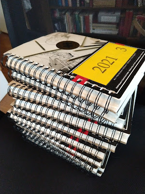
Three years of daily calligraphy


This is not a new situation for me.  In 2013 I forced myself to learn to make collage by way of daily art (and did it for three years).  I came to love it, incorporate many aspects and techniques into my "serious art," and would happily do it again as a daily practice.  In 2016 I forced myself to overcome my dread of drawing, even joining a life-drawing group and enrolling in a beginning college art class, where I got an A+.  I learned to make better realistic renditions than I did at the start of the year, but I couldn't force myself to stick with realism.  I quit the drawing group and by the end of the year was filling my sketchbooks with maps, repetitive patterns, doodles and increasingly abstract line work.

So with one success and one failure in my past, I'm trying again.  I've always avoided anything that you could describe as "painting," although I have used plenty of paint in the last decade.  Why the terror, considering that I love to have paintings by other people all around me?  I can think of several possible reasons.

For one, I've always rankled at the concept that painting is "real art," whereas fiber is some kind of second-tier impostor medium that is only grudgingly allowed into museums and galleries.  So if that's the way they feel about it, to hell with painting, I'll do anything but.  A childish opinion, which doesn't even hold up very well under cross-examination, but there it is.

For another, I have never felt comfortable using a brush to lay down color.  In three years of calligraphy I've tried many different writing implements, falling in love with many of them.  But brushes are not in that group.  Every time I try to write with a brush I think the result looks awkward and weak.  So unless I conduct my paint career exclusively with palette knives (not that there's anything wrong with that) I have a big hurdle to overcome.
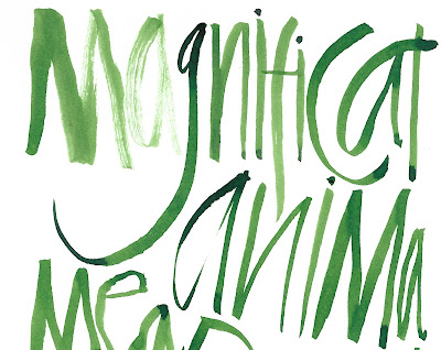
Just doesn't look that good to me....


Most important, I've always relished the freedom that fiber art, especially quilting, offers in terms of  design.  You make a little motif or sewed-together area and put it up on the design wall, and then add some more areas.  And eventually you can rearrange them till you get a pleasing composition.  If you think this red part should be closer to the bottom edge, cut off the extra stuff.  If you think it should be closer to the center, make some more piecing and add it onto the side.  If you think the two red bits should be farther apart, add something else in between.  By contrast, when you paint, you need a sound preliminary idea of where your elements are going to fall on the canvas before you start putting red things down.
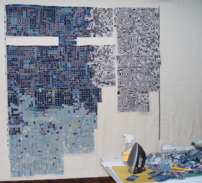
This is how I like to work!!
I have developed a pretty good sense of composition over the years but I almost always do it on the design wall, moving things around and auditioning and trying this and trying that before deciding on the final result.  I'm afraid that if I can't rearrange I will either end up with crappy compositions or be forced to (gasp! horrors!) make advance sketches.  And advance planning is NOT the way I like to work!  I like to think by doing.  But I have no idea how that's going to work with painting.

I've done one painting so far.  I am using an interesting technique to make myself overcome terror and paralysis, which I'll tell you about soon.  

Meanwhile, you can check out all my daily art on my daily art blog.


Thursday, December 16, 2021

Daily art -- the end of a streak

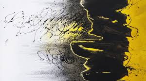
Two weeks from tomorrow will be my last daily calligraphy.  After three years on this streak, it's time to stop.  I have accomplished a lot with this practice, although not what I intended to do when I started.  At that time I had just seen and fallen in love with the work of an Iranian artist, Golnaz Fathi, who used calligraphy, or maybe I should say marks that resembled calligraphy -- especially this painting:

Golnaz Fathi


I thought that in a year of writing I could figure out how to achieve a similar effect, that it was just a case of finding the right ink/paint and the right brush/pen and developing a personal style of making letters.  Turns out that in three years I have not yet achieved that goal, although I think I have come close a few times.

I have learned many things in those three years.  First, that I am much more comfortable using a pen than using a brush.  I keep buying new pen nibs to add to my already huge collection, jump-started with a whole lot of pens inherited from my father.  But while he went for bold pens with wide or ball-shaped tips, I have been going smaller and smaller, in search of pens that are very flexible, going from narrow to wide in a single stroke as you add pressure.  I love the old-fashioned look that you get from plain old script written with a small pen.


Second, that it's harder than you think to do asemic writing, the fancy-pants term for writing that doesn't have any meaning.  To do this well you need a repertoire of symbols that look like actual letters but aren't.  In three years I did a pretty good job of developing my own personal asemic script, which is also nicely suited to the thick-and-thin flexible pen.


Third, despite the literal meaning of "calligraphy" -- beautiful writing -- I have become quite enamored of crude, non-beautiful writing.  It helps to have a pen or other writing tool that will produce irregular lines, maybe also some spatters, and that's not always easy.  My favorite beer-can pen got old and died last year, and a couple of new ones haven't given the same effect.  


Finally, the closest I have been able to come to the pictorial quality of Fathi's work has been by writing wet-into-wet.  This technique will serve me well for next year's daily art: painting.  I'll tell you more in later posts. 

Tuesday, January 19, 2021

Good news for calligraphers

In case you were wondering about your India ink:


Tuesday, January 12, 2021

Book report -- 2020

The pandemic had its bright moments, and for me one of the highlights of the year was more reading time.  Thankfully our library, though all branches were shut for several months, kept its digital services going and seemed to be buying new e-books at a faster rate than it had Before.  As an avid reader of the New York Times Book Review, I would frequently read about a new book that looked interesting, pick up my phone and put in a request for the e-book.  Nowadays if a library hasn't purchased a book yet, it will still show you the blurb for the book and allow you to "recommend" it.  If it's purchased, you go to the head of the line to check it out.

I know exactly what books I read last year thanks to my new habit of writing an excerpt from each book as my daily calligraphy, on the day I finish it.  And I can go back and read those passages to revisit any book that I have forgotten the details of.

I read a lot of nonfiction last year, mostly about social justice, American history and politics.  I particularly recommend Evil Geniuses by Kurt Andersen, which outlines how our political system has become so polarized and hateful in the last decades.  (Hint: it wasn't accidental.)


After reading several books by black authors, I was at times outraged, at times frustrated, at times both over the state of race relations in the US.  I had always known about slavery, of course, but even as an American history major I had never heard about many of the darker aspects of our sorry past.  My eyes were opened, but the negative emotions were overwhelming.

Somehow I got the idea to read Barack Obama's first book, Dreams From My Father, written in 1995 when he hadn't achieved any public prominence.  Of all the authors who grappled with the dilemma of being black in America, Obama seemed to me the most thoughtful and nuanced.  If you can only read one book about race and social justice, read this one.


But my nonfiction reading wasn't all heavy and discouraging.  I loved The Wave, by Susan Casey, who finds existential meaning in rogue waves, tsunamis and giant wave surfing.  Unless you live in a low ranch house on a barrier island, this is wonderful escapism! 


I won't recommend fiction, because tastes are so varied that the book I love is very likely to be one that you wouldn't read if they paid you.  And vice versa.  But I confess that having to write down every book I read has been a subtle nudge in the direction of less trashy trash, which makes me proud.

Despite doing a lot of reading in 2020, I chalked up a lot fewer books than the year before -- 59 books, compared to 79 in 2019.  That's because in 2019 we spent six weeks on cruise ships, mostly crossing the ocean rather than doing port calls every day.  That means a lot of time to sit on the balcony and read.  By contrast, during pandemic I spent many hours in the studio and in the kitchen instead of with a book.  

I'll keep up the book diary this year, so if you every want to check up on what I've been reading and see if it's up to your standards, look on my daily art blog.  This link will show you just the weeks in which I had a book diary entry. 

Meanwhile, what have been your favorite books from the last year or so?

Sunday, December 13, 2020

My readers help with calligraphy

Many times when I write about my frustrations with calligraphy (this year's daily art), readers make suggestions.  I've resolved to try out those suggestions before the year ends -- and yes, I've pretty much decided to stick with calligraphy again next year, because I certainly haven't done all I can do with the task.

Vancouver Barbara said "for a real thrill in randomness try very skinny pieces of cedar bark that have the ends smashed.  The "pen" takes over and you get some incredibly beautiful marks."

Not having any cedar bark at hand, I tried this with a strip of paper and decided it was a disaster.


I'll keep trying to find some cedar.

Karen Amelia Brown suggested that I try using a ruling pen, a gizmo with two arms whose distance apart is adjusted with a screw.  (Supposedly the ink stays in between and the outside of the arm stays clean enough to move smoothly against your ruler.)   I vaguely remember my father using a pen like this but I don't think it's in the stash of art stuff that I inherited.  So this experiment will have to wait till I venture out to the art supply store -- probably not in the immediate future.

Mags Ramsay said "using non-dominant hand can bring a fresh approach."  I've known that for a long time but it took her comment to nudge me into actually trying.  I used a fountain pen instead of a dip pen for these experiments because it gave me one less thing to worry about.  I was amazed at how difficult it was to make my left hand do anything I told it to!!  


The black writing in the first sample is nonsense letters; the green writing in the second is actual words in German, but written right-to-left.  The red is English, right-to-left.  For green and red I turned the sketchbook sideways so I didn't have to hold my writing hand on top of the spiral binding (new appreciation for the systemic difficulties that lefties face).  

All seem equally illegible.  I was pleased with the overall appearance -- the writing maintained its character throughout the page, and was reasonably good-looking as a pattern.  But I'm not sure whether I want to continue exploring this approach, since I have so little control over what happens. 

Thank you, readers -- suggestions are always warmly appreciated!  You can check out all my daily calligraphy on my Daily Art Blog.


Sunday, December 6, 2020

Ornament time

As I have done for at least 40 years, I'm making ornaments this year.  In the beginning of this project, my work time was focused on coming up with a new idea each year, and in a good year, adding one or two people to the list -- new in-laws, new babies, new friends.  Lately it's a good year when I don't have to take someone off the list, and in this year of pandemic, it's especially heartening that I haven't lost anyone.


My daily art for the last two years has been calligraphy, so it's probably no surprise that I'm writing the names for the ornaments.  I usually just do initials, plus the year, but on the infrequent occasions when I've spelled out full names, I've never done so with a writing implement!  So, a first this year (hard to accomplish when the series has been going on for so long).

I visited my friend Marti last week and was delighted to find that she has hung all the ornaments I've given her over the years in a place of honor, pinned to a beautiful pale green quilt that she made.  This will be year #22 that she's been on the list, a long time and so many shared memories.


I left it too late this year, should have started my ornaments in October as it became apparent how unreliable postal service has become of late.  I got the two international envelopes in the mail a couple of weeks ago, but the US batch won't go till tomorrow morning.  Fingers are crossed for all of them to arrive on time.  Or if they can't get there for Christmas, at least before New Year so the "2020" won't be a lie. 


Tuesday, November 17, 2020

Calligraphy update -- coke can pen

I've written before about how in my daily art I have tried to emulate what you might call calligraphy brut -- strokes and letterforms that look like they were written with crude tools by a caveman.  In the summer I tried to accomplish this by using a pen made by cutting and folding a chunk cut from a coke can, but wasn't pleased with the results.  I did other things instead, but in the last several weeks the coke can pen, sitting in my pen-and-pencil cup on the dining room table, has called out to me.

I want to love this pen for its uncontrollability, but it was behaving too well.  It was giving me smooth lines that almost looked like they came from an actual commercial-pointed pen.


This wasn't bad, but it wasn't brut.  I kept trying, but still wasn't getting the results I wanted.  This next writing improved when I whapped the pen against my finger to splatter some ink spots over the page at the end.


And then one day, out of the blue, look what happened about halfway through the writing -- the pen started to stutter on the upstroke and give me some beautiful ripples.  (I'm still surprised at how symmetrical they are -- the pen seemed to fall into the same vibrating rhythm on so many of the lines.)


I loved it!  And have been trying to get the same effect ever since.  Some days the pen stutters and the writing looks totally brut; other days it refuses to cooperate and just gives me smooth lines, like the example below.


I finally deduced that to get the stutter, the two flaps of metal at the tip of the pen have to move independently.  When I run a knife blade in between before writing, to clear out any dried-on ink that might be pasting the two flaps together, the chances of stutter/splatter improve.

But not always.

I guess if you're in love with accidental effects, as I most definitely am, you have to embrace the fact that they're accidental, for heaven's sake, and they don't always come when you call.  

Meanwhile, I'm continuing to use the pen most days and hope for brut.

You can check out all my daily calligraphy here.


Saturday, October 31, 2020

Ideas from the blue


A long time ago I made a little doodle on the side of a larger piece of paper.  I think I was trying a large round pen nib to see what kind of line it would make, and drew the U-shaped curve.  Then at some later point I think I had another pen in hand, sketched the surrounding box and made a "stem" for the "wineglass."  The piece of paper nestled in with my piles of clippings, and I kept running across it every now and then.

Earlier this month I decided the little doodle was striking some kind of chord with me, because every time I came across it, I carefully put it back onto a pile instead of into the wastebasket.  So I did my daily calligraphy based on the doodle.  


And then I did it again, and again and again.  The "wineglass" changed shapes and orientations and colors, and occasionally morphed into a dumbbell with two curves in the box instead of one. The boxes escaped from the grid to stand alone. The pale washes that I had been using in other calligraphy appeared.  


It's hard for me to articulate why this little doodle makes me so happy.  And it's turning out to be hard to use it in a satisfying way on the large page of a sketchbook instead of the tiny one-off version that I've kept so long.


I don't know if I'm done with this motif or not.  I'm not even sure I like this series of experiments.  Are they losing their spontaneity as I do them over and over?

I've done this in the past, made something that seemed great the first time around but never as good again, no matter now many times I revisit it.  Maybe that's because I love to work improvisationally, without the safety net of sketching or a lot of planning ahead.  So when I come back and do the same motif again, it seems constrained and artificial rather than serendipitous.  What do you think?  Have you had a similar experience?


Tuesday, October 27, 2020

Ideas from others -- Marina Soria

This summer I got an email from Jan Milne, who reads my blog from Australia and wondered if I was familiar with the work of Marina Soria, a calligrapher from Argentina.  I wasn't, and immediately looked her up.  Among all the images I saw, one sent me straight to my sketchbook to emulate.

Marina Soria


Two ideas to play with: first, trapping the letters between horizontal lines, and second, filling in some of the negative spaces with pale washes of color.  Here's my version:


I worked with this idea for a while, then decided it would be interesting to use the wash-in-negative-space approach with other styles of lettering.  Here's what I came up with then:


I like to use washes -- about the only thing I can do with a brush that seems to look good (clearly need more practice....).  I've had fun with this technique (you can see all my daily calligraphy here on my Daily Art blog) and want to give many thanks to Jan for tipping me off to this new artist.  Almost every time you look at somebody else's work in the same ballpark as your own, you find ideas to test out and riff on.  Do they become a permanent part of your repertoire or just an experiment?  Only time will tell.


Wednesday, August 12, 2020

Checking in on calligraphy 3


Trying to achieve the same character as the Denise Lach calligraphy that I loved, I ventured out to my local art supply store, which had just reopened, to buy a little squeeze bottle with a needle tip in the smallest diameter they sold.  This turned out to have a different character than the eye droppers and coke-can pen -- namely, much more prone to blobs!


Seems that the squeeze bottle has three modes, just like Goldilocks and the three bears: not enough ink flow, too much ink flow, and just right.  Unfortunately the only one of these modes that I am able to control is too-much; if you give the squeeze bottle a little squeeze you get a huge blob.  Just-right mode seems to occur only after you've started with too-much and written out the excess, and after a short while it expires into not-enough mode.


One of the advantages of this method is that if you keep the squeeze bottle quite empty, you can add more ink of a different color tomorrow -- or even midway through one day's page -- and change the color.  I put too much red in a while back and am still writing it off, waiting for a chance to transition over to blue or green.


I've experimented with doing my letters straight up and down and on a slant. Some days I'm happy with what I come up with, other days not so much.  But none of the days are even close to the Denise Lach exemplar that I am trying to emulate.

You can see all my daily calligraphy here.


Thursday, August 6, 2020

Checking in on calligraphy 2


I have been looking to the book Schrift Spiele by the German calligrapher Denise Lach as inspiration for my daily calligraphy.  This example from the book spoke to me, and I have been trying for several weeks to achieve similar results that made me happy.

Denise Lach, Schrift Spiele
I like the contrast between heavy blobby strokes and very fine lines, and the way the actual letters are difficult if not impossible to make out.  The text said it was done with a "glass pipette" which I gather means an eye-dropper kind of tool.

So I looked around the house for eye-dropper kind of tools, and came up short.  But wait, how about the eye dropper inside the bottle of ink?

I did a bunch of dailies with this method, and was less than thrilled.


The blobby strokes worked out OK but the hairlines were more difficult.  This effect was exacerbated by the tendency of the acrylic ink to show up much lighter in value when there isn't much coverage.

Next I tried my old coke-can-and-tongue-depresser pen, which gave a different nuance to the fine lines.


Sometimes I'd get ink splatters, which were OK, but overall I felt the ink flow was very hard to control, and I just wasn't happy.  Some parts of the composition were nice:


...but other parts seemed crude and ugly:

I decided I needed a better tool.  I'll tell you about that in the next post.


Sunday, August 2, 2020

Checking in on calligraphy 1


Although one day seems very much like the next in these lockdown/quarantine times, I do have my daily calligraphy to keep me honest.  When I run out of inspiration I grab my book by the German calligrapher Denise Lach and try to find an illustration that looks interesting.  And then I shamelessly copy it, maybe several times, trying it on for comfort to see if I can make it mine instead of hers.  I'll show you three different examples in posts this week.

Here's what I copied from, what I would describe as whimsically drawn letters:

Denise Lach, Schrift Spiele


And here are several days worth of my alphabets.  I have found that 26 letters seem to fill one of my pages quite nicely.


Lach's calligraphy has a smaller range of colors than mine, but somehow looks snappier.  I'm lazily working just from the bottles of ink that happen to be living on my dining room table.  Yes, I could probably root around in the studio and come up with some paints in different colors, or maybe colored pencils, but that would require energy, a quality that I don't seem to have a whole lot of lately.


I kind of like these alphabets, but I'm not sure they're going anywhere.  Maybe I should be trying to contort my letters into more non-traditional shapes, or trying to find more colors.  Or maybe find just one color, as Lach did.


You can see all my daily calligraphy here.