

Thursday, May 30, 2019
Wednesday, May 29, 2019
Form, Not Function 3 -- more prizes
Rounding out the list of money prizewinners at FNF:

If you like obsessive piecing, you'll love this quilt! It kind of reminds me of my own fine-line piecing, with lots of small bits surrounded and joined by very skinny strips, but Black's is less controlled, more improvisational than my own. I spent a lot of time in front of this quilt trying to discern a pattern to the color concentrations. And as an obsessive piecer myself, I went into zen state trying to figure out the order in which she sewed it all together! Almost everything in the quilt is solid color, except for one or two commercial prints and a couple of batiks that read as stripes.

Nida's work, familiar to anybody who has attended a major quilt show in the last decade, features her trademark angst-ridden women with visible innards, plus a host of tiny details that make total sense only to a surrealist mind. Figuring out what this quilt is about is more difficult than I have found in many other Nida quilts; it seems to have many themes, including pollution, patriotism, rape, feminism, contraception, pregnancy and windbag politicians. And I'm sure I missed some.
I didn't inspect every seam in the quilt, but it's largely if not entirely done with raw-edge applique, zigzag stitched with invisible thread.


But wait, there's more! Under the picture is a traditional Around The World quilt pattern, executed subtly in different colors of the same value. Having once composed a fussy-cut graphic quilt of half-inch squares myself, I can testify to the tedious difficulty of getting all those squares mapped out, cut and kept in the right position as they're sewed. This is a tour de force of piecing.
Monday, May 27, 2019
Form, Not Function 2 -- the big prizes
The two big prizes in FNF, right after best in show, went to two of the biggest quilts in the room.


The artist statement explains: "Made to look like shattered glass, the work is crafted from traditional mattress ticking fabric to convey the intimacy that once was, the fragility of human connections, and the emotional impact of ending a relationship.... every time the quilts are installed, the layout and scale change. This speaks to the varying ways in which individuals enter and leave our lives."
Two big quilts, each with big impact and presence!
Saturday, May 25, 2019
Last week on Art With a Needle
My big art activity of the week was to serve as the prize judge for Form, Not Function. I showed you the best in show quilt yesterday, and will be discussing many others in the show, prizewinners and not, in the next several posts. Stay tuned!
We just finished Anniversary Week in our family. It starts on May 18 with my son's wedding anniversary, May 19 with my sister's, then a couple of days off until May 23 for mine. Then comes May 24, my mother's birthday (104, had she lived that long).
Here's my favorite miniature of the week, to commemorate all those happy days:

Friday, May 24, 2019
Form, Not Function 1 -- best in show
Best in show at Form, Not Function: Quilt Art at the Carnegie is this wonderful quilt by Judy Kirpich:

As in most of Judy's quilts, this one starts with hand dyed cotton and achieves its complexity with dozens of pieced rings. It has both hand and machine quilting.
Although I had the opportunity to watch Judy at work once when we shared a week at a workshop, I still can't conceive of how she manages to insert pieced circles and still have her quilt end up pretty flat. She is some genius at the sewing machine, that's for sure.

My fellow prize judges and I did not read either the title or the artist statement before we chose it as best in show; we didn't know exactly what it was about but the dark, powerful emotion came through even without words. And of course, the visual complexity of the image and the masterful technique were obvious.
Judy's having a great night -- while we're announcing her big prize at the Carnegie, she's at the Dairy Barn in Athens OH to help announce the big prizes at Quilt National, for which she served as a juror. We wish she could be in both places at once!

Wednesday, May 22, 2019
Form, Not Function almost up at the Carnegie
This will be Year 16 for Form, Not Function: Quilt Art at the Carnegie, a juried show of contemporary quilts that I was fortunate to have helped establish. For several years my co-members of River City Fiber Artists served as jurors for the show, as well as organizers, entry wranglers and quilt installers. For the last decade or so it has graduated to a new-each-year panel of prominent jurors, and typically one or more of them will return to see the quilts on the wall and choose the prizewinners.
This year the jurors, Terry Jarrard-Dimond (who won best in show at FNF several years ago), Carolyn Mazloomi and Colleen Merrill, were all unable to come for the judging, so the Carnegie curator thought it would be nice to ask River City Fiber Artists to be the prize judges in a nod to our long history with the show. Two of us who are in town this week, plus one participating by speakerphone, went over yesterday to judge the show, and were pleased to see a gallery full of beautiful work.
Almost everything in the show is big, with only 18 pieces, compared to as many as 30 in past years. One piece, in fact, was so big as entered that it would have required a 40-foot wall. The Carnegie having no walls that long, they contacted the artist, Emily Bellinger, and asked if she could edit her installation to fit a smaller space. She did, and here it is on the wall.


Saturday, May 18, 2019
Last week on Art With a Needle
It's been a quiet week as I try to get myself back on Eastern time, restock the groceries, catch up with the laundry and get all the suitcases put away after our trip. I'm wondering whether I need to deliberately try something new with my daily calligraphy (am I getting into a rut just making beautiful letters with my fancy new pen?).
I'm getting my work tables cleared off so I could (theoretically) get started on a new quilt. Maybe next week!
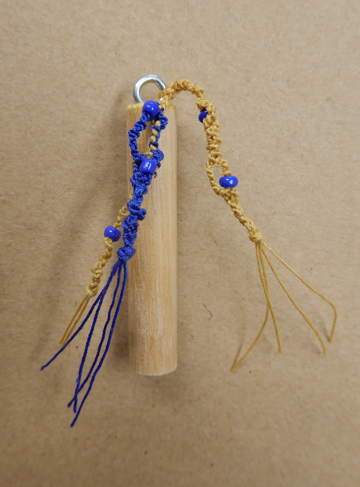
Here's my favorite miniature of the week. We found a box of junk in the back of the closet at the gallery that included a little cylinder lock -- apparently dug out of its original site in a desk or box, and without a key. It made the perfect base into which I could make an elaborate knotted construction.

Friday, May 17, 2019
A glimpse of Van Gogh
Although our brief visit to Amsterdam last week was well before the high season for tourists, there were plenty on hand in the rock-star sections of the Rijksmuseum. As usual, as many of the people were looking at their phones as looking at the Van Goghs. I mostly stood back and looked at the people.

Tuesday, May 14, 2019
Daily art on the road
I've always believed that a successful daily art project depends on setting rules that you can live with, so for instance if you spend lots of time at your wilderness cabin where you can't get a cell or internet signal, don't choose a project requiring a daily Instagram post. Since traveling is a big part of our lives, I need daily art that's portable.
My calligraphy project is easy to take along -- just a sketchbook plus a pen or two. For this trip, knowing that I would mostly be in a ship cabin with a nice desk, I decided to bring along two dip pens and a bottle of ink, wrapped carefully to avoid spills and packed in carry-on luggage so it wouldn't have to endure pressure changes. I also brought along a wire brush to clean the pen after writing.
My miniatures required a bit more thought. Decided to bring a scissors, a glue stick, a needle and one spool of thread and a pair of tweezers. From that point in, I had to forage for raw materials each day, a process that I find exciting.
When you go ashore from a cruise ship, which we did occasionally, you can always look for native plant life or rusty nuts and washers, but on board you generally find neither category of stuff. So I worked mostly with paper, and that spool of thread. One day I made paper beads, the kind where you cut a very long, skinny triangle of paper, put glue on the back and roll it up around a skewer.


Back home, it's already a thrill to use a thread color other than red! But the fun of finding art materials in a foreign environment always gives me a creativity boost.
Saturday, May 11, 2019
Last week on Art With a Needle
Actually, it's the last three weeks...
After I showed pictures of my heavily stitched houses mounted onto batik-covered panels, Sylvia commented, "They need something -- maybe a key? or some lettering? I do like the batik background but they look unfinished to me." And Sandy wrote, "Reading Sylvia's comment makes me think. I agree. Perhaps what they need is just a dark line of stitching like you did for the windows. Sort of visually to stop the house from blending into the sky. Or something?"
I have to say that I agree too. The houses still look a little insipid. But the joy of fiber art is that you never have to be finished until you want to. I'll probably think about it and do something more, and write about it when that happens. Thanks for your comments -- they reinforced my original gut feeling that these are not masterpieces yet.
After I wrote about my new calligraphy pen, which is prone to leaving blobs while it gracefully swells from thin to thick, my namesake Kathy wrote, "Definitely embrace the blobs!" We share not only a name but an opinion. I'm blobbing away (although the more I use the pen the less frequently I get blobs -- maybe practice is starting to pay off).
Mckittycat wondered if I an familiar with the calligraphy of Denise Lach. Yes, in fact my dear friend Uta Lenk gave me a copy of Lach's book a couple of years ago, and that was part of the reason I decided to do calligraphy as my daily art this year. I have not been rigorously going through the book and using her work as prompts, but I plan to start doing that soon. Again, I'll keep you posted.
And finally, my friend and former student Mieke wrote that she hopes I enjoyed Amsterdam, right in her backyard. Yes, I did! It's a wonderful city, if you can avoid being run over by bicycles. But in its favor, unlike in the U.S. the cyclists (a) stop at red lights and (b) don't wear spandex. Next week I'll be writing about some of the art we saw.
Here's my favorite miniature from this week:
As always, you can check out all my daily art here.
Friday, May 10, 2019
Airport surprise
I haven't posted in a week because I have been busy! After a two-week sea voyage from Florida to Amsterdam, and a couple of days doing museums there, and a marathon trip home yesterday, we're home. I will have lots to share, but here's a quick one. As you walk through the Amsterdam Airport (and you'd better bring your hiking boots, because it's about a half-hour stroll from where we checked in to where we got on the plane) what do you see but a sign that says "Rijksmuseum." And it's not a billboard advertising the museum, but an actual tiny museum set up in the middle of a concourse.
Inside, two large rooms with pictures.


I thought this was a fine idea. Surely the Rijksmuseum must have thousands of artworks good enough to be in its collection but not good enough, by comparison, to make it onto the main gallery walls. Surely it's better to have them on view than in crates in the basement. And how many frazzled travelers will benefit from a few minutes of peace and beauty before they hit the road again.
Thursday, May 2, 2019
Calligraphy update -- my new pen 2
I have been playing with my new calligraphy pen, enjoying the way the two halves of the nib spread apart under pressure to make thick-and-thin strokes. Then I saw this photo on Instagram, posted by my friend Jane Lloyd:

and knew I had to try it.
I've always loved the elaborate calligraphy that Andy Warhol used so much in his advertising and art directing career. He had his mom in Pittsburgh do the writing and send it to him to paste into the layouts. Later she moved to New York which sped up the production time. Here's Andy's business card/letterhead, which Mom wrote for him:

So armed with my new G nib pen, I am now trying to channel Julia Warhola.

Subscribe to:
Posts (Atom)


