

Saturday, June 30, 2012
Friday, June 29, 2012
All frosting, no cake
Last week the New York Times had an article on LeRoy Neiman, the just-deceased artist who specialized in sports scenes. The writer recalled that when he was in art school, people would often comment that a painting looked like a LeRoy Neiman.

"A reasonably sophisticated art student knew what that meant, and it was not a compliment," the writer said. "To compare a student's work to Mr. Neiman's meant, 'You are trying to distract the viewer from noticing your wooden draftsmanship and your ineptitude with matters of form and structure by larding your canvas with loud color and patchy accretions of paint.' Or, 'What you are making is all frosting, no cake."
The article goes on to discuss Neiman and other artists "marginalized by the cognoscenti" but loved by the masses, including Walt Disney, Salvador Dalí, Norman Rockwell and Andrew Wyeth. (I'm surprised he left out Thomas Kincade, who also became rich and famous well beyond his artistic abilities.) But that's for another discussion.
What struck me about these remarks was how well they apply to the "art quilt" world, if you change a couple of words. Make that "You are trying to distract the viewer from noticing your mediocre design and your ineptitude with matters of form and structure by larding your quilt with loud color and flashy embellishment." Ouch?
All frosting, no cake -- that's as good a description of a large portion of the "art quilt" world as anything else you could come up with. Unfortunately it's probably easier to find some of these no-cake wonders than it is to find quilts with more rigorous art underpinnings.
Go to the State Fair, for instance. The judges are knowledgeable to the point of hysteria about stitching, binding and making points match, but generally have no training in design. Go to the quilt shop, and find patterns and samples that showcase the latest fabrics but don't go much beyond cute in the artistic department. Go to the magazines and books, and find project recipes complete with patterns and directions so you can replicate somebody else's superficially attractive creations.
In particular, I have to agree with the writer's assessment of loud color as a distraction from mediocre design. I once took a non-quilting friend to a show that featured work by a quilter I have no respect for. My friend said, "oh, these are wonderful!" I said, "what do you like about them?" She was slightly taken aback, thought for a bit, and said "I like the color." More thought. No more response.
The fact that I didn't respect this quilter didn't stop her from selling a lot of work and becoming quite well-known locally. She did have a way with brilliant color that knocked your socks off at first glance. But there was nothing beyond the color that I could ever detect.
Fortunately there is another school of thought in "art quilts," one more firmly rooted in the traditional principles of high art than in the worlds of craft and decor. I aspire to be part of that school and am grateful for the venues that support it. I happen to think that Quilt National, the biennial exhibit at the Dairy Barn in Athens OH, is the mother of all such venues, which is why I'm madly piecing away this summer on my entry for that show. Sure, you can argue with the jurors' choices in QN as in any exhibit, but I believe they generally look for the cake, not the frosting. I hope they'll find plenty of cake for QN '13.
Wednesday, June 27, 2012
Embroidery tutorial 4 -- knotted stitches
In this family of stitches you make overhand knots in your thread. Sometimes you take a tiny stitch through the base fabric while you make the overhand knot; other times the knot is free-standing in the middle of a previous stitch.
This family includes one of my favorite stitches, the coral stitch. I love this stitch because it makes a strong line and is very economical of thread. I use it for curvy doodles and for a lot of drawing.

This one is called four-legged knot stitch. Here the knot just loops around the bottom thread of the X instead of going through the fabric. I might try this one again, but this time catching the fabric for a firmer stitch.
 This next one is called double knot stitch. Like the four-legged knot, all the knotting is simply done around the base stitch, not going through the fabric. Like the four-legged knot, I found this one to be a bit insecure for my taste, although it does sit up quite tall from the fabric for a 3-D effect.
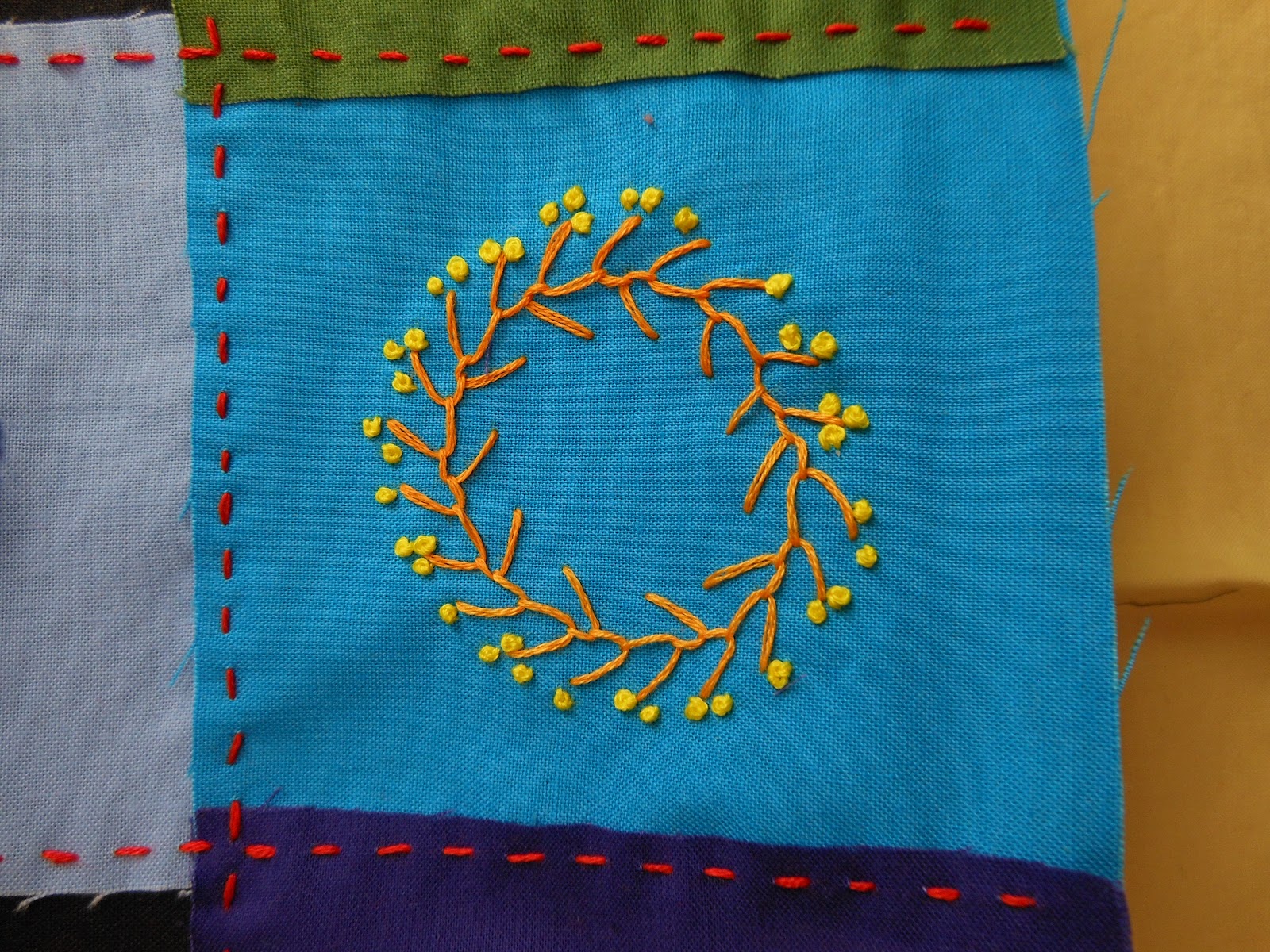
 And of course, there are french knots, which I love, even though they aren't technically knots at all (if you tugged and pulled at a french knot it would straighten out to a plain straight stitch). I often make little flowers at the end of my feather stitch "branches," or just mass the knots to make more solid expanses of color, as in the deviled egg below.

This family includes one of my favorite stitches, the coral stitch. I love this stitch because it makes a strong line and is very economical of thread. I use it for curvy doodles and for a lot of drawing.

This one is called four-legged knot stitch. Here the knot just loops around the bottom thread of the X instead of going through the fabric. I might try this one again, but this time catching the fabric for a firmer stitch.


Tuesday, June 26, 2012
Book review -- Sew embellished!
I was invited to participate in a "blog tour," in which several bloggers were given copies of a new book to review and give away. The book is "Sew embellished!" by Cheryl Lynch, who is a fellow participant in the Quiltart email list.

It's a beginner's book, focusing on how to construct small quilts that can be embellished with beads, rickrack, buttons, photos, hand-stitching, ribbon and whatnot.
Although it's set up as a project book, with detailed patterns and instructions on how to exactly replicate Cheryl's pieces, I found the most interesting and helpful material in the front of the book, with generic information that people can use with any project. In particular, I liked the directions on how to make buttons and other embellishments out of polymer clay.
If you'd like to put your name in the hat for a copy of Cheryl's book, leave a comment in the next couple of days and I'll choose a winner on Saturday. (I'm sorry we can't ship overseas.)
Monday, June 25, 2012
Happy Birthday!
Had my father lived another six years, he would have turned 99 today.
Since this blog is mainly about art, I'll take this opportunity to reminisce a bit about how my father taught me about art. Although he and my mother were both only one generation from pretty damn poor and uneducated, out of the blue they both developed a love of art that was quite unexpected in the dark days of the depression. Dad began to acquire art as a very young man and was quite proud of his growing collection. Indeed, buying art was one of the most important activities of his life, a passion he instilled in his children as well.
 Among his World War II souvenirs was this lovely watercolor of Weilburg, Germany, which he purchased from an impoverished German artist he ran into on his military rounds. The purchase price, modest though it was for Dad, allowed the artist and his family to buy food for several weeks.
 Shortly after the war, Dad was asked to judge an art contest for his local museum. His honorarium consisted of the second-place winner, this gorgeous picture of Saginaw, Michigan, with the Saginaw River in the foreground. The steeple at the right was the church where my parents were married and my sister and I were baptized.
 When I was about 10, Dad took me on a Christmas shopping mission -- we went to an art fair and bought a painting that was supposed to be a secret gift for my mother. It showed up under the tree with an envelope reading "A surprise for Vi!" But when she opened the card, it said "The surprise is that this painting is for Kathy!" It was the first piece of art that was mine alone, and the first of dozens, if not hundreds, that Dad gave to me.
All three of these paintings now hang in my home and whenever I see them -- wherever I turn -- I am reminded of how my father opened my eyes and my world to art. A favorite family activity was to hit an art fair (the Cheap Art Fair was the best of all) and buy a bunch of new stuff. We shopped at the low end of the food chain but managed to find plenty of lovely things. The occasional dud didn't cause all that much financial regret, and probably made some artist quite happy.
After my parents died, my sibs and I divvied up the artwork, a process that began long before our parents' demise, has taken years to accomplish and still isn't complete. Just last week some sculptures that belong to our brother in Australia moved from my sister's house to mine; we hope that someday they'll make their way across the ocean to their rightful home. I'm now trying to pass some of the art along to succeeding generations, continuing Dad's legacy, passing down both the tangible and the ineffable.
 So Happy Birthday, Dad! You're here in every room of the house, living on in the art.
Since this blog is mainly about art, I'll take this opportunity to reminisce a bit about how my father taught me about art. Although he and my mother were both only one generation from pretty damn poor and uneducated, out of the blue they both developed a love of art that was quite unexpected in the dark days of the depression. Dad began to acquire art as a very young man and was quite proud of his growing collection. Indeed, buying art was one of the most important activities of his life, a passion he instilled in his children as well.


All three of these paintings now hang in my home and whenever I see them -- wherever I turn -- I am reminded of how my father opened my eyes and my world to art. A favorite family activity was to hit an art fair (the Cheap Art Fair was the best of all) and buy a bunch of new stuff. We shopped at the low end of the food chain but managed to find plenty of lovely things. The occasional dud didn't cause all that much financial regret, and probably made some artist quite happy.
After my parents died, my sibs and I divvied up the artwork, a process that began long before our parents' demise, has taken years to accomplish and still isn't complete. Just last week some sculptures that belong to our brother in Australia moved from my sister's house to mine; we hope that someday they'll make their way across the ocean to their rightful home. I'm now trying to pass some of the art along to succeeding generations, continuing Dad's legacy, passing down both the tangible and the ineffable.

Sunday, June 24, 2012


Friday, June 22, 2012
Embroidery tutorial 3 -- couched stitches
If you make one long stitch, then hold it in place with some tiny stitches, that's called couching. It's a versatile technique. I've gotten much better with practice in holding the long stitch perfectly straight and making the tiny stitches practically disappear, which is a good way to "draw" lines.
 You can also give yourself plenty of slack on the long stitch so that you can make it curve as you couch it down. I also use it for small curved letters.
 A variant of couching: hold down a whole bundle of straight stitches with longer, more visible stitches.

 In more elaborate embroidery, couching is frequently used to hold down heavier decorative cords, but I'm restricting myself to plain old embroidery floss for this project so I'm not getting the spectacular results that some people do. But for me, couching is an important functional tool that allows me to make lines.


Wednesday, June 20, 2012
Embroidery tutorial 2 -- caught stitches
In my daily art project I'm doing a lot of doodles with various embroidery stitches. One kind that I have used a lot since childhood are what I call "caught stitches" -- bring the needle up, take it back down again, but don't pull the stitch tight. Instead catch it with another stitch and pull it away from the straight, much as you would pull the string with a bow and arrow.
When you do this with a single stitch, it's called fly stitch.
 When you extend your catching stitch to start a second stitch, you can go on forever in a row, with each stitch attached to the one before. This is called blanket stitch. (Technically blanket stitch is worked over the edge of the fabric but here it's just a regular embroidery stitch.
 You can turn every other stitch in the opposite direction and it becomes feather stitch.
 If you make one end of the stitch a lot longer than the other, you have Cretan stitch.
 If you put your needle back into the same hole that it came out of, but catch it a ways away to make a little loop, you get a chain stitch.
 If you make only one chain stitch instead of a whole chain of them, it's called detached chain. If you make a bunch of them radiating from a single point, you get a lazy daisy.
 I sometimes find that it doesn't take long to fill my daily square with blanket or feather stitches, and I don't feel like stopping quite yet. So I often decorate the stitches with little "flowers" made from french knots.

When you do this with a single stitch, it's called fly stitch.


Tuesday, June 19, 2012

Monday, June 18, 2012
Embroidery tutorial 1 -- straight stitches
This year my daily art project involves hand-stitching. Some days I draw a picture but on many days I simply doodle in embroidery, practicing stitches and making little abstract designs.
I realized after several weeks that my stitch repertoire was sadly limited, and decided to find a book and look up some new stitches. So the project took on an extra dimension that I had not anticipated at the start of the year: a tutorial in embroidery. I thought I would use my progress reports to share some of the stitches I'm using.
Simplest of all is the running stitch, where the needle comes up and goes down along a line. Here's an example of a lot of parallel straight lines in running stitch:
 And here's an example of running stitch in curved lines:
 If you make your simple stitches go every which way instead of arranging them neatly in a line, it becomes rice stitch. It's surprisingly difficult to achieve a true random pattern with this stitch and still cover your background evenly, which is why I stopped stitching before filling the entire square. You really have to think ahead and make sure your stitches aren't all going in the same direction -- or maybe I'm overengineering.
 And if you put one layer of straight stitches over another, you end up with cross stitch, everybody's childhood favorite.
 They can be neat, in a regular pattern as above, or messy, piled on top of one another with no plan, as below.
 I guess you could do an awful lot of embroidery using just straight stitches, without getting too bored.
I realized after several weeks that my stitch repertoire was sadly limited, and decided to find a book and look up some new stitches. So the project took on an extra dimension that I had not anticipated at the start of the year: a tutorial in embroidery. I thought I would use my progress reports to share some of the stitches I'm using.
Simplest of all is the running stitch, where the needle comes up and goes down along a line. Here's an example of a lot of parallel straight lines in running stitch:


Sunday, June 17, 2012


Thursday, June 14, 2012
Wednesday, June 13, 2012
Quilt National progress report
I've been working hard and last week finished the second top for my Quilt National entry. Putting off quilting, I've started on the third top.
In many ways this is a walk down memory lane. Three years ago I made a huge quilt entirely of striped fabrics, which is still touring Europe as part of the Color Improvisations exhibit curated by Nancy Crow.
 Crazed 8: Incarceration, detail (so called because all the little guys are dressed in stripes and behind bars)
I loved the quilt and decided I wanted to do that same approach again. Unfortunately, the quilt trend gods were not smiling on stripes, nor have they changed their minds since. Buying striped fabric is difficult if not impossible, although I have kept my eyes peeled every time I walk into a fabric store. (But you have your choice of 189 different patterns, sizes and color combinations of polka dots.)
I did manage to acquire a few yards here and there and decided that I own enough stripes to embark on another version. So I have cut a pile of strips and am starting to sew them together. This time the predominant color will be red, not blue.
 QN Top #1, which I have showed you in progress, was fun to work on because the colors reverberated and vibrated. This one seems to be doing much the same thing. Some of the stripes vibrate so much I can barely focus on them -- and that's even before I put them next to another stripe. If I can keep my brain from exploding, this is going to be quite an exciting piecing project.
In many ways this is a walk down memory lane. Three years ago I made a huge quilt entirely of striped fabrics, which is still touring Europe as part of the Color Improvisations exhibit curated by Nancy Crow.

I loved the quilt and decided I wanted to do that same approach again. Unfortunately, the quilt trend gods were not smiling on stripes, nor have they changed their minds since. Buying striped fabric is difficult if not impossible, although I have kept my eyes peeled every time I walk into a fabric store. (But you have your choice of 189 different patterns, sizes and color combinations of polka dots.)
I did manage to acquire a few yards here and there and decided that I own enough stripes to embark on another version. So I have cut a pile of strips and am starting to sew them together. This time the predominant color will be red, not blue.

Tuesday, June 12, 2012
Learning more about art
Got an email the other day from a quilter whose work I have known about for years, largely because we've been participants on the Quiltart list for a long time, reading each other's messages and blogs. She wrote: "For the last 15 years or so I have concentrated on ways to create portraits with fabric. I am really wanting to grow and develop further as an artist. I am finding that I don't really have a basis for understanding more abstract art -- for instance, why is one 'good' and another is not. I was wondering if you could give me some recommendations of books or websites that might help me develop a more sensitive understanding."
Wow! That's quite a question, and I had to think for a while. I wandered around on Google for a bit looking for some background material, and the best I could find without spending all day was this discussion of abstract art. But I think the real solution to your dilemma is broader than just reading matter, it's how to cultivate a way of looking at and evaluating art, other people's and your own.
I would suggest that instead of being intimidated by how different abstract art is from the representational work you already do, you think about the similarities. Other than not trying to faithfully depict things from real life, abstract art follows almost all the same rules of composition: balance, rhythm, proportion, emphasis, unity. Everything you know about color applies equally to representational and abstract work.
Maybe a good place to start is to look through a bunch of images that you know to be "good" -- for instance, work by the famous abstract expressionists, or the earlier 20th century painters. Run through the list of qualities (balance, rhythm, etc.) and try to see how they appear in these pictures.
 Piet Mondrian, Composition with Blue, Red, Yellow, and Black
For instance, here the yellow and red areas balance the heavy black at the top. There's clear unity in the lines and the grid, and emphasis on the very large white square.
 Philip Guston, Bronze
Here there's a rhythm in the lighter pinks surrounding the darker focal center, with white in the four corners. There's unity in the character of the brushstrokes and the quality of the paint (crude, messy, seemingly applied in haste). And so on.
 Robert Motherwell, Mural Fragment
There's rhythm in the size and weight of the five large black shapes, in the strong black verticals and the colored horizontals. The small white and black circles at the right echo the larger ovals. The three columns of the composition have a pleasant proportion, not identical in width but in good balance. The green stripe just below dead center complements the warm earth tones and neutrals everywhere else in the painting.
The more you do this exercise when you visit museums or look at art images online, you'll get better at seeing the principles of good design. And you will be able to see them at play in your own quilts as you compose them on the design wall.
Speaking of design walls, I think that it's important as you become more abstract in your quilts to work with at least some improvisational flexibility. Where making representational pictures in fabric, especially portraits, requires a lot of advance planning and design on paper, and not a lot of changing of plans in midstream, I think you have to give yourself more freedom in doing abstractions on the design wall. Allow yourself plenty of stepping back, looking, contemplating, and letting the fabric talk to you. Colors that you thought would play well together when you made your preliminary sketches or pulled piles of fabric to work with may not be right when you see them in the flesh at actual size.
I don't know whether this answer will be enough to satisfy my friend. Maybe if the rest of you have favorite books or websites or ideas you could suggest them as well. But in the end, I think the solution is to spend as much time as possible looking at and thinking about art, no matter whether you're doing it with the help of books or conversations with others or the internet or some other method. You can develop your biceps by doing curls or chin-ups or working on a nautilus machine -- it doesn't really matter which one you choose as long as you do it regularly. Same with thinking about art.
Wow! That's quite a question, and I had to think for a while. I wandered around on Google for a bit looking for some background material, and the best I could find without spending all day was this discussion of abstract art. But I think the real solution to your dilemma is broader than just reading matter, it's how to cultivate a way of looking at and evaluating art, other people's and your own.
I would suggest that instead of being intimidated by how different abstract art is from the representational work you already do, you think about the similarities. Other than not trying to faithfully depict things from real life, abstract art follows almost all the same rules of composition: balance, rhythm, proportion, emphasis, unity. Everything you know about color applies equally to representational and abstract work.
Maybe a good place to start is to look through a bunch of images that you know to be "good" -- for instance, work by the famous abstract expressionists, or the earlier 20th century painters. Run through the list of qualities (balance, rhythm, etc.) and try to see how they appear in these pictures.

For instance, here the yellow and red areas balance the heavy black at the top. There's clear unity in the lines and the grid, and emphasis on the very large white square.

Here there's a rhythm in the lighter pinks surrounding the darker focal center, with white in the four corners. There's unity in the character of the brushstrokes and the quality of the paint (crude, messy, seemingly applied in haste). And so on.

There's rhythm in the size and weight of the five large black shapes, in the strong black verticals and the colored horizontals. The small white and black circles at the right echo the larger ovals. The three columns of the composition have a pleasant proportion, not identical in width but in good balance. The green stripe just below dead center complements the warm earth tones and neutrals everywhere else in the painting.
The more you do this exercise when you visit museums or look at art images online, you'll get better at seeing the principles of good design. And you will be able to see them at play in your own quilts as you compose them on the design wall.
Speaking of design walls, I think that it's important as you become more abstract in your quilts to work with at least some improvisational flexibility. Where making representational pictures in fabric, especially portraits, requires a lot of advance planning and design on paper, and not a lot of changing of plans in midstream, I think you have to give yourself more freedom in doing abstractions on the design wall. Allow yourself plenty of stepping back, looking, contemplating, and letting the fabric talk to you. Colors that you thought would play well together when you made your preliminary sketches or pulled piles of fabric to work with may not be right when you see them in the flesh at actual size.
I don't know whether this answer will be enough to satisfy my friend. Maybe if the rest of you have favorite books or websites or ideas you could suggest them as well. But in the end, I think the solution is to spend as much time as possible looking at and thinking about art, no matter whether you're doing it with the help of books or conversations with others or the internet or some other method. You can develop your biceps by doing curls or chin-ups or working on a nautilus machine -- it doesn't really matter which one you choose as long as you do it regularly. Same with thinking about art.
Monday, June 11, 2012
Textiles in a Tube 6 -- the winners
I've written about each piece in Textiles in a Tube 2, the exhibit at Riverworks Gallery in Greenville SC, for which I was the juror. Now it's time for the winners. In third place,
 Paula Baumann, Pulled in All Directions, detail below

A cloud of color, silk organza dyed in various shibori resist patterns, unpressed so that it took a 3-D form -- I liked the color, the shadows, the ethereal quality.
In second place,
 Deborah Bein, In Light Of, detail below
 This piece is a two-sided composition of discharged fabric, its imagery enhanced by the quilting line. It was seen before in a national show, but only the front side; in TNT it was suspended in space so that both sides were visible. Yes, I know it isn't red, but I've always loved the mysterious quality of discharge shapes on black.
And the first place,
 Pat Pauly, Flying Solo 2, detail below
 Pat is known for her pieced quilts that combine commercial and artist-made fabrics, dyed, screenprinted and painted with motifs in many different scales. I liked the juxtaposition of three very different design sensibilities: the feather shape at the top, its white background patterned with small overall marks, and the bottom section with its sort of regular circles. A beautiful composition that holds together many disparate elements in harmony.
If you're anywhere in the vicinity of Greenville, I hope you can drop by and see the show, up through July 15.
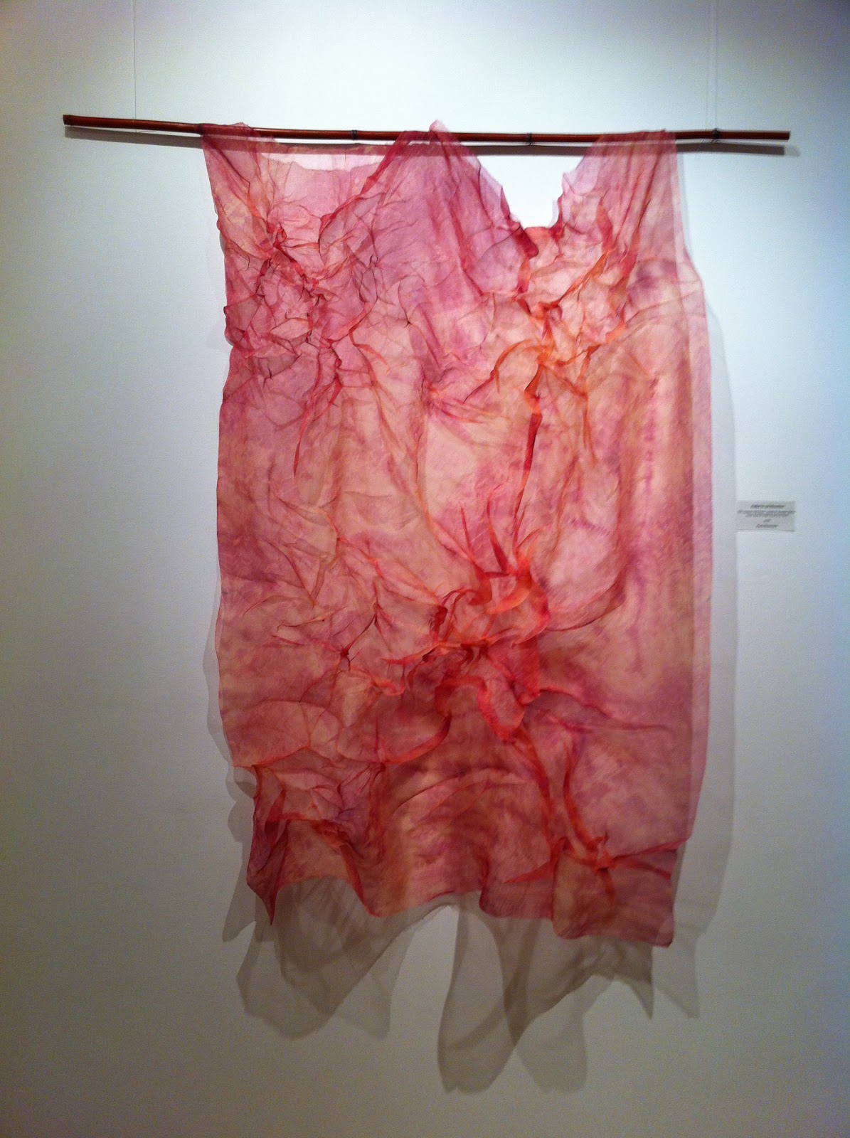

A cloud of color, silk organza dyed in various shibori resist patterns, unpressed so that it took a 3-D form -- I liked the color, the shadows, the ethereal quality.
In second place,


And the first place,


If you're anywhere in the vicinity of Greenville, I hope you can drop by and see the show, up through July 15.
Subscribe to:
Posts (Atom)


