Wednesday, February 29, 2012

Recurring roots

I wrote earlier this week about recurring motifs in the work of embroiderer Tom Lundberg.  Coincidentally, I saw another exhibit recently by three fiber artists who also explored recurring motifs.  The artists are Pat DaRif, Joanne Weis and Valerie White and their show, "Rooted in the Earth," is up at the Huff Gallery at Spalding University, Louisville KY through April 8.

I've seen and participated in group shows with themes, and they're not always successful.  It often seems that people have taken great liberties in trying to fit the theme to their work, sometimes extending only as far as the title.  But this trio of artists have produced remarkably cohesive bodies of work that fit the "roots" theme well and, even better, fit with each other.

Note in the photos the many different ways that the three artists have depicted roots.

Valerie White, Righteous Roots, detail below


Valerie White, Refuge, detail below


Pat DaRif, Mangrove VI, detail below


Pat DaRif, Ollie and Maud: Rooted in the Earth, detail below


Joanne Weis, Early Settlers (Floyd's Fork), detail below


Joanne Weis, Goldenrod (Floyd's Fork), detail

Monday, February 27, 2012

Master of stitching -- Tom Lundberg

Last week Tom Lundberg, whose embroideries I've seen in many books but never in the flesh, was in town as a visiting teacher at the University of Louisville School of Art.  In addition, the school has an exhibit of his work, and he gave a lecture.

Lundberg describes his work as "small-scale narrative embroideries" but the narrative is often difficult for the viewer to discern.  Often the imagery suggests stars, planets, space and sky.  In the lecture, he shed some light on a few of his favorite recurring motifs such as the foot and the sandal.  The footprint, he said, is a portal into a new space; the sandal brings to mind taking one step on the way to change.

Tom Lundberg, Change of Plans, 2002,  9.75 x 3.75"


Tom Lundberg, Fire Walking, 2002,
9 5/8 x 4"


I am always intrigued by the recurring images that many artists use in their work.  Something strikes a chord, and then before you know it, it comes back again and again. 

Tom Lundberg, Summer Vortex, 1997, 6.25 x 6"

Tom Lundberg, Back Yard Step, 1994, 5.5 x 6"


Tom Lundberg, Zori Pocket, 2000,  5.5 x 4.75"

Lundberg said that over the years he has realized that "my home base is a really small space."  Most of his embroideries are about the size of an outstretched hand and many are shaped like pockets, cuffs and other clothing elements.  On a few occasions when he has tried to work larger, he often is dissatisfied and cuts the work into smaller pieces.

All his work is hand-stitched, very densely so no glimpse of the background fabric is visible.  Interestingly, Lundberg's visit was part of an ongoing program for three-dimensional artists, and he said he was delighted to realize that his work, barely a quarter-inch thick, could be classified as 3-D.

The show will be on display through March 25.


Saturday, February 25, 2012

Friday, February 24, 2012

More about details

I wrote earlier this week about detail shots -- why I like to see details as a juror, and whether it's even appropriate for quilt and fiber shows to look at details (i.e. technique and craftsmanship) instead of judging on overall artistic merit (i.e. the overall view).  Having thought about this issue and come down on the side of detail, I had a chance to test my theory with a visit to one of the good juried quilt art shows, "Form, Not Function: Quilt Art at the Carnegie."

This show, at the Carnegie Center for Art and History in New Albany IN, is in its ninth year and over the years has attracted most of the major quilt artists in the country.  Although I helped organize this show and served as a juror for several years, I have not been involved in the last two shows except as a viewer and an award donor.  In fact, I was out of the country and missed the opening of the show in January, and did not have a chance to visit until last week.

As I looked at the show, I asked myself whether seeing the detail was beneficial to me as a viewer, and tried to think whether it would have helped me as a juror.  Here's the quilt that seemed to be the best case study for these thoughts:

Virginia Spiegel, Boundary Waters 53

Standing across the room (or looking at the full-view image) you don't really know what you're looking at.  It could very easily be a painting. 

(I have to apologize for my photo -- in person the work seemed a lot greener and richer than you see here, and no amount of fiddling with my photo program could get the image closer to what I remember as the real thing.)

If it were a painting, would you jury this piece into your painting show based on this image alone?  If it were a quilt, would you jury it in to FNF based on this image alone?  If you encountered it in person in a museum, would you stay on the far side of the room to look at it?

I suspect in any case you would appreciate a detail view.  Here's what you get by coming up close:

some text referencing the boundary waters

a lot of delicious texture.


As a viewer I found the closer look made the piece far more interesting, likable and expressive.  From across the room, where it might have been a painting, it seemed ordinary; up close I found its character and its hidden treasures.

I've always liked art with hidden treasures -- bits of information that are not visible in the long view, that don't reveal themselves until you have looked for a while.  I think they are little rewards to the viewer for giving the work a second or a third look.  I love to find these little bits in the art I see in museums, and try to put these touches into my own work.

So the question is, do jurors deserve to see a hidden treasure or two as they evaluate work for shows?  Or is that inappropriate, cheesy, low-end, too oriented to craft and not enough to art?  Is there a different answer for quilts than for paintings or other mediums?  I suspect most fiber artists would vote for details; I wonder whether painters have another opinion.

Tell me what you think.

Wednesday, February 22, 2012

The juror thinks -- why worry about technique?

Earlier this week I wrote about my recent experience jurying a quilt/art show, and talked about what should be shown in the detail shot.  Lisa Call responded with a great question:  "Why are you looking at technique for an art show? Why does it matter how it is made? Painters don't submit detail images when they enter juried shows. Why not do away with the detail show requirement all together and judge the work solely on its artistic merit?"

I had to stop and think about it before I could figure out the answer.  I did some research.  Maybe they don't ask for details in painting shows, but when I looked back in my files at the last couple of all-medium museum shows that I have entered, one wanted detail shots and one didn't.  Presumably painters would have submitted details too in that first show. 
If Lisa is right that painters generally don't submit detail shots, I wonder why not.  Having looked at bazillions of paintings in museums all over the world, I know that sometimes the up-close view of how the paint is applied makes a picture more interesting than I first thought when I saw it from across the room.  Wouldn't jurors benefit from a closer look at such works, and wouldn't those painters' chances of getting into the show improve with a detail shot?

I think that artistic merit can be judged from across the room (aka full-view images) but when you look at it up close you can be seeing artistic merit as well.  And we do scrutinize painters' techniques when we enjoy their art -- think Jackson Pollock's spatters vs. Gerhard Richter's mirror paintings vs. Jasper Johns' encaustics over newsprint, just to mention three that come to mind immediately. 

But I don't want to talk about paintings, I want to talk about quilts, because the show I was jurying was limited to quilts. 

As a juror, I cop to a lot of curiosity about how things are made (as opposed to how well).  Before I start to evaluate a quilt's quality, I like to know what I'm looking at.  I think this is a valid idea for a juror to entertain, because so many quilts that want to be art are so heavily influenced by technique, and certain techniques have almost become cliches.  If so, whether or not the techniques are well executed is almost beside the point; more pertinent is whether the piece has some originality.

But OK, I also like to know about craftsmanship, which I think is what Lisa is questioning.  I think the rules are different in quilt shows than in all-medium shows.  I'm not talking about Quilt Police rules (although some of the most prestigious art quilt shows do impose rules that may seem a bit arbitrary) but the unwritten rules about what standards should apply in shows that see quilts as art.

I think much as we might like our work to be regarded solely as art, and even though some shows and organizations are dedicated to having quilts seen that way, we have not yet totally escaped the craft tradition of our medium.  Yes, Tracey Emin or Louise Bourgeois can make a quilt that is welcome at the Tate Modern even though it may be baggy, lumpy, crudely sewed and downright sloppy in its execution.  But that same quilt is probably not going to get past the first round of jurying at Quilt National (or any of the other serious art quilt shows -- I use QN as shorthand for the big leagues) .

To a certain extent that's a good thing.  People who walk in the door to see Quilt National or Visions or a SAQA exhibit are probably expecting a high level of craftsmanship as a given, and then want to find artistic merit as well.  Poor craftsmanship in these venues tends to reflect poorly on the whole field.  Since I have seen many, many of Lisa Call's quilts in person, and know them to be meticulously crafted, I have to think that she values this quality as much as I do.  We know that if we showed a quilt that was baggy, lumpy, etc. it would give many people an excuse to not like it; they would be so distracted by the poor execution that they might not even look at the artistic merit.

Lisa and I both know that we could choose to abandon the quilt circuit and attempt to show our work solely in all-medium venues, and if we did, maybe we wouldn't have to spend so damn much time at meticulous piecing and quilting because the greater art world doesn't know the difference or care.  But having chosen to enter QN we know that good craft gives us extra points.

I think the moment when quilt shows decide that artistic merit is the only way to judge, and craft or technique means nothing, is the moment when we don't need quilt shows any more.  What would be the point?  We might as well go up against the paintings and the sculptures instead of restricting ourselves to the limited competition of quilts.  

What do you think?

Monday, February 20, 2012

Photography -- the juror speaks

I've railed in the past about juried shows where the jurors comment about the quality of photography, often more than they do about the nature and quality of the art.  I've always felt cheated that instead of focusing on important issues, they lecture us on things that seem so bureaucratic and elementary.  But last week I had the pleasant task of jurying a show and guess what -- I would like to comment on the photography.

But not the kinds of comments that I usually hear from jurors.  I saw a quilt hanging from a tacky wood slat, an inch or two of it poking out from each side of the quilt.  And that didn't bother me at all, because I am not so easily distracted that the sight of some wood made me unable to think about the quilt.  I saw an image that was shot at an angle instead of head-on, so the right edge of the quilt receded away.  That didn't bother me either, because I could see what I needed despite the bad photography.  One of those quilts I chose, the other I rejected, and the photography had nothing to do with either decision.  Even though you often hear jurors say that bad photography will instantly cause them to reject a piece, I want to evaluate the art, not the photography.

I also told the organizers, back last summer when we were first discussing the show, to save their money and not hire a service to make sure the color profiles were as accurate as possible.  I'm not even sure what that means or how it's done, but I was pretty sure it would be wasted.  I think good design is apparent no matter whether the quilt is more turquoise or more green, and accurate color won't save a bad design.  I suppose it's possible that I'll show up at the museum in April and be surprised that a certain quilt is a lot redder or bluer than I had expected, but I have a hard time thinking that I would regret my decision simply because of that fact.

What did bother me, and what I want to put into your minds for consideration as you get ready to enter shows, was the fact that many of the detail shots didn't show enough detail. 

Jurors look at detail shots for one reason only: because we want to know more about how the quilt was constructed, and to get clues about craftsmanship.  We generally don't bother even looking at the detail unless we like the quilt in the first place, or at least haven't yet decided to reject it.  Questions that cause us to go to the detail might be:

-- Were those white bits done with embroidery, or paint, or bleach, or applique?

-- How densely is it stitched or quilted?

-- Is that raw-edge applique, or needle-turned, or sewed down with a zigzag stitch?

-- What are those little circles that seem to be 3-D?

-- How is that writing put on -- pen, embroidery, other?

-- Are those little squares pieced, or fused, or printed out?

-- This looks kind of baggy and wrinkly at the bottom -- is it really?

But too many times last week, when I went to the detail shots I couldn't answer the questions.  I would zoom in farther and farther, and lean closer and closer to the screen, until the image went out of focus and I still hadn't figured out what kind of stitching held it together.  Once I got up to 375% zoom in search of an answer (unsuccessful).

I was unhappy to see two or three quilts where the detail shot was practically as big as the full view -- in one case, it included about 80 percent of the entire width of the quilt!  With that small reduction in field, you can barely tell the difference between the two views.  Why even bother to submit a detail?

So here's my advice: think for a minute about the kinds of questions that a juror might have upon looking at the full view of your quilt.  What's intriguing?  What's confusing?  What's really special that you can't see in the overall shot?  If the quilt were there in the flesh, what parts would you want the juror to go up really close and scrutinize?  What's going to make the juror say WOW?  Than frame your detail shot to answer as many of those questions as you can, especially the most important one, whichever that is.

Please think about it the next time you send in an entry.

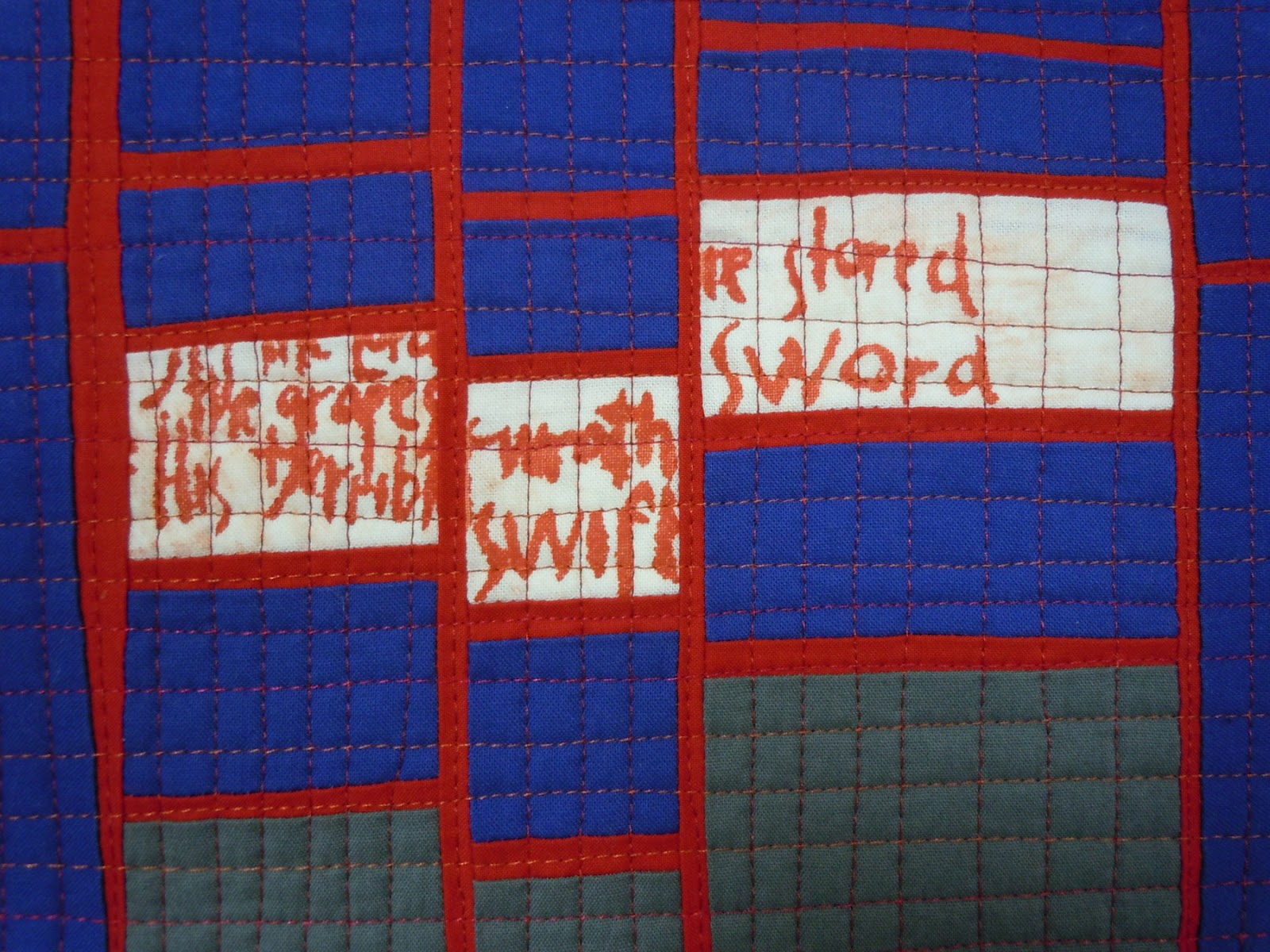
Here's a detail shot that covers about four by six inches of the quilt.  You can see the piecing, the quilting and the screenprinted text.

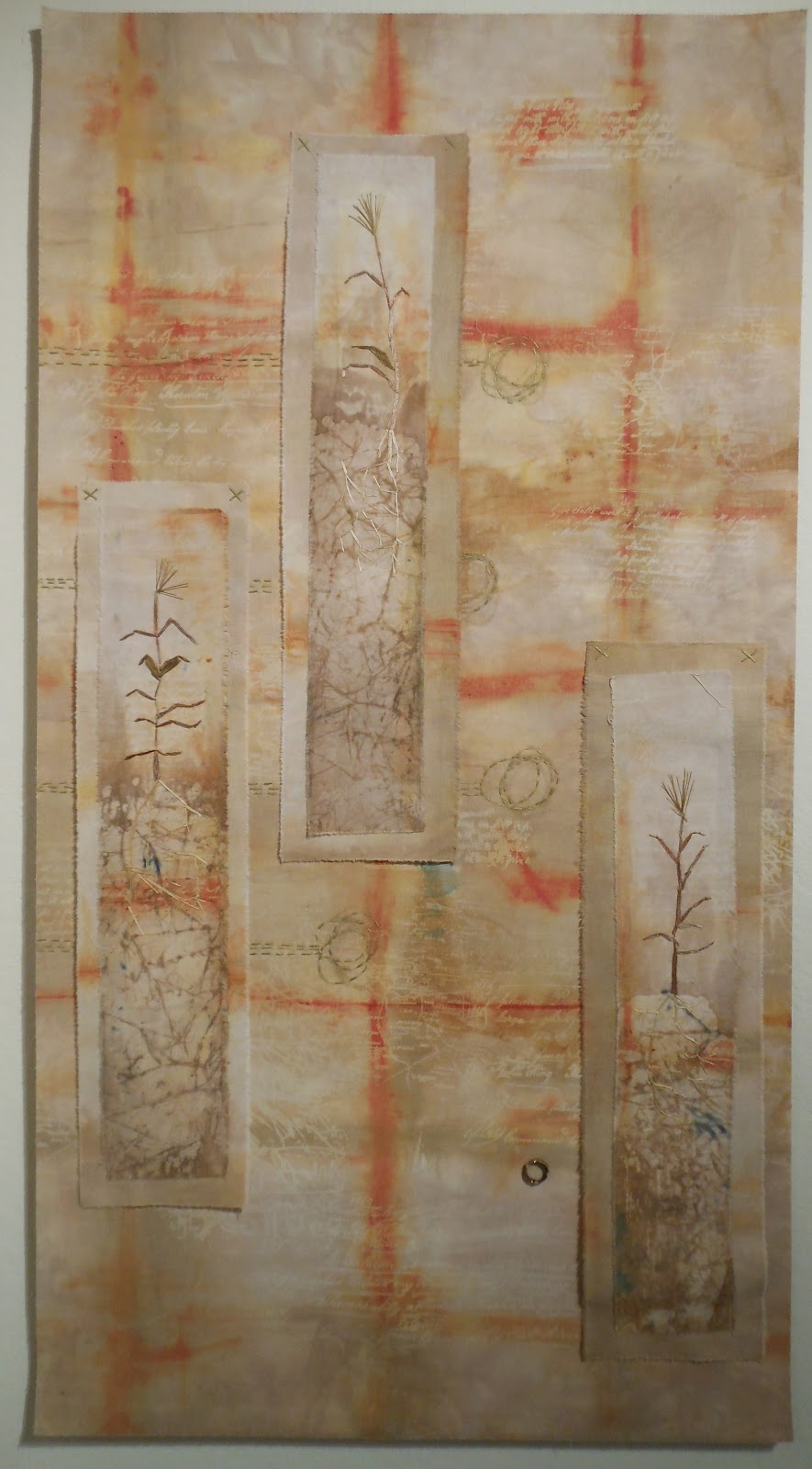
Here's one that covers about five by seven, close enough to see what the grid is made of and how the buttons were stitched to it.

Here's one that shows only about three by four inches, close enough to show the density of stitching and the frayed edges, and how the stitched squares are sewed together.

Sunday, February 19, 2012

Photo suite 8 -- color diptychs

I have always been drawn to diptychs, compositions with two halves.  I like to find these compositions in life with the aid of close focus.


Saturday, February 18, 2012

Friday, February 17, 2012

Daily art for 2012 -- progress report 1

My daily art project for this year is hand stitching.  I work on four-inch squares of Kona cotton (because I have boxes and boxes and boxes of the stuff in many different colors) and the rule is to do some kind of stitching.  So far I've always used embroidery floss, but that wasn't specified in my rules so perhaps I'll experiment with other threads as the year goes on.  Or not.

Now that I'm halfway through the second month, I thought it might be time to let you know how things are going.

Some days I have made pictures relating to something I did, saw or learned that day.  For instance, on January 1 we were cruising at Santarem, Brazil, several hundred miles up the Amazon.  At Santarem (as at many other places along the Amazon) there's a phenomenon called meeting of the waters, where the blue Tapajós flows into the muddy brown Amazon.  The two colors of water don't blend for several miles, so you can see a distinct line down the center of the river.

Here it is in embroidery.

Another day on our cruise we heard a lecture on the mating habits of birds and how the males put on various shows of plumage, song or behavior to prove their superiority as potential mates and fathers.  Our lecturer told how male ospreys will catch fish, hold them under their bodies in aerodynamic position, and fly around in front of the females who sit in trees and watch the show.

Here's the square from my friend's birthday.

I'm finding these picture embroideries challenging, since I can't draw.  But it's also kind of freeing to work without a cartoon, just making marks directly on the fabric (no guidelines allowed).  And I've given myself permission to look crude and primitive.

I'll write later on some of the non-pictorial squares I've made so far.

Wednesday, February 15, 2012

Restricted entry

I checked over my to-do list Saturday morning and realized that it was the last day to enter a fiber art show that had been vaguely on my radar screen.  What the heck -- as Google says, I'm feeling lucky.  All entries had to be submitted online, a clever ploy for show organizers who want to cater to procrastinators like me. 

When I do electronic entries I like to review the rules and entry forms and collect all the information and images I need into a single folder before I go online.  The rules page talked about size and age restrictions, but the details of how to configure the entry said this:

Entries are submitted electronically through this website. To get started, create a free account. Once your account is created and you log in, click the "submit a photo" link on the left navigation. Credit card payment only. Deadline for online entries is midnight on February 11.

So I gathered the dimensions, year and price, which surely they would need.  I gathered images of the quilts, hoping they would turn out to be the proper pixel size and properly named.  I gathered artist statements in case they wanted them.  I got my credit card.

Then I began to create my free account.  Typed in my name, email address, and gave them a password. With which the machine was not satisfied.  It gave me a message:

password strength: low

The password does not include enough variation to be secure. Try:
• Adding both upper and lowercase letters.
• Adding numbers.
• Adding punctuation.

How nice that they want to protect me from hackers.  Now that I thought about it, I realized there are probably lots of people out there just waiting to break in, delete the photos I posted and substitute rotten photos of awful quilts, and I'd never get into the show.  So I made the password longer, adding some numbers.   Still not good enough, although now the password strength had made it to medium.  I added capital letters but it still wasn't enough.  Why didn't they say at the beginning I had to do all three things!  Finally, with a period, the password got to high -- but wait!!

The user name and email I submitted were already taken!! 

I guess that means the computer's memory goes back a year to when I entered the same competition.  So I clicked on the "forgot your password?" button.  Some time later the rescue email had not yet arrived so I went to eat lunch. 

After lunch the email was there and I logged in.  Changed my password to one that's Chinese-hacker-proof, including capital letters, numbers AND punctuation.  Which I should probably write down and put in a safe place in case I try to enter this show next year.  

Clicked the "submit a photo" link.  Typed in the title of the piece.  The next box wanted "description" so I typed in "commercial cottons; machine pieced and quilted."  Began to upload my first image.  The image upload failed but worked the second time around.  While I was watching the little white circle of death go round and round, I realized that they hadn't asked me for the dimensions and year, so I went back and typed those into the "description" box.  Apparently didn't need the price or the artist statement.

It didn't take long to complete the forms, and once I got past the uploads, the part with the credit card went quite smoothly.  (Funny how they can develop user-friendly ways to separate you from your money, but not so much for collecting your information.

It did occur to me along the way that maybe I didn't want to enter this show after all, but I know and respect the juror and decided to struggle on.  I have to wonder whether the people who organize shows ever try to navigate their own entry systems.

When I served for several years as an intimate advisor to a juried quilt show, I would always comment that there are an awful lot of quilt shows out there competing for people's entries, and we should do everything possible to make our show more attractive than the others.  We could never offer the prestige of Quilt National, or afford to print a hardcover catalog, or give $10,000 for first prize.  But we could offer fast turnaround, so a quilt wasn't held in limbo for months, and we could offer an easy entry process.  For instance, why did everybody have to send in artist statements, which the jurors didn't read, when we could simply ask those accepted to provide later?

We hadn't come up with online entry at that time, so I didn't offer any suggestions along those lines.  But if anybody asked my opinion today I would suggest that difficult, confusing and bug-ridden entry systems are a good way to shoot your show in the foot.


Tuesday, February 14, 2012

My new toy

As any machine sewist knows, you can't go anywhere without your seam ripper.  But since said tool has a very sharp point (if yours doesn't any more, throw it out and buy a new one) it's a little tricky to transport it to workshops or other venues.  My typical solution was to get an old wine cork and jam it on the sharp point before I put the ripper in my bag.

That works fine, and has the additional benefit of being no-cost.  (If you need a cork, let me know and I'll be happy to send you three dozen or so.)

But when I taught a workshop last year, I was totally thrilled to be given a present: a new and improved seam ripper that protects itself (and you) when you're not using it.

Here's the ripper in defense mode:

And here it is open for business:

You'll notice how tiny this little baby is, which can be a problem when it hides under your fabric.  But who could resist this adorable toy?  And it has a skinny point and sharp blade, extremely helpful when you're doing fine piecing. 

Monday, February 13, 2012

Quilter in transition

I recently had the pleasure of attending the opening reception and gallery talk for a new show of work by Terry Jarrard-Dimond, at the Arts Center in Greenwood SC.  The seven quilts on display show her transition from one striking, highly individualistic style to another; it's neat to be able to trace this evolution in style.

Her "old style" quilts are distinguished by precision piecing of her hand-dyed fabrics.  They depict shapes that Terry has always described as "entities" in some kind of relationships that we can only guess at.  The quilts are somewhere between large and very large.


Barn Dance: Spring Swing, 2008

I've seen this quilt in the past and have always been intrigued by the stark white panel at the left, balancing and giving gravitas to the saturated colors and strong shapes in the rest of the composition.

Plus Blue, 2009


The star of the show, visible before you even walk in the front door of the gallery, is Plus Blue, the largest piece on display.  Terry made this at the same time she was working on three quilts for the Color Improvisations exhibit, now touring in Europe, and I would describe these four pieces as the culmination of her "old style" of pieced quilts.  Like those three pieces, this one is huge, bright and commanding with its strong shapes and repeating motifs.  My photo doesn't do justice to the brilliant hand-dyed fabrics.

After this tremendously productive year, Terry decided it was time for a change and started experimenting with more assertive surface design.  She had always dyed her own fabrics, but in solid-ish colors with only a bit of mottling.  Now she started applying the dye or more deliberately, with paintbrushes or monoprints, and also used discharge.

She said in her gallery talk that in her older quilts, color came first.  By contrast, in her newer work, "the color is rich, the color is beautiful, but the color is secondary to texture and composition."

Nude in the Dark, 2010


Richter Inspirations 1, 2010

There's a lot going on in this small piece, reminiscent of the work of German painter Gerhard Richter.  Some pieces have been appliqued with zigzag stitch.  The panel on the left has particularly heavy threadwork in different colors.

Richter Inspirations, detail

Here's her most recent piece:

Personal Space, 2012

Interestingly, the bold, mysterious shapes from Terry's older quilts have returned in this piece, appliqued over the top of the painted and printed stripes.

Long-time readers of Terry's blog saw a lot of her surface design experiments as she started to break away from her old style.  Now the fabrics, executed in much larger scale, have started to appear in her quilts. 

I wish we could have seen more of these new pieces in the show, but Terry had to share the space with the equally striking work of two other artists, Tom Dimond and Syd Cross.  The show continues through February 25.