Sunday, February 26, 2012
Saturday, February 25, 2012
Friday, February 24, 2012
More about details
I wrote earlier this week about detail shots -- why I like to see details as a juror, and whether it's even appropriate for quilt and fiber shows to look at details (i.e. technique and craftsmanship) instead of judging on overall artistic merit (i.e. the overall view). Having thought about this issue and come down on the side of detail, I had a chance to test my theory with a visit to one of the good juried quilt art shows, "Form, Not Function: Quilt Art at the Carnegie."
This show, at the Carnegie Center for Art and History in New Albany IN, is in its ninth year and over the years has attracted most of the major quilt artists in the country. Although I helped organize this show and served as a juror for several years, I have not been involved in the last two shows except as a viewer and an award donor. In fact, I was out of the country and missed the opening of the show in January, and did not have a chance to visit until last week.
As I looked at the show, I asked myself whether seeing the detail was beneficial to me as a viewer, and tried to think whether it would have helped me as a juror. Here's the quilt that seemed to be the best case study for these thoughts:
Virginia Spiegel, Boundary Waters 53
Standing across the room (or looking at the full-view image) you don't really know what you're looking at. It could very easily be a painting.
(I have to apologize for my photo -- in person the work seemed a lot greener and richer than you see here, and no amount of fiddling with my photo program could get the image closer to what I remember as the real thing.)
If it were a painting, would you jury this piece into your painting show based on this image alone? If it were a quilt, would you jury it in to FNF based on this image alone? If you encountered it in person in a museum, would you stay on the far side of the room to look at it?
I suspect in any case you would appreciate a detail view. Here's what you get by coming up close:
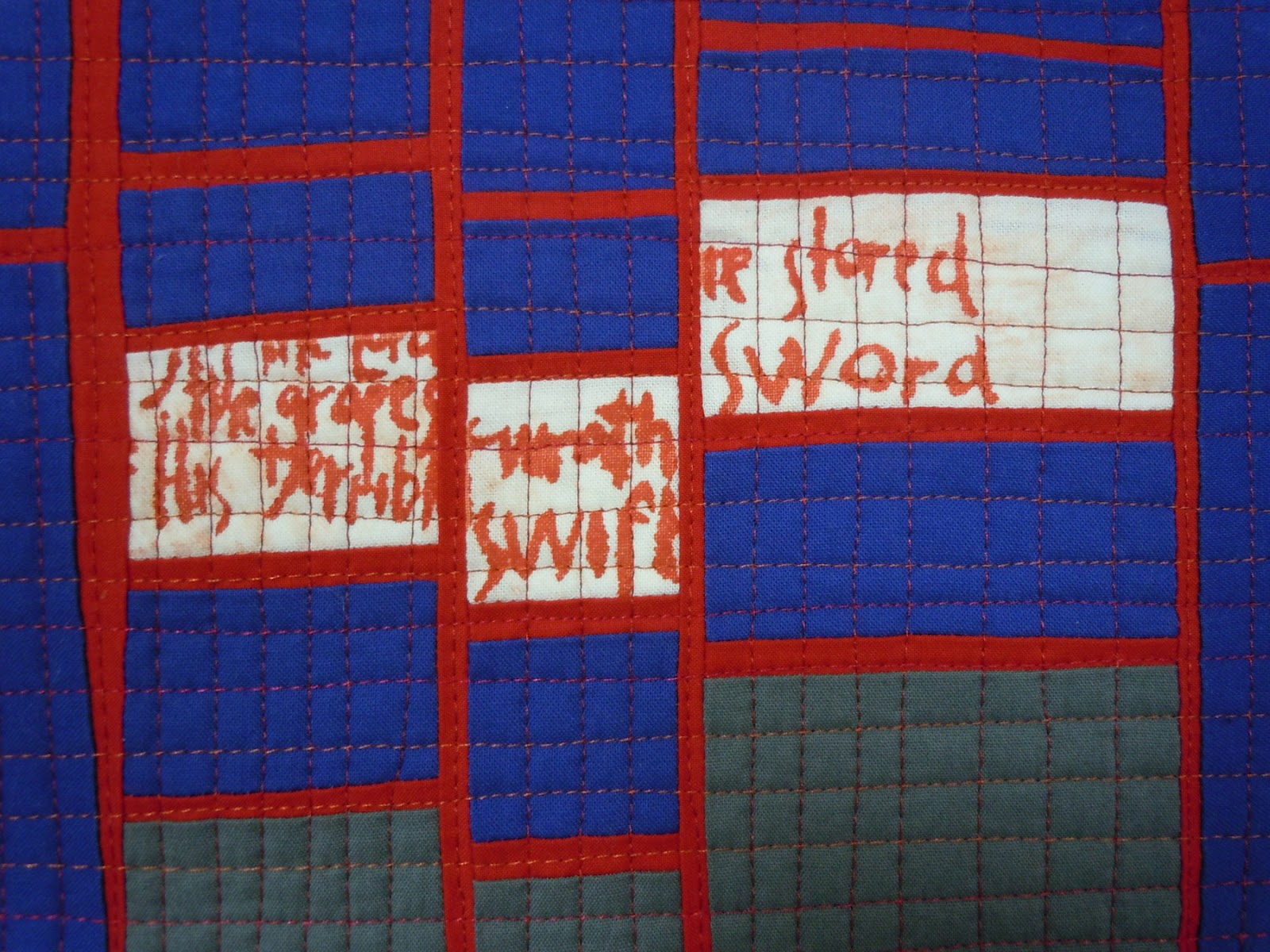
some text referencing the boundary waters
a lot of delicious texture.
As a viewer I found the closer look made the piece far more interesting, likable and expressive. From across the room, where it might have been a painting, it seemed ordinary; up close I found its character and its hidden treasures.
I've always liked art with hidden treasures -- bits of information that are not visible in the long view, that don't reveal themselves until you have looked for a while. I think they are little rewards to the viewer for giving the work a second or a third look. I love to find these little bits in the art I see in museums, and try to put these touches into my own work.
So the question is, do jurors deserve to see a hidden treasure or two as they evaluate work for shows? Or is that inappropriate, cheesy, low-end, too oriented to craft and not enough to art? Is there a different answer for quilts than for paintings or other mediums? I suspect most fiber artists would vote for details; I wonder whether painters have another opinion.
Tell me what you think.
This show, at the Carnegie Center for Art and History in New Albany IN, is in its ninth year and over the years has attracted most of the major quilt artists in the country. Although I helped organize this show and served as a juror for several years, I have not been involved in the last two shows except as a viewer and an award donor. In fact, I was out of the country and missed the opening of the show in January, and did not have a chance to visit until last week.
As I looked at the show, I asked myself whether seeing the detail was beneficial to me as a viewer, and tried to think whether it would have helped me as a juror. Here's the quilt that seemed to be the best case study for these thoughts:
Virginia Spiegel, Boundary Waters 53
Standing across the room (or looking at the full-view image) you don't really know what you're looking at. It could very easily be a painting.
(I have to apologize for my photo -- in person the work seemed a lot greener and richer than you see here, and no amount of fiddling with my photo program could get the image closer to what I remember as the real thing.)
If it were a painting, would you jury this piece into your painting show based on this image alone? If it were a quilt, would you jury it in to FNF based on this image alone? If you encountered it in person in a museum, would you stay on the far side of the room to look at it?
some text referencing the boundary waters
a lot of delicious texture.
I've always liked art with hidden treasures -- bits of information that are not visible in the long view, that don't reveal themselves until you have looked for a while. I think they are little rewards to the viewer for giving the work a second or a third look. I love to find these little bits in the art I see in museums, and try to put these touches into my own work.
So the question is, do jurors deserve to see a hidden treasure or two as they evaluate work for shows? Or is that inappropriate, cheesy, low-end, too oriented to craft and not enough to art? Is there a different answer for quilts than for paintings or other mediums? I suspect most fiber artists would vote for details; I wonder whether painters have another opinion.
Tell me what you think.
Wednesday, February 22, 2012
The juror thinks -- why worry about technique?
Earlier this week I wrote about my recent experience jurying a quilt/art show, and talked about what should be shown in the detail shot. Lisa Call responded with a great question: "Why are you looking at technique for an art show? Why does it matter how it is made? Painters don't submit detail images when they enter juried shows. Why not do away with the detail show requirement all together and judge the work solely on its artistic merit?"
I had to stop and think about it before I could figure out the answer. I did some research. Maybe they don't ask for details in painting shows, but when I looked back in my files at the last couple of all-medium museum shows that I have entered, one wanted detail shots and one didn't. Presumably painters would have submitted details too in that first show.
If Lisa is right that painters generally don't submit detail shots, I wonder why not. Having looked at bazillions of paintings in museums all over the world, I know that sometimes the up-close view of how the paint is applied makes a picture more interesting than I first thought when I saw it from across the room. Wouldn't jurors benefit from a closer look at such works, and wouldn't those painters' chances of getting into the show improve with a detail shot?
I think that artistic merit can be judged from across the room (aka full-view images) but when you look at it up close you can be seeing artistic merit as well. And we do scrutinize painters' techniques when we enjoy their art -- think Jackson Pollock's spatters vs. Gerhard Richter's mirror paintings vs. Jasper Johns' encaustics over newsprint, just to mention three that come to mind immediately.
But I don't want to talk about paintings, I want to talk about quilts, because the show I was jurying was limited to quilts.
As a juror, I cop to a lot of curiosity about how things are made (as opposed to how well). Before I start to evaluate a quilt's quality, I like to know what I'm looking at. I think this is a valid idea for a juror to entertain, because so many quilts that want to be art are so heavily influenced by technique, and certain techniques have almost become cliches. If so, whether or not the techniques are well executed is almost beside the point; more pertinent is whether the piece has some originality.
But OK, I also like to know about craftsmanship, which I think is what Lisa is questioning. I think the rules are different in quilt shows than in all-medium shows. I'm not talking about Quilt Police rules (although some of the most prestigious art quilt shows do impose rules that may seem a bit arbitrary) but the unwritten rules about what standards should apply in shows that see quilts as art.
I think much as we might like our work to be regarded solely as art, and even though some shows and organizations are dedicated to having quilts seen that way, we have not yet totally escaped the craft tradition of our medium. Yes, Tracey Emin or Louise Bourgeois can make a quilt that is welcome at the Tate Modern even though it may be baggy, lumpy, crudely sewed and downright sloppy in its execution. But that same quilt is probably not going to get past the first round of jurying at Quilt National (or any of the other serious art quilt shows -- I use QN as shorthand for the big leagues) .
To a certain extent that's a good thing. People who walk in the door to see Quilt National or Visions or a SAQA exhibit are probably expecting a high level of craftsmanship as a given, and then want to find artistic merit as well. Poor craftsmanship in these venues tends to reflect poorly on the whole field. Since I have seen many, many of Lisa Call's quilts in person, and know them to be meticulously crafted, I have to think that she values this quality as much as I do. We know that if we showed a quilt that was baggy, lumpy, etc. it would give many people an excuse to not like it; they would be so distracted by the poor execution that they might not even look at the artistic merit.
Lisa and I both know that we could choose to abandon the quilt circuit and attempt to show our work solely in all-medium venues, and if we did, maybe we wouldn't have to spend so damn much time at meticulous piecing and quilting because the greater art world doesn't know the difference or care. But having chosen to enter QN we know that good craft gives us extra points.
I think the moment when quilt shows decide that artistic merit is the only way to judge, and craft or technique means nothing, is the moment when we don't need quilt shows any more. What would be the point? We might as well go up against the paintings and the sculptures instead of restricting ourselves to the limited competition of quilts.
What do you think?
I had to stop and think about it before I could figure out the answer. I did some research. Maybe they don't ask for details in painting shows, but when I looked back in my files at the last couple of all-medium museum shows that I have entered, one wanted detail shots and one didn't. Presumably painters would have submitted details too in that first show.
If Lisa is right that painters generally don't submit detail shots, I wonder why not. Having looked at bazillions of paintings in museums all over the world, I know that sometimes the up-close view of how the paint is applied makes a picture more interesting than I first thought when I saw it from across the room. Wouldn't jurors benefit from a closer look at such works, and wouldn't those painters' chances of getting into the show improve with a detail shot?
I think that artistic merit can be judged from across the room (aka full-view images) but when you look at it up close you can be seeing artistic merit as well. And we do scrutinize painters' techniques when we enjoy their art -- think Jackson Pollock's spatters vs. Gerhard Richter's mirror paintings vs. Jasper Johns' encaustics over newsprint, just to mention three that come to mind immediately.
But I don't want to talk about paintings, I want to talk about quilts, because the show I was jurying was limited to quilts.
As a juror, I cop to a lot of curiosity about how things are made (as opposed to how well). Before I start to evaluate a quilt's quality, I like to know what I'm looking at. I think this is a valid idea for a juror to entertain, because so many quilts that want to be art are so heavily influenced by technique, and certain techniques have almost become cliches. If so, whether or not the techniques are well executed is almost beside the point; more pertinent is whether the piece has some originality.
But OK, I also like to know about craftsmanship, which I think is what Lisa is questioning. I think the rules are different in quilt shows than in all-medium shows. I'm not talking about Quilt Police rules (although some of the most prestigious art quilt shows do impose rules that may seem a bit arbitrary) but the unwritten rules about what standards should apply in shows that see quilts as art.
I think much as we might like our work to be regarded solely as art, and even though some shows and organizations are dedicated to having quilts seen that way, we have not yet totally escaped the craft tradition of our medium. Yes, Tracey Emin or Louise Bourgeois can make a quilt that is welcome at the Tate Modern even though it may be baggy, lumpy, crudely sewed and downright sloppy in its execution. But that same quilt is probably not going to get past the first round of jurying at Quilt National (or any of the other serious art quilt shows -- I use QN as shorthand for the big leagues) .
To a certain extent that's a good thing. People who walk in the door to see Quilt National or Visions or a SAQA exhibit are probably expecting a high level of craftsmanship as a given, and then want to find artistic merit as well. Poor craftsmanship in these venues tends to reflect poorly on the whole field. Since I have seen many, many of Lisa Call's quilts in person, and know them to be meticulously crafted, I have to think that she values this quality as much as I do. We know that if we showed a quilt that was baggy, lumpy, etc. it would give many people an excuse to not like it; they would be so distracted by the poor execution that they might not even look at the artistic merit.
Lisa and I both know that we could choose to abandon the quilt circuit and attempt to show our work solely in all-medium venues, and if we did, maybe we wouldn't have to spend so damn much time at meticulous piecing and quilting because the greater art world doesn't know the difference or care. But having chosen to enter QN we know that good craft gives us extra points.
I think the moment when quilt shows decide that artistic merit is the only way to judge, and craft or technique means nothing, is the moment when we don't need quilt shows any more. What would be the point? We might as well go up against the paintings and the sculptures instead of restricting ourselves to the limited competition of quilts.
What do you think?
Monday, February 20, 2012
Photography -- the juror speaks
I've railed in the past about juried shows where the jurors comment about the quality of photography, often more than they do about the nature and quality of the art. I've always felt cheated that instead of focusing on important issues, they lecture us on things that seem so bureaucratic and elementary. But last week I had the pleasant task of jurying a show and guess what -- I would like to comment on the photography.
But not the kinds of comments that I usually hear from jurors. I saw a quilt hanging from a tacky wood slat, an inch or two of it poking out from each side of the quilt. And that didn't bother me at all, because I am not so easily distracted that the sight of some wood made me unable to think about the quilt. I saw an image that was shot at an angle instead of head-on, so the right edge of the quilt receded away. That didn't bother me either, because I could see what I needed despite the bad photography. One of those quilts I chose, the other I rejected, and the photography had nothing to do with either decision. Even though you often hear jurors say that bad photography will instantly cause them to reject a piece, I want to evaluate the art, not the photography.
I also told the organizers, back last summer when we were first discussing the show, to save their money and not hire a service to make sure the color profiles were as accurate as possible. I'm not even sure what that means or how it's done, but I was pretty sure it would be wasted. I think good design is apparent no matter whether the quilt is more turquoise or more green, and accurate color won't save a bad design. I suppose it's possible that I'll show up at the museum in April and be surprised that a certain quilt is a lot redder or bluer than I had expected, but I have a hard time thinking that I would regret my decision simply because of that fact.
What did bother me, and what I want to put into your minds for consideration as you get ready to enter shows, was the fact that many of the detail shots didn't show enough detail.
Jurors look at detail shots for one reason only: because we want to know more about how the quilt was constructed, and to get clues about craftsmanship. We generally don't bother even looking at the detail unless we like the quilt in the first place, or at least haven't yet decided to reject it. Questions that cause us to go to the detail might be:
-- Were those white bits done with embroidery, or paint, or bleach, or applique?
-- How densely is it stitched or quilted?
-- Is that raw-edge applique, or needle-turned, or sewed down with a zigzag stitch?
-- What are those little circles that seem to be 3-D?
-- How is that writing put on -- pen, embroidery, other?
-- Are those little squares pieced, or fused, or printed out?
-- This looks kind of baggy and wrinkly at the bottom -- is it really?
But too many times last week, when I went to the detail shots I couldn't answer the questions. I would zoom in farther and farther, and lean closer and closer to the screen, until the image went out of focus and I still hadn't figured out what kind of stitching held it together. Once I got up to 375% zoom in search of an answer (unsuccessful).
I was unhappy to see two or three quilts where the detail shot was practically as big as the full view -- in one case, it included about 80 percent of the entire width of the quilt! With that small reduction in field, you can barely tell the difference between the two views. Why even bother to submit a detail?
So here's my advice: think for a minute about the kinds of questions that a juror might have upon looking at the full view of your quilt. What's intriguing? What's confusing? What's really special that you can't see in the overall shot? If the quilt were there in the flesh, what parts would you want the juror to go up really close and scrutinize? What's going to make the juror say WOW? Than frame your detail shot to answer as many of those questions as you can, especially the most important one, whichever that is.
Please think about it the next time you send in an entry.
Here's a detail shot that covers about four by six inches of the quilt. You can see the piecing, the quilting and the screenprinted text.
Here's one that covers about five by seven, close enough to see what the grid is made of and how the buttons were stitched to it.
Here's one that shows only about three by four inches, close enough to show the density of stitching and the frayed edges, and how the stitched squares are sewed together.
But not the kinds of comments that I usually hear from jurors. I saw a quilt hanging from a tacky wood slat, an inch or two of it poking out from each side of the quilt. And that didn't bother me at all, because I am not so easily distracted that the sight of some wood made me unable to think about the quilt. I saw an image that was shot at an angle instead of head-on, so the right edge of the quilt receded away. That didn't bother me either, because I could see what I needed despite the bad photography. One of those quilts I chose, the other I rejected, and the photography had nothing to do with either decision. Even though you often hear jurors say that bad photography will instantly cause them to reject a piece, I want to evaluate the art, not the photography.
I also told the organizers, back last summer when we were first discussing the show, to save their money and not hire a service to make sure the color profiles were as accurate as possible. I'm not even sure what that means or how it's done, but I was pretty sure it would be wasted. I think good design is apparent no matter whether the quilt is more turquoise or more green, and accurate color won't save a bad design. I suppose it's possible that I'll show up at the museum in April and be surprised that a certain quilt is a lot redder or bluer than I had expected, but I have a hard time thinking that I would regret my decision simply because of that fact.
What did bother me, and what I want to put into your minds for consideration as you get ready to enter shows, was the fact that many of the detail shots didn't show enough detail.
Jurors look at detail shots for one reason only: because we want to know more about how the quilt was constructed, and to get clues about craftsmanship. We generally don't bother even looking at the detail unless we like the quilt in the first place, or at least haven't yet decided to reject it. Questions that cause us to go to the detail might be:
-- Were those white bits done with embroidery, or paint, or bleach, or applique?
-- How densely is it stitched or quilted?
-- Is that raw-edge applique, or needle-turned, or sewed down with a zigzag stitch?
-- What are those little circles that seem to be 3-D?
-- How is that writing put on -- pen, embroidery, other?
-- Are those little squares pieced, or fused, or printed out?
-- This looks kind of baggy and wrinkly at the bottom -- is it really?
But too many times last week, when I went to the detail shots I couldn't answer the questions. I would zoom in farther and farther, and lean closer and closer to the screen, until the image went out of focus and I still hadn't figured out what kind of stitching held it together. Once I got up to 375% zoom in search of an answer (unsuccessful).
I was unhappy to see two or three quilts where the detail shot was practically as big as the full view -- in one case, it included about 80 percent of the entire width of the quilt! With that small reduction in field, you can barely tell the difference between the two views. Why even bother to submit a detail?
So here's my advice: think for a minute about the kinds of questions that a juror might have upon looking at the full view of your quilt. What's intriguing? What's confusing? What's really special that you can't see in the overall shot? If the quilt were there in the flesh, what parts would you want the juror to go up really close and scrutinize? What's going to make the juror say WOW? Than frame your detail shot to answer as many of those questions as you can, especially the most important one, whichever that is.
Please think about it the next time you send in an entry.
Here's one that covers about five by seven, close enough to see what the grid is made of and how the buttons were stitched to it.
Here's one that shows only about three by four inches, close enough to show the density of stitching and the frayed edges, and how the stitched squares are sewed together.
Sunday, February 19, 2012
Photo suite 8 -- color diptychs
I have always been drawn to diptychs, compositions with two halves. I like to find these compositions in life with the aid of close focus.
Subscribe to:
Posts (Atom)