
But not the kinds of comments that I usually hear from jurors. I saw a quilt hanging from a tacky wood slat, an inch or two of it poking out from each side of the quilt. And that didn't bother me at all, because I am not so easily distracted that the sight of some wood made me unable to think about the quilt. I saw an image that was shot at an angle instead of head-on, so the right edge of the quilt receded away. That didn't bother me either, because I could see what I needed despite the bad photography. One of those quilts I chose, the other I rejected, and the photography had nothing to do with either decision. Even though you often hear jurors say that bad photography will instantly cause them to reject a piece, I want to evaluate the art, not the photography.
I also told the organizers, back last summer when we were first discussing the show, to save their money and not hire a service to make sure the color profiles were as accurate as possible. I'm not even sure what that means or how it's done, but I was pretty sure it would be wasted. I think good design is apparent no matter whether the quilt is more turquoise or more green, and accurate color won't save a bad design. I suppose it's possible that I'll show up at the museum in April and be surprised that a certain quilt is a lot redder or bluer than I had expected, but I have a hard time thinking that I would regret my decision simply because of that fact.
What did bother me, and what I want to put into your minds for consideration as you get ready to enter shows, was the fact that many of the detail shots didn't show enough detail.
Jurors look at detail shots for one reason only: because we want to know more about how the quilt was constructed, and to get clues about craftsmanship. We generally don't bother even looking at the detail unless we like the quilt in the first place, or at least haven't yet decided to reject it. Questions that cause us to go to the detail might be:
-- Were those white bits done with embroidery, or paint, or bleach, or applique?
-- How densely is it stitched or quilted?
-- Is that raw-edge applique, or needle-turned, or sewed down with a zigzag stitch?
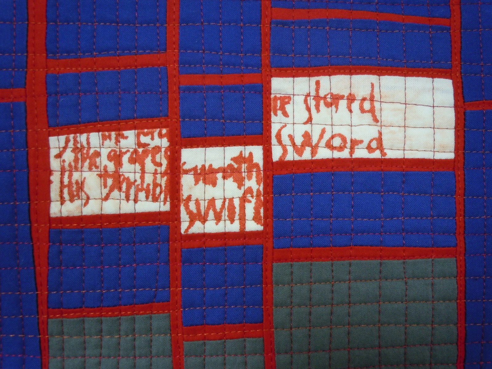
-- What are those little circles that seem to be 3-D?
-- How is that writing put on -- pen, embroidery, other?
-- Are those little squares pieced, or fused, or printed out?
-- This looks kind of baggy and wrinkly at the bottom -- is it really?
But too many times last week, when I went to the detail shots I couldn't answer the questions. I would zoom in farther and farther, and lean closer and closer to the screen, until the image went out of focus and I still hadn't figured out what kind of stitching held it together. Once I got up to 375% zoom in search of an answer (unsuccessful).
I was unhappy to see two or three quilts where the detail shot was practically as big as the full view -- in one case, it included about 80 percent of the entire width of the quilt! With that small reduction in field, you can barely tell the difference between the two views. Why even bother to submit a detail?
So here's my advice: think for a minute about the kinds of questions that a juror might have upon looking at the full view of your quilt. What's intriguing? What's confusing? What's really special that you can't see in the overall shot? If the quilt were there in the flesh, what parts would you want the juror to go up really close and scrutinize? What's going to make the juror say WOW? Than frame your detail shot to answer as many of those questions as you can, especially the most important one, whichever that is.
Please think about it the next time you send in an entry.


This is really helpful information, Kathy. Thanks for sharing from a juror's perspective.
ReplyDeleteI immediately looked at some of my recent detail shots! Thanks for telling us what the jurors want to see.
ReplyDeleteKathy,
ReplyDeleteTo play devil's advocate here, why are you looking at technique for an art show? Why does it matter how it is made?
Painters don't submit detail images when they enter juried shows.
Why not do away with the detail show requirement all together and judge the work solely on it's artistic merit?
Lisa -- that's a very provocative question and I would like to think about it a bit before responding. Stay tuned.
ReplyDeleteThank goodness I have finally done something right - I always wondered - just how close should a detail shot be. I decided it should show stitches/beads/seams etc. I think if the workmanship was poor I would be disappointed as a viewer in any type of art show also.
ReplyDeleteIndeed it is. I'm looking forward to your thoughts. I'm thinking about why my answer might be :)
ReplyDelete