I'm sorry that my hometown quilt show, "Form, Not Function: Quilt Art at the Carnegie" closed last week so my posts don't have a chance of luring you to see it. Because of travel and illness I wasn't able to see the show until late in its run but still wanted to share some more of the quilts that I liked.
Martha Hall, Double Talk
Anybody who likes pieced quilts has already had the fleeting thought, upon seeing the Quick Response codes, "that looks kind of like a quilt!" You can't look at these intricate compositions of squares and rectangles without thinking of how easy it would be to translate them into quilts.
And many people have already translated those fleeting thoughts into quilts. Some have done a much better job of it than others, and I award my personal prize to Martha Hall as the best QR quilt I've ever seen. It will be hard for anybody else to top this one.
First, because she's translated the black and white code into a lovely color palette. Second, because she has cleverly incorporated a bunch of smaller QR arrays into her larger composition which you can't see till you get up close. (I love details that are revealed at close viewing.)
Third, because her quilting complements the design well, evoking circuits and connections.
Fourth, because there's a secret -- if you use your fancyfone to read each of the little QRs, they give you a bunch of "QR" phrases.
And finally, though I know it's gauche to admit it, I give extra points to quilts that are technically correct. (Guess that makes me #14, a Qualified Rube.) This one lies perfectly flat on the wall, and the complex piecing never loses its straight lines and square corners, which is a lot harder than it looks.
Martha, thanks for making a quilt that gave me a great deal of pleasure to look at!
Wednesday, March 7, 2012
Monday, March 5, 2012
Collaboration project 10 -- an update
I wrote last year about a collaboration with photographer Keith Auerbach, who made beautiful designs starting with a scanned image of one of my little sew-off squares. I said at the time that as collaborations go, this wasn't at all a balanced meal. I did 1 percent of the work, he did 99 percent. But I resolved to have a second act in which I would have a better showing.
So here it is.
After scanning and playing with the sew-off images, Keith played with some other images as well. One of his results struck me as being particularly amenable to a pieced quilt, because of the graphic stripes in the center panels.
So here's what I came up with:
I don't think this is a great work of art; in fact I will probably never finish it, let alone show it in public. But I am excited about some things I learned in making it.
Most notable was the striking effect of the striped panels, exactly what drew me to the image in the first place. They were indeed amenable to being executed in fabric. Yes, everything is pieced (since you can't buy striped fabrics these days).
But the parts I liked best about the little quilt were not the plain striped panels but the complex areas where diagonal cuts of stripes were juxtaposed with others -- for instance, at the left margin just below center, or to the left of the red pyramids.
The stripes vibrate all over, as in the old Op Art paintings, but especially at the places where the regular pattern is interrupted. I'm going to make more work with stripes, and explore what happens with different patterns and color combinations.
What else did I learn? That a judicious bit of commercial print fabric can enliven an austere array of pieced solids. I've gotten so far away from commercial prints in the last several years that it took a fair bit of courage for me to incorporate the red into this piece, but I think it worked nicely. I'll try to keep an open mind in the future for similar opportunities.
And finally, that my beloved Kona cotton solids, which I have used exclusively for almost ten years, have some bad habits that I may not be able to live with in making more quilts like this. Kona is a beefy fabric but not tightly woven. Those qualities endear themselves to me, because it's a forgiving cloth; you can rip out mistakes, in either the piecing or the quilting, without leaving holes, as you get in Pimatex or other broadcloths.
But the downside of not-tightly-woven is that cut edges fray easily, leaving nasty little threads out in the middle of the pieced areas. Which creates no problems if your colors are darker, but every little thread shows through to the front in a pale yellow or white fabric. In this photo it's not Kona that's fraying, but you can see what a mess you can end up with. In my striped study, the dark Konas didn't fray anywhere near this badly, but enough stray threads did escape that it would have taken a full day to get the piece ready for show quality. Call that a full week to get a full-size quilt ready, time I would be very crabby about spending.
So if I make more high-contrast stripes with white or other pale colors, I will either have to seek out another fabric, or figure out a way to keep the Kona in check. I'll keep you posted.
Meanwhile, thanks again to Keith for letting me use his photo as inspiration. I got plenty out of this collaboration and suspect I will get lots more before it's over.
So here it is.
After scanning and playing with the sew-off images, Keith played with some other images as well. One of his results struck me as being particularly amenable to a pieced quilt, because of the graphic stripes in the center panels.
So here's what I came up with:
I don't think this is a great work of art; in fact I will probably never finish it, let alone show it in public. But I am excited about some things I learned in making it.
Most notable was the striking effect of the striped panels, exactly what drew me to the image in the first place. They were indeed amenable to being executed in fabric. Yes, everything is pieced (since you can't buy striped fabrics these days).
But the parts I liked best about the little quilt were not the plain striped panels but the complex areas where diagonal cuts of stripes were juxtaposed with others -- for instance, at the left margin just below center, or to the left of the red pyramids.
The stripes vibrate all over, as in the old Op Art paintings, but especially at the places where the regular pattern is interrupted. I'm going to make more work with stripes, and explore what happens with different patterns and color combinations.
What else did I learn? That a judicious bit of commercial print fabric can enliven an austere array of pieced solids. I've gotten so far away from commercial prints in the last several years that it took a fair bit of courage for me to incorporate the red into this piece, but I think it worked nicely. I'll try to keep an open mind in the future for similar opportunities.
And finally, that my beloved Kona cotton solids, which I have used exclusively for almost ten years, have some bad habits that I may not be able to live with in making more quilts like this. Kona is a beefy fabric but not tightly woven. Those qualities endear themselves to me, because it's a forgiving cloth; you can rip out mistakes, in either the piecing or the quilting, without leaving holes, as you get in Pimatex or other broadcloths.
But the downside of not-tightly-woven is that cut edges fray easily, leaving nasty little threads out in the middle of the pieced areas. Which creates no problems if your colors are darker, but every little thread shows through to the front in a pale yellow or white fabric. In this photo it's not Kona that's fraying, but you can see what a mess you can end up with. In my striped study, the dark Konas didn't fray anywhere near this badly, but enough stray threads did escape that it would have taken a full day to get the piece ready for show quality. Call that a full week to get a full-size quilt ready, time I would be very crabby about spending.
So if I make more high-contrast stripes with white or other pale colors, I will either have to seek out another fabric, or figure out a way to keep the Kona in check. I'll keep you posted.
Meanwhile, thanks again to Keith for letting me use his photo as inspiration. I got plenty out of this collaboration and suspect I will get lots more before it's over.
Sunday, March 4, 2012
Friday, March 2, 2012
Back in the jury box again
I'm going to be a juror again -- this time for a show where we earnestly solicit your entries! It's the second year for Textiles in a Tube, sponsored by Greenville Technical College in Greenville SC. It will be on display in the college's classy Riverworks Gallery in the city's art district, June 1 - July 15.
There's a gimmick -- all art must arrive at the gallery in a 3 x 36" mailing tube. But that should only jumpstart your creativity! For instance, here's the best in show from last year's exhibit:
Shelley Brenner Baird, A Long Story, 2" x 468", detail below
It's a little accordion-fold book/quilt that when unfolded stretches across the whole wall. She did fit it all into a tube, along with the velcro strip that had to be affixed to the wall to hold it up. See the whole work at Shelley's website here.

If you're intrigued by the challenge, check it out here. Entry deadline is May 4.
There's a gimmick -- all art must arrive at the gallery in a 3 x 36" mailing tube. But that should only jumpstart your creativity! For instance, here's the best in show from last year's exhibit:
Shelley Brenner Baird, A Long Story, 2" x 468", detail below
It's a little accordion-fold book/quilt that when unfolded stretches across the whole wall. She did fit it all into a tube, along with the velcro strip that had to be affixed to the wall to hold it up. See the whole work at Shelley's website here.
If you're intrigued by the challenge, check it out here. Entry deadline is May 4.
Wednesday, February 29, 2012
Recurring roots
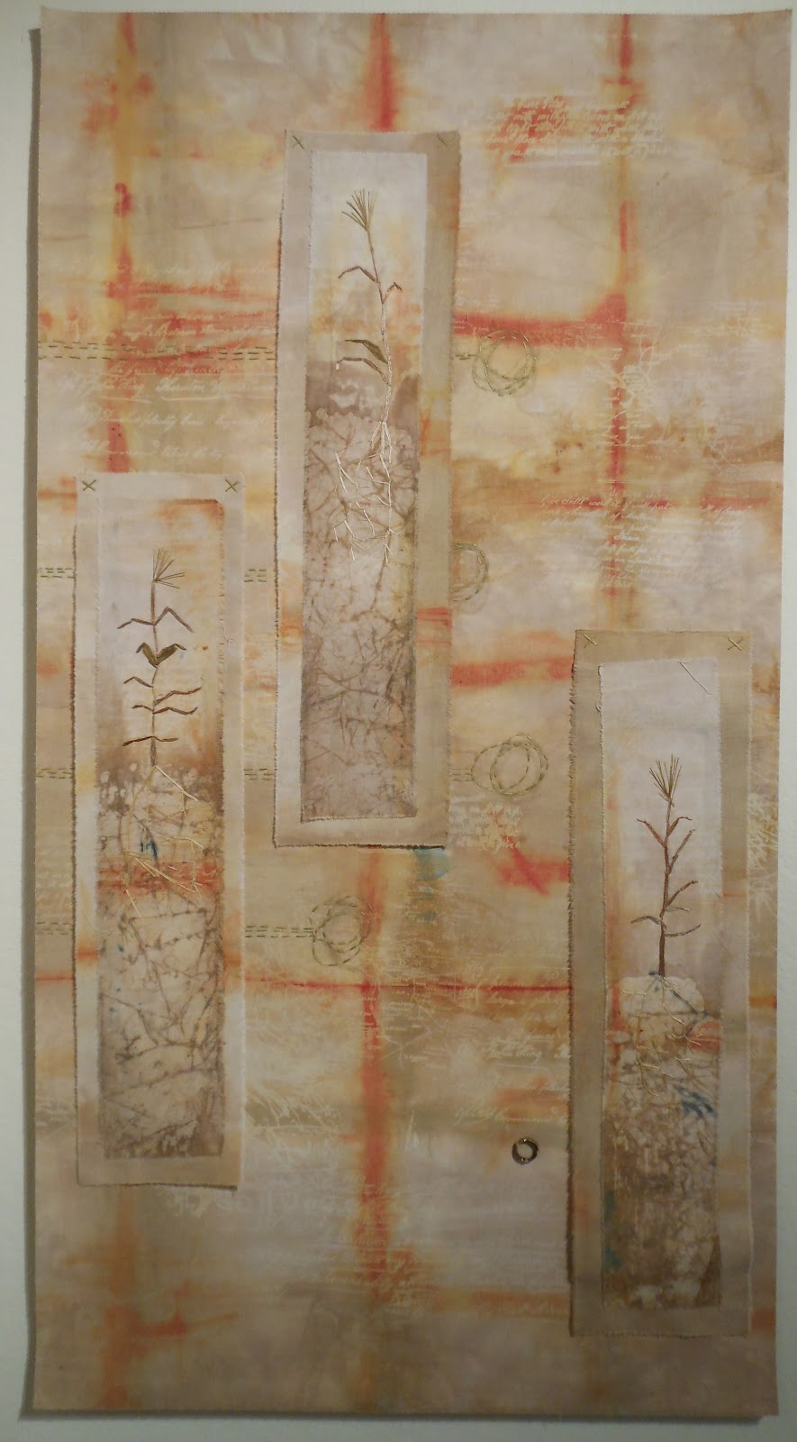
I wrote earlier this week about recurring motifs in the work of embroiderer Tom Lundberg. Coincidentally, I saw another exhibit recently by three fiber artists who also explored recurring motifs. The artists are Pat DaRif, Joanne Weis and Valerie White and their show, "Rooted in the Earth," is up at the Huff Gallery at Spalding University, Louisville KY through April 8.
I've seen and participated in group shows with themes, and they're not always successful. It often seems that people have taken great liberties in trying to fit the theme to their work, sometimes extending only as far as the title. But this trio of artists have produced remarkably cohesive bodies of work that fit the "roots" theme well and, even better, fit with each other.
Note in the photos the many different ways that the three artists have depicted roots.
Valerie White, Righteous Roots, detail below
Valerie White, Refuge, detail below
Pat DaRif, Mangrove VI, detail below
Pat DaRif, Ollie and Maud: Rooted in the Earth, detail below
Joanne Weis, Early Settlers (Floyd's Fork), detail below
Joanne Weis, Goldenrod (Floyd's Fork), detail
I've seen and participated in group shows with themes, and they're not always successful. It often seems that people have taken great liberties in trying to fit the theme to their work, sometimes extending only as far as the title. But this trio of artists have produced remarkably cohesive bodies of work that fit the "roots" theme well and, even better, fit with each other.
Note in the photos the many different ways that the three artists have depicted roots.
Valerie White, Righteous Roots, detail below
Valerie White, Refuge, detail below
Pat DaRif, Mangrove VI, detail below
Pat DaRif, Ollie and Maud: Rooted in the Earth, detail below
Joanne Weis, Early Settlers (Floyd's Fork), detail below
Joanne Weis, Goldenrod (Floyd's Fork), detail
Monday, February 27, 2012
Master of stitching -- Tom Lundberg
Last week Tom Lundberg, whose embroideries I've seen in many books but never in the flesh, was in town as a visiting teacher at the University of Louisville School of Art. In addition, the school has an exhibit of his work, and he gave a lecture.
Lundberg describes his work as "small-scale narrative embroideries" but the narrative is often difficult for the viewer to discern. Often the imagery suggests stars, planets, space and sky. In the lecture, he shed some light on a few of his favorite recurring motifs such as the foot and the sandal. The footprint, he said, is a portal into a new space; the sandal brings to mind taking one step on the way to change.
Tom Lundberg, Change of Plans, 2002, 9.75 x 3.75"
Tom Lundberg, Fire Walking, 2002,
9 5/8 x 4"
I am always intrigued by the recurring images that many artists use in their work. Something strikes a chord, and then before you know it, it comes back again and again.
Tom Lundberg, Summer Vortex, 1997, 6.25 x 6"
Tom Lundberg, Back Yard Step, 1994, 5.5 x 6"
Tom Lundberg, Zori Pocket, 2000, 5.5 x 4.75"
Lundberg said that over the years he has realized that "my home base is a really small space." Most of his embroideries are about the size of an outstretched hand and many are shaped like pockets, cuffs and other clothing elements. On a few occasions when he has tried to work larger, he often is dissatisfied and cuts the work into smaller pieces.
All his work is hand-stitched, very densely so no glimpse of the background fabric is visible. Interestingly, Lundberg's visit was part of an ongoing program for three-dimensional artists, and he said he was delighted to realize that his work, barely a quarter-inch thick, could be classified as 3-D.
The show will be on display through March 25.
Lundberg describes his work as "small-scale narrative embroideries" but the narrative is often difficult for the viewer to discern. Often the imagery suggests stars, planets, space and sky. In the lecture, he shed some light on a few of his favorite recurring motifs such as the foot and the sandal. The footprint, he said, is a portal into a new space; the sandal brings to mind taking one step on the way to change.
Tom Lundberg, Change of Plans, 2002, 9.75 x 3.75"
Tom Lundberg, Fire Walking, 2002,
9 5/8 x 4"
I am always intrigued by the recurring images that many artists use in their work. Something strikes a chord, and then before you know it, it comes back again and again.
Tom Lundberg, Summer Vortex, 1997, 6.25 x 6"
Tom Lundberg, Back Yard Step, 1994, 5.5 x 6"
Tom Lundberg, Zori Pocket, 2000, 5.5 x 4.75"
Lundberg said that over the years he has realized that "my home base is a really small space." Most of his embroideries are about the size of an outstretched hand and many are shaped like pockets, cuffs and other clothing elements. On a few occasions when he has tried to work larger, he often is dissatisfied and cuts the work into smaller pieces.
All his work is hand-stitched, very densely so no glimpse of the background fabric is visible. Interestingly, Lundberg's visit was part of an ongoing program for three-dimensional artists, and he said he was delighted to realize that his work, barely a quarter-inch thick, could be classified as 3-D.
The show will be on display through March 25.
Subscribe to:
Posts (Atom)