Monday, April 30, 2018
A quilt show that I'd like to see
Catching up on my digital reading for the week, I finally got to read a review from Hyperallergic about a show of quilts at the Baltimore Museum of Art. They're made by Stephen Towns, a black artist who turned from his customary painting practice to make a series of ten quilts depicting scenes from the slavery era. In particular, most of the quilts focus on Nat Turner, who led an unsuccessful slave rebellion in 1831.
Stephen Towns, Birth of a Nation
I was impressed that the review avoided almost all of the cliches that sadly show up in so many critical discussions of quilts as art. The reviewer did not make a big deal out of Towns being a man in the predominantly female world of quilting. There was no mention of these quilts not looking like grandma's quilts. There was no flogging of the fake history that quilts were used to mark the route of the Underground Railroad.
I was also impressed that Towns apparently made the quilts himself by hand -- the review talks about his bleeding fingers -- instead of farming the work out to his mom. I liked the fact that he ransacked his parents' home for scraps from clothing made by his mother and sisters. Most of all, I was impressed that these quilts were hung in a mainstream art museum.
If you're in the vicinity of Baltimore, you might want to check it out; the show will be up through September 2. And I can testify that the rest of that museum is pretty wonderful too.
Sunday, April 29, 2018
Thursday, April 26, 2018
Spell check strikes again
I've never been a big fan of spell check because spell check can't think. As long as a word is in the dictionary it's OK with spell check, even if it's the rung worm. People neglect to proofread their own work because after all, they ran spell check! And I particularly hate spell check with autocorrect because -- well, you know why.
But when I was getting ready to send a new book off to Blurb for printing, I allowed the spell check to run just in case.
This is a spell check that suggests alternatives for the words it doesn't like. It didn't like "artwithaneedle," which was understandable. But I was surprised to see what it suggested instead:
(In case you can't read it, spell check suggested that I change it to "trichloroethane.")
Tuesday, April 24, 2018
Daily art report 5 -- maps of the USA
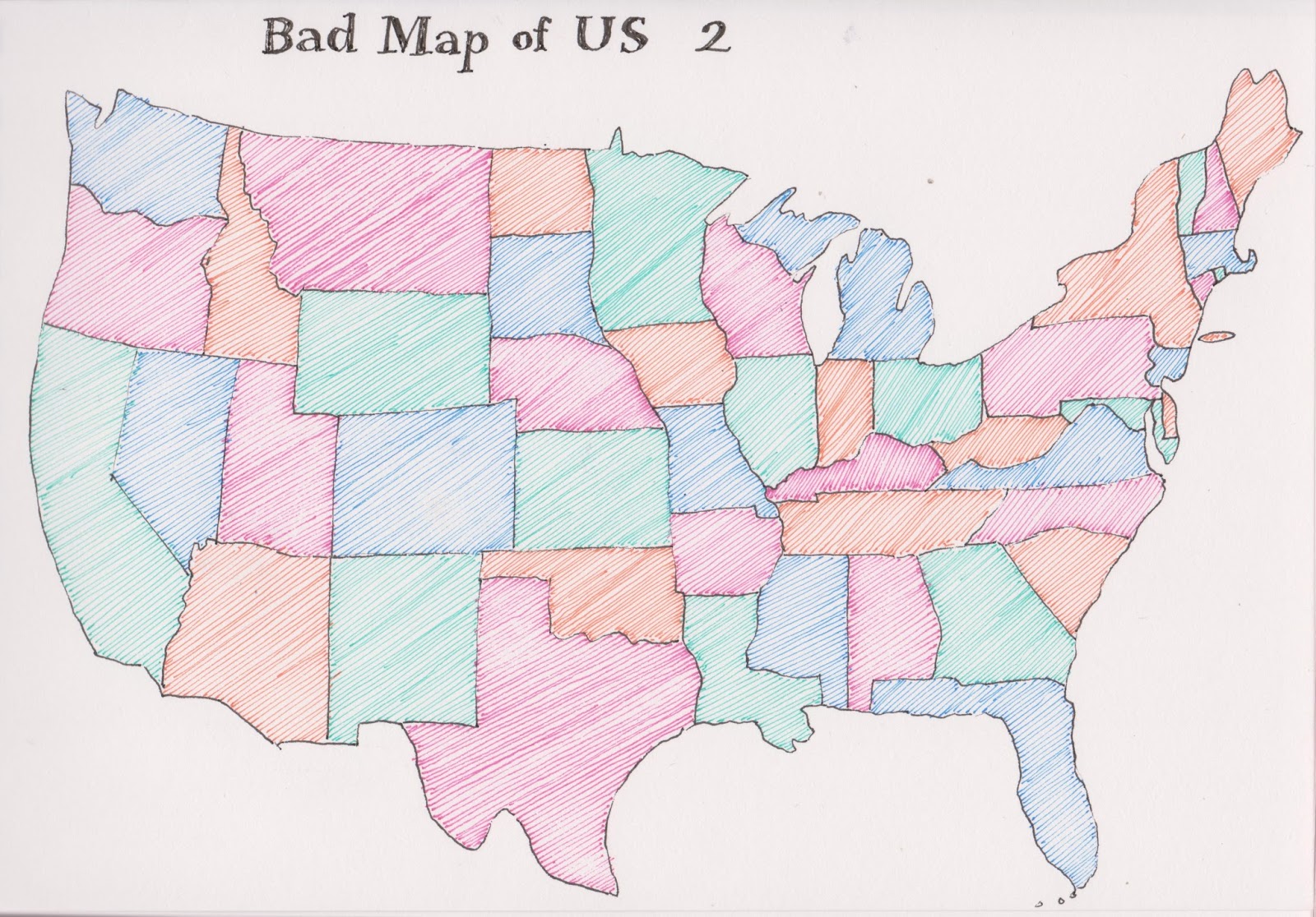
Recently I started a challenge to myself in my daily map project, having to do with the map of the United States. What is more familiar to us than that map -- we see it every day in the weather report, not to mention on schoolroom walls, in textbooks, in road atlases, and who knows where else. But I bet few of us know it so well that we can draw it without a cheat sheet.
I decided a map of the lower 48 would fit nicely on the page of my sketchbook, so I set out to draw it. I have been working quite a bit with copying maps from books, and enjoy trying to make good replicas by eye. I decided it would be a good challenge even if I had a map to copy from, so I tore out the weather map, which had the outlines of the states, and set to drawing.
And I should mention that I draw in ink, a deliberate choice of medium that encourages you to get it right the first time. (I love the ink lines; pencil seems too tentative, too faint.)
The outer perimeter of the map turned out pretty accurate, especially the Great Lakes. But when I started filling in the states I ran into difficulties. I would start from one corner and start to draw states, and maybe start again from another corner, but when it was time to meet in the center things didn't work out all that well.
Arizona and New Mexico ended up twice their real size, while Montana was half its real size. Texas ended up with an interesting northern edge, Tennessee was just downright strange and you can't find Delaware at all.
So I decided to do it again the next day.
This time things turned out better; I was careful to get Arkansas where it belongs. New York, West Virginia and the Dakotas flunked the shape test, but Maryland and Delaware were a whole lot better.
I was so excited with this exercise that I wanted to do it every day. Only problem: it took me two hours to draw the map and color it in. That's more time than I'm willing to devote to daily art, so I'll have to wait for days when I'm sitting around a table all afternoon talking and drawing.
If I do the map often enough, maybe I can achieve two goals by the end of the year: to be able to draw a stunningly accurate map while consulting a real map, all the states having their proper shapes and sizes; and to be able to draw an accurate map without consulting a real map. I think those are two separate skills and it would be nice to get them both.
The next week I decided to draw the outline of the United States while consulting my cheat sheet, but try to fill in the states from memory. This was such a spectacular failure that I drew over it again and again, trying to get a bit closer. Still need a bit of work on those skills.
Sunday, April 22, 2018
Friday, April 20, 2018
Women / Impressionism 6
One last post from the exhibit at the Speed Museum.
Whenever my friend Marti and I go to a museum we play a game at the end: which piece do you want to take home with you? It requires us to take one last walkabout, reminding ourselves of everything we've seen, and to discuss why this one is our favorite. (It's an exercise that I recommend to any serious art viewer, making sure that you haven't just looked without seeing and thinking.)
Here's Marti's favorite, which we both thought screamed "Vermeer" for its gorgeous light coming in from the side window.
Anna Ancher, Young Woman Arranging Flowers, ~1885
It struck me that hardly any of the paintings showed those classic Impressionist subjects of landscape or still life. Those have always been my favorite Inpressionist genres, and I had a hard time choosing my favorite from the few possibilities.
Fanny Churberg, Waterfall, 1877
This artist got no respect from the Finnish art world: they called her paintings "strange" and "abnormalities." Unsurprisingly, she gave up painting.
Marie Cazin, Evening, 1884-88
The dramatic smoke plume made me think of all those paintings of trains, especially inside the huge open-air railroad stations.
Helene Schjerfbeck, The Door, 1884
Anna Bilinska-Bohdanowicz, Unter den Linden in Berlin, 1890
This was my favorite, reminiscent of all the Childe Hassam paintings of New York street scenes with flags flying. I loved the way the precise detail of the architecture dissolved into hazy radiance.
Well, maybe not my absolute favorite -- how about a tie between that one and this beautiful still life of pink satin shoes. Not only do I love the painting, I sure wish I had a pair of shoes just like it.
And that's all, folks! You still have a couple of weeks to see the exhibit, "Women Artists in the Age of Impressionism," which closes May 13. As the Michelin Guide says, it's worth a detour. Maybe even worth a trip.
Subscribe to:
Posts (Atom)