I wrote last week about sending a new self-publishing project off to the printer, using the Blurb service. Although I get laughs over Blurb's spellcheck, I mostly admire their platform and its ease of use; same with Snapfish, another service that I have used several times. In both cases you choose a format and up pops a template for you to work with. It shows the dimensions of the page, with a pink line around the margins to show where you don't dare put anything because it's too close to the edge. If you have chosen a format with information that has to go in a certain place -- for instance, if you're making a calendar, the grid goes HERE and your photos go THERE -- that's obvious on the screen.
Coincidentally, while I was working on Blurb for project 1, I was also working on project 2, the postcard for my solo show, opening in late October. I needed a supplier who would not only print the card but mail it so I went with Modern Postcard. I went to the website and downloaded the template for a postcard. But wait -- it was a zip file and I don't have an unzip program on my computer.
Plan B was to just find a schematic for how a postcard has to be laid out. Postal regulations are very picky about where you have to put the mailing permit into, where you have to put the address, which areas you have to keep blank for the bar code. I sort of knew about all that; I didn't know that there are also large areas that must be kept free of any state abbreviation or zip code lest the optical reading devices at the post office get confused.
Surely there would be a diagram somewhere on the Modern Postcard site that would show me these specs. And after only ten or eleven clicks I did find one -- but it was so small and blurry that I couldn't read it.
I had to run the video and pause it when the diagram came on screen; fortunately that wasn't quite so blurry so I could read and copy down the dimensions.
Now into Photoshop Elements to set up the postcard -- I made myself a little template marking off the no-fly zones.
Then I put in all the info in the space that was left, and I was all set. And it only took 15 clicks around the Modern Postcard site to get me there.
All the while I kept thinking how much more difficult this was than project 1, which was proceeding at the same time. If Modern Postcard had a user interface like Blurb or Snapfish, I would have just gone to their site, chosen "4.25 x 6" postcard," and up would have popped an interactive screen onto which I could have drawn text boxes and typed into them, drawn photo boxes and flowed images into them, and moved things around until I was happy.
This is not to trash Modern Postcard -- I've used them in the past and been happy with their quality, and get this, I even have a personal representative, based in the same hemisphere as me, who calls me on the phone and responds to my emails within minutes! After I hit the SEND button on this project, I told her that I wished they would take a look at Blurb and Snapfish and maybe put in something like that instead of what they have.
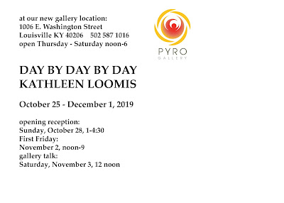
Anyway, here's what I came up with:
If you're going to be anywhere near Louisville during the month of November, I hope you'll drop by and see my show!


It is frustrating when the format you are expecting is not what you are given. There are plenty of free programs that unzip files for you, but that wouldn't work if you prefer an online interface. I like Snapfish too, and Shutterfly is equally good. I haven't used Blurb yet but I did want to print out my blog at some point using their service.
ReplyDeleteWish I could see your show. Hope it is well attended--a treat for those who see it.
ReplyDelete