Sunday, January 31, 2016
Thursday, January 28, 2016
Another fabric collage
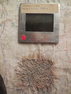
I was in the mood to do fabric collage this week as a respite between bouts of quilting. This one was inspired by a piece of weaving that I acquired in the grab bag at my local textile art group. It's a fairly unfortunate piece of weaving -- a bit motheaten in the middle, not very firmly woven and scraggly where the yellow yarn was inlaid into the red. Apparently its maker saw how things were going and cut it off the loom in despair; it has two-inch warp threads flopping off the top and ten-inch warp threads tied in an overhand knot at the bottom.
Some years ago when Baer's, our wonderful old-fashioned fabric store, went out of business, I scored several garbage bags full of upholstery and notion sample books in a grab bag. Somebody else got to them first and cut out all the actual samples, then gave me the cardboard books, which were what I wanted in the first place. They make fabulous supports for collage, firm enough not to buckle under wet adhesives, big enough for large compositions, rigid enough to stand up by themselves.
I used a sample book as the base for my collage, covered it in a map and put a layer of cheesecloth over the top to subdue the printing. Next to the weaving I put a slide that I rescued from the wastebasket at the School of Art (they were converting their slide library to digital images). Although I love old slides, it's always disappointing that you can't just put them into your own artwork and let viewers see the image on the slide. But this one, mounted above the white background, is sort of visible -- prompted by the title of the slide you can make out the dark field under a pale sky.
Then to rhyme with the plowed field, I added a sew-off square.
What do I like most about this collage -- that it's spare and evocative, or that every single thing in it, except for the cheesecloth, was rescued and recycled?
Tuesday, January 26, 2016
Fabric collage
I've been puttering in the studio over the last week or so, finishing up the two "turmoil" and "tranquility" quilts but also working on some smaller projects that have been on my radar screen for a while. Thought you might like to see one of them.
Faithful readers know that I like to make art in series, and on a regular schedule, so last year I enlisted one of my art pals for a monthly fabric collage. We agreed on a size and format, and then each of us made up six little baggies of fabric stuff from which we would make our collages. Or I should say, six pairs, because each month we would both be working with the same raw materials.
I've really enjoyed making the collages, although I think it took almost the whole year before I felt totally comfortable with the concept. Now that the year is over, I think I want to stick with the program and see if I can make them less like a crafts project and more like art.
I fell behind on my schedule and didn't finish the last two collages in the year until just now. So here's November.
What I got in the baggie was a hank of blue embroidery floss and larger piece of white fabric with printing on it (actually a reproduction of the Gutenberg Bible). Rooting around on the big work table in my studio, I found some adorable blue-and-white fabric with farm animals printed on it. It had obviously once been a shirt -- still had a pocket on one of the pieces -- and I have no recollection of how it got to my studio table as I never saw it before.
I tried to arrange the Bible fabric on the animals but it wasn't working. For a couple of days I had the fabrics on display by my sewing machine, looking unhappy. Something else was needed to tie them together. Then on the other end of my work table I discovered a tiny piece of fabric that I had screenprinted in a Jane Dunnewold workshop, left over from a quilt I made with it. It called out to me and said it wanted to be with the Bible and the animals. Since the screenprinted pattern was the words to The Battle Hymn of the Republic, I decided it was a suitable playmate.
I sewed the three pieces of fabric together and embroidered over them and they looked pretty good, but there was still a lot of empty space over at the right. My first idea was to add a sew-off square, which also looked good but didn't occupy much of the space. So I looked in my button bag and found lots of red and blue buttons to carry out the color scheme.
And here it is:
Sunday, January 24, 2016
Wednesday, January 20, 2016
Just a little turmoil
I've written about the quilt I'm making to enter the SAQA "Turmoil" exhibit, and thanks to my husband being gone and not having to make meals or otherwise be sociable, I have finished sewing the top. I think it looks pretty good; I'd give it a B in the category of for the first time you try something new.
Interestingly, the first time you try something new can fall anywhere on the quality spectrum. I have looked back at some of the "number one"s in my longer series and thought they were embarrassingly crude (the technique hadn't yet been refined by practice) or embarrassingly simple (I hadn't yet figured out how to add complexity). On the other hand, I have looked back at some "number one"s and realized that I hit a home run the first time out of the dugout, and much as I tried, I could never recapture the magic.
Here's one that I thought was great --
Crazed 1: Tricolor
I've made more than 20 in this series and while some have been pretty spectacular, I was never able to make another with this lovely character of different widths of the fine lines. This quilt was sold out of the SAQA@20 traveling exhibit and I've always been sorry that it's gone.
But I digress. I realized that the red turmoil quilt had become something I wasn't anticipating -- shapes made entirely out of pieced fine lines. Arranging the shapes into a composition turned out to be easier said than done, especially since I did no advance planning and some of the shapes ended up sewed into larger expanses of background so they couldn't be shifted around without a lot of ripping and resewing.
But anyway, the top is done. Now to decide how to quilt it.
I took some of my leftover bits and sewed a small quilt, just 6 x 8 inches, to donate to the SAQA Spotlight auction at their conference in April. (If you're a SAQA member and want to make something small and non-threatening for a good cause, check out the Spotlight requirements here.)
(Actually I want this photo to be turned 90 degrees clockwise, but Blogger isn't letting me do that. Tip your head to the left and see what you think. And don't be distracted by those wider strips at the corner; the outer 3/4 inch will be hidden underneath a mat.)
Making the tiny quilt served three purposes: first, to use up the leftover bits; second, to donate to the good cause; and third, to test quilting approaches. This particular quilting approach, in which I generally follow the lines of the piecing, worked just fine on a 6x8" piece, since I could easily turn it under the needle when the direction of the piecing changed. But it would be impossibly tedious with a larger quilt, so I need a new approach. I'll keep thinking.
Labels:
good causes,
machine piecing,
machine quilting
Monday, January 18, 2016
Drawing -- my New Year's resolution
After three years of daily collage, I decided to shift gears in 2016 and have my daily art be drawing. I've bought a little sketchbook and am filling a page every day. But I've done something even more radical and signed up for ART 101 at University of Louisville -- the first formal art course I've ever taken in my life.
So for the first time in my life I find myself with a serious big sketchbook, not the dinky, unthreatening little ones that I am hesitantly becoming comfortable with.
sketchbooks -- big and little
It's an online course, which makes life a whole lot easier than shlepping to campus. But taking a drawing class at home requires different kinds of assignments, of course. Even if you have a husband or roommate on premises there's no guarantee of a live model willing to sit still for you on demand. So this week we're drawing our own feet, plus an irregularly shaped vegetable and a glass bottle.
I had to go out and buy a whole raft of pencils in different varieties, and have discovered that I like the charcoal pencils better than the graphite. I'm trying to become confident with a darker, bolder mark, wrestling with my inner wimp who wants to make teeny weeny faint lines so nobody can see my hesitations and mistakes. I'll keep you posted on how things go.
If you want to follow along with my daily drawing, I'm posting once a week to my daily art blog. But maybe you'd rather wait till later in the year when I get a little better at it.

Sunday, January 17, 2016
Thursday, January 14, 2016
Turmoil with starbursts
Look what's happening to my red turmoil! It has developed starbursts of pale striped piecing!
I wasn't exactly planning to do this, but it happened. I had thought to lighten up the values a bit with pastels, and pretty soon I had a whole lot of piecing that reads as white/pale pink. And then the bits of pale started being jagged triangles.
Right now I'm arranging them on the wall to make constellations or starbursts. I don't know if they're going to stay in this configuration or if the pales are going to want to group themselves into a larger mass. But I think I'm reaching the end of my mindless piecing -- the stage where I just make rectangles of strips upon strips. Now I'm cutting and piecing the rectangles together into complicated expanses. I think I'm only going to make new "fabric" as needed to make the whole thing go together.
The final putting-together process can be endlessly fiddly and take a whole lot longer than the early production phase, but it's also the most fun. And I would say I'm at the beginning of the end for this composition.
Next week my husband is going to Florida for a week so I will be able to spend all my waking hours at the sewing machine. I wonder how much I'll be able to finish before he comes home.
Wednesday, January 13, 2016
Monday, January 11, 2016
One woman's turmoil....
... is another woman's tranquility, I observed several days ago when I wrote about two quilts that I'm making for a SAQA show called "Turmoil and Tranquility." The two started as one design wall full of piecing, but apparently decided they wanted to become two separate works. I commented that perhaps I would enter one in the Turmoil portion of the show, and the other in the Tranquility portion.
I thought that the red bits seemed turmoiled, while the black area seemed more tranquil.
But I was surprised to read some of the comments that people left on that post. Some people thought the red was more tranquil.
That in itself is not surprising, because everybody gets different visual vibes from abstract compositions. But what surprised me was that many of the commenters linked their impressions to the colors rather than to the design.
One wrote: "I generally see black more as turmoil and the red more as tranquility." Another said: "Red has more vibrancy for me but I do not read that as turmoil necessarily. But it's your quilt and your emotions." A third said: "Reds make me happy, which could also read as a tumultous false gaiety. Blacks make me reflective and calm, but could also reflect a depressive turmoil. Depends on the mood of the viewer in the moment."
Of course I can't quarrel with any of these remarks; people's different responses are always valid for them. But I have to confess that my own reading of the quilt, as it's going together, has very little to do with either color or the emotion it conjures up. For me, whether a quilt is calm or not has to do primarily with how the pieces fit together. Those with wide expanses of parallel lines, all heading in the same direction, or with regular shapes all lined up symmetrically are calm no matter what color they are. Those with lines going in all different directions, or with irregular shapes, are busy and disturbed. Value enters into the picture too; the lower the contrast, the calmer the impression.
That's what happened in my piece "Entropy," which is in Quilt National '15.
It starts out calm at the left, with all horizontal stripes, low value contrast, relatively little fracturing and only three fabrics. It becomes more and more confused and jumbled as it moves to the right, with the stripes heading in different directions, the pieces smaller and more irregular, the colors fragmented and in smaller areas.
The fact that I used primarily blues and greens was almost incidental -- that's the colors I had on hand. I think I could have achieved almost exactly the same effect with a palette of warm colors.
I discuss this only to make the point that everybody's brains work differently. I think I have an emotion deficiency in my work; it's way more cerebral and conceptual than it is emotional. (Probably it's no coincidence that I hardly ever use representational images.)
So my reading is that the red is less tranquil than the black. I say that while looking at all those diagonal cuts in the red, the smaller areas, the wider variety of colors and values, the more frequent fractures between "neighborhoods" of stripes.
(And apologies for the photo quality -- my point-and-shoot camera is obviously thrown into serious turmoil while trying to focus.)
I think I could probably, using the very same box full of fabrics, have constructed a red quilt that was more tranquil and a black quilt that was more jumpy and edgy.
And by the way, I now think both the quilts should be entered in the Turmoil section of the show. Thanks to all of you who commented; you made me think about it and helped me clarify my own motives and reactions.
Sunday, January 10, 2016
Sunday funnies 1
If you're a really, really faithful reader of this blog, perhaps you visited this morning expecting to find a photo suite of four to seven pictures on a theme. I love to group my photos into theme collections, finding that together they seem to mean more than they do alone. I've been posting a photo suite every Sunday since New Year's Day 2012, and last week was number 209.
But I decided to make a change in my rules this year. I'll still do photo suites, but only once a month, on the first Sunday. On the other Sundays I'll post a single photo -- one that I hope will make you laugh or at least smile a little bit. In a nod to my youth, I'm calling this new series "Sunday funnies" -- what we used to call the comic pages. I hope you enjoy them!
Friday, January 8, 2016
Another challenge 2
I wrote yesterday about a call for entries for a show sponsored by the Indianapolis Museum of Art, based on the quilts of Marie Webster. I said that I found a quilt that appealed to me, mainly because the appliqued figures were white.
Marie Webster, Bedtime
That's because I have been experimenting with machine stitching directly onto canvas. I love the look and the process of dense stitching, especially using different shades of the same general color to give a "hand-dyed" effect.
So I thought I could execute a variation of Marie's scene on canvas by stitching the blue background and leaving the moon, stars and children unstitched. What I like about this technique is that the stitched canvas tightens up and shrinks, while the unstitched parts end up puffed and puckered.
Here's a detail shot of one of the stars. I have this superstition about showing a quilt while its show entry is still pending, so I'm not going to give you the full view just yet.
Left to my own devices, I would have put a sleeve on the back of the canvas and called it done; I like the way the canvas ripples and hangs askew. But SAQA has rules for what constitutes a quilt, and it must be "layered and stitched." So I decided I had to put a back on the canvas and put at least some stitching through both the layers. Fortunately this was easy -- I sewed around the edges, and scribbled a little in the center, and called it "quilting."
So the entry is in the system and in a month we'll see if it gets in. Yes, it's still sweet and pale, but I hope the technique will come across as edgy enough to qualify as contemporary.
Wish me luck!
Thursday, January 7, 2016
Another challenge
SAQA has a show, with the entry deadline this week, that you might think I would never enter in a million years -- especially if I had to make a new work especially for the theme. And for several months after the call was announced, I too thought I would never enter it in a million years.
It's a show to be held at the Indianapolis Museum of Art, based on the quilts of Marie Webster (1859-1956). She was a woman ahead of her time, who made a lucrative business out of designing applique quilts and selling the patterns and quilting kits. She also wrote the first quilting book ever: Quilts, Their Story and How to Make Them, in 1915 -- still in print, and maybe you have a copy.
You can see some of her quilts owned by the Indianapolis Museum HERE. The rules of the show are that whatever you enter has to be inspired by a specific Webster quilt.
There was considerable conversation about this show at my fiber art retreat in the springtime, mostly along the lines of how could we stand to make a quilt based on these sweet, pale, symmetrical, old-fashioned designs. Whereas many traditional quilters are still happy to make work in this style, the sensibilities of the art quilt world have moved a long way beyond.
Since my rule for challenges is to never make a piece that doesn't involve something already on my radar screen, I decided to pass on this show. But then I had several conversations with my art pal Beth Schnellenberger, who pointed out that IMA is a prestigious venue that had never before shown any contemporary quilts, and since SAQA had persuaded them with some difficulty to sponsor this show, it was important to have good work entered. If all the entries were sweet, pale, symmetrical and old-fashioned, it would be a cold day in hell before IMA ever gave the time of day to contemporary quilters.
So I went back to the pictures and searched for a Webster quilt that somehow spoke to me -- even in a whisper. I did identify one that I liked, or should I say, liked more than the others. Yes, it's sweet and pale, but I thought it had more moxie than all the flower patterns. And I liked the fact that the figures were white.
Marie Webster, Bedtime
Huh? What does that have to do with anything, you might wonder. I'll explain more tomorrow.
Wednesday, January 6, 2016
Tuesday, January 5, 2016
Postage stamps again
I'm way overdue on making my quilt for my International Threads group; the prompt "signs and symbols" was supposed to be made by October, but for some reason I was blanking on what to do. You know my rule is to respond to challenges only with things that are already on my mind or better yet, on my to-do list. (Because challenges are so enticing, I have to restrain myself from going after every one that crosses my path.) But what could I do for this theme that was already on my table?
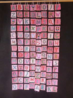
Finally it hit me -- duh -- I should do the alphabet. And with a bit of arithmetical fiddling I realized that I could do four alphabets, 108 letters, in my old favorite "postage stamp" format and fit them perfectly into the assigned dimensions of the quilts. So I whipped into a frenzy of stitching over the New Year's holiday and to make my tiny "stamps."
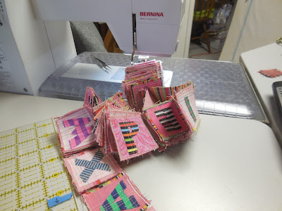
I've made a lot of postage stamp quilts and have figured out how to crank them out almost on an assembly line, so the construction is a case of plonking down at the sewing machine, turning on trash TV and SEWING, SEWING, SEWING. Because all the stamps are the same size, I gang them up into long rows and sew from one to the next, cutting them apart only at the very end. One thing I love about this process is that the stamps tend to accordion-fold themselves up into a neat pile behind the sewing machine where I can't see them. When it's time to start a new row of stitching, there they are pretty much in a little bundle!
Here they are ready to be arranged and sewed together.
And here's the finished product:
Sunday, January 3, 2016
Friday, January 1, 2016
Crabby at the refrigerator / Happy New Year!
NO, not crabby because there's 200 pounds of leftover turkey in the refrigerator, and no ice cream. Crabby because at our recent retreat I discovered this new addition to the decor -- refrigerator magnets that you can use to make poetry.
I have enjoyed such toys in the past in other people's kitchens, although I've never had a set myself. It has always been fun to write a poem while waiting for the water to boil. But this set was suspiciously lacking in half the concepts I thought should be available to me as a poet -- especially a poet who's taking a week to focus on art.
Where is the discouragement? Where is the frustration? Where are the obstacles to overcome? the problems to be worked through? How could I write an honest poem if all the words were sappy and positive? Would it be great art if Hamlet said, "To be, that is wonderful! No questions!"
Don't know about you, but sometimes I have small dreams. Sometimes I feel the urge to step right up and shout "No, I won't do it today!"
I want a poetry magnet set that allows me to write poems along the lines of :
Negative attitude
no focus, no goals
not enough determination
can't see a future
don't want to work
Tomorrow, maybe excellence
today, trash TV
junk food and a bottle of beer.
Happy New Year!! May 2016 have less junk food and more excellence, but let's don't get discouraged if that doesn't happen every day.
Subscribe to:
Comments (Atom)


