Thursday, May 30, 2013

Form, Not Function 5 -- Machine quilting

In shows like Form, Not Function, which requires that all entries be composed of layers held together by stitching, you can see a wide variety of quilting techniques and designs.  As is common in art quilting, most of the pieces were machine quilted, and this year the trend is definitely utilitarian, with    freehand parallel lines the most common approach.

There was no fancy machine quilting on display, the elaborate and magnificent designs that you might see at Paducah or other shows with a more traditional slant.  I wasn't really surprised at this, because "art" quilts tend to rely much more on design and composition to make their points.  But a tour around the room, focusing on the quilting, made me wonder what else people are doing besides those simple lines.  (And I'm frowning at myself just as much as at anybody else, because that's my default quilting pattern too.)

The most masterful machine quilting in the room was done by Sandra Ciolino, with tiny, perfectly controlled freemotion loop-the-loops densely covering the entire surface.

Martello #2: Breakthrough, Sandra Ciolino, 54 x 38" (detail below)


I also liked Daren Redman's quilting, an interesting curved grid.  It's hard to do this kind of quilting, where you stitch into a corner, then turn around and stitch out again, without leaving pesky little bubbles at the turning point.  Daren did it beautifully.

Summer Flowers, Daren Redman, 49 x 53" 


Wednesday, May 29, 2013

Sign of the week

at the sandwich shop

Tuesday, May 28, 2013

Form, Not Function 4 -- fusing

Longtime readers of this blog will know that I'm not a big fan of fusing, but I do admit that it's the only efficient way to achieve many compositions that would be much more tedious executed in piecing or applique.  Here are a few that I thought were particularly well done and artistically effective.

Echoes of Important Things, Christy Gray, 17 x 45" (detail below)

Christy Gray's small work is an austere composition of an aerial landscape, given depth by the hand-dyed fabrics and free cutting.  It's impeccably machine quilted and given a real spark by the small areas where an edge is highlighted by an inch or two of satin stitch.

Gender Equality, Kathleen McCabe, 43 x 61" (detail below)

This striking image looks from a few feet away as if it's made from mottled hand-dyes or other tone-on-tone printed fabrics.  But up close you can see that the mottling is made from tiny guns,about two inches long, cut out from a contrast color and placed on top of the background fabric.  Then each little gun shape is outlined with machine stitching.


Friday, May 24, 2013

Art reader's digest

From "Thinking Through Craft," by Glenn Adamson:

The Romanian sculptor Constantin Brancusi casts a long, sheltering shadow over the crafts. ... He provides a stable and reassuring point of reference for functionless, formal, abstract sculpture in organic materials -- a description that covers the majority of works sold in the upper stratum of the crafts marketplace....


Constantin Brancusi, Bird in Space


From a certain perspective, one might say that this is a perfectly acceptable state of affairs.  Who doesn't love Brancusi?  He invented abstract sculpture.  His works have tremendous presence.  He was a master craftsman, and his works show ample evidence of his skill in their carefully shaped volumes and beautifully modulated surfaces.  Perhaps we should be grateful that the flame he lit is still burning in one corner of the art world.  And yet, seem from another perspective, the crafts' adherence to Brancusi seems distinctly reactionary.  His groundbreaking abstract works are now nearly a century old, and have not been "contemporary" since well before the Second World War. ... So what should we make of the craft world's collective homage to Brancusi?  We might simply conclude that the crafts have become a preserve for outmoded models of art.  The crafts, we could argue, are an arena in which those who don't care to pay attention to contemporary art play at being involved in an art historical lineage.  For them Brancusi is not only a source of aesthetic power, but also a convenient rhetorical device.  His precedent authorizes craftspeople to ignore the art discourse of the present day, and permits collectors to pile up objets d'art without worrying about the modern and postmodern avant garde. ....

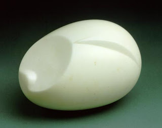
Brancusi, The Newborn

Wednesday, May 22, 2013

Tuesday, May 21, 2013

Form, Not Function 3 -- Machine piecing

Despite the wide variety of techniques and approaches seen in "art" quilts today, my favorite is still the  plain, flat, unadorned abstract pieced quilt.  Hey, that's the kind I make, so you would expect me to like that genre.  I think they were better represented in this year's Form, Not Function show than they have been in several previous years.

Although the design of these quilts is highly modern in feel, they often carry hints of their traditional heritage, in their geometric forms, often repeated, and the strong contrast of their solid-color pieces.  Cynics might say quilts like this are Nancy Crow wannabes, and it's true, some of the people who do them have been Nancy's students.  But I think the best of them have developed their own voices and their quilts resemble Nancy's work only in format and their general space on the art spectrum.

I already showed you Judy Kirpich's quilt, one of the big winners at FNF and an occupant of this genre.  Here are some others that I particularly liked.  A couple of others will show up in a later post when I talk about machine quilting, because almost all of these quilts are finished that way.

Doormats #1, Marcia DeCamp, 49 x 67"

A classy use of strip piecing, in a limited color palette -- the simplest of elements, but a sophisticated composition with a lot of movement.


City Edge #1, Gerri Spilka, 54 x 58"

Like the quilt above, the simplest of elements -- "ribs" of varying length coming off central spines -- and a limited color palette, but a well balanced composition.  Note how the  six areas of floating rectangles (ribs but no spines, you might say) make a counterpoint to the overall theme.


Dark Side of the Moon, Melinda Snyder, 59 x 41"


Two geometric motifs -- a split oval and a skinny cross -- combine for a surprisingly varied composition.  The hand-dyes give lots of depth, especially in the areas of low value contrast.


Deserted, Sarah Pavlik, 44 x 50"

Not exactly abstract, but certainly abstracted -- the recognizable chairs are taken to a mysterious place by the disembodied slats in the background, and highlighted by the little arbitrary areas of color.


Monday, May 20, 2013

Modern quilting -- read it now!

Last week I wrote about an article in the Wall Street Journal on Modern Quilting and said that unfortunately you have to be a WSJ subscriber to get the article online.  Messages on the Quiltart email list have pointed out that you can in fact find it, and I tried to provide those links for you.


UPDATE:  Well, folks, I am flummoxed.  Twice I have found the full article online (on different sites) by going to google and typing in "modern quilters stress simplicity, edgy subjects."  But on both occasions when I have tried to link there in my blog post, the link does not deliver you to the full article, just to the WSJ site with a subscriber access block.

If you really want to read the damn article, try the google search.   Try some of the links that show up on the search page and I hope you can find it.  And then I hope you think it's been worth the trouble.

Thanks, WSJ.  (Unlike the NYTimes, which allows nonsubscribers to read several free articles per month.)

Saturday, May 18, 2013

Art reader's digest

From "Art and Fear," by David Bayles and Ted Orland, 1993:

Given a small kernel of reality and any measure of optimism, nebulous expectations whisper to you that the work will soar, that it will become easy, that it will make itself.  And verily, now and then the sky opens and the work does make itself.  Unreal expectations are easy to come by, both from emotional needs and from the hope or  memory of periods of wonder.  Unfortunately, expectations based on illusion lead almost always to disillusionment.

Conversely, expectations based on the work itself are the most useful tool the artist possesses.  What you need to know about the next piece is contained in the last piece.  The place to learn about your materials is in the last use of your materials.  The place to learn about your execution is in your execution.  The best information about what you love is in your last contact with what you love. Put simply, your work is your guide: a complete, comprehensive, limitless reference book on your work.  There is no other such book, and it is yours alone.  It functions this way for no one else.  Your fingerprints are all over your work, and you alone know how they got there.  Your work tells you about your working methods, your discipline, your strengths and weaknesses, your habitual gestures, your willingness to embrace.

The lessons you are meant to learn are in your work.  To see them, you need only look at the work clearly -- without judgement, without need or fear, without wishes or hopes.  Without emotional expectations.  Ask your work what it needs, not what you need.

Friday, May 17, 2013

Form, Not Function 2 -- hand-stitching

I always like to look at the work in juried shows and try to identify common themes or techniques that give a hint to the jurors' sensibilities or to trends in the art world.  At Form, Not Function this year, there was some nice hand-stitching, carrying on a trend that I've been seeing in quilts for the past few years.

Mary Ruth Smith's spectacular piece included applique and piecing but almost all of its design came from stitching.

Passage, Mary Ruth Smith, 27 1/2 x 27 1/2" (detail below)

Julia Pfaff's piece is a whole-cloth quilt with fabric paint making the amoebic shapes.  Each little shape -- the size of a kidney bean -- is outlined with tiny, precise hand stitching, then echoed with equally precise machine stitching.

Contrast X, Julia Pfaff, 65 1/2 x 28 1/2" (detail below)


Wednesday, May 15, 2013

Form, Not Function -- the big winners

"Form, Not Function: Quilt Art at the Carnegie" opened last weekend, the tenth year for this show.  To celebrate, there's a beautiful catalog that shows not only everything from this show but also all the previous best-in-show winners, and a listing of all participants, jurors and judges from the past.

Best in show this year was Betty Busby -- the second year in a row!  Her quilt features a thread-painted center surrounded by an expanse of natural handwoven cotton and a sunburst of fat wrapped cords, quilted with big, beautiful, subtle hand seed stitches.

Betty Busby, Retia, 60 x 45" (details below)

This year the Carnegie received a grant that will fund a generous award of excellence -- in effect, the second place winner -- for five years.  It went to Judy Kirpich for her intricately pieced quilt.

Judy Kirpich, Circles No. 6, 57 x 61", detail below

What's notable about Judy's work is that all those circles are pieced in, not appliqued, not fused.  I've seen her working in person and still don't understand how she manages to get everything so perfectly flat.  And her quilting is wonderful, making the circles pop and giving lots of variety to the backgrounds.

Because the Carnegie was doing the catalog this year, it asked artists to deliver their work a few weeks early so the show could be judged and the winners listed in the catalog.  That also had the pleasant side effect of allowing the two big winners to be hung in the prime spots of the gallery, at the two ends of the long classical room, which showed them at their best.


I'll write more later this week about other works in the show that I liked.  Meanwhile, why not give yourself a present and buy a copy of the catalog?


Tuesday, May 14, 2013

Monday, May 13, 2013

Modern Quilting -- according to the Wall Street Journal

Last Friday's Wall Street Journal carried an article on our old favorite issue:  "Modern Quilters Stress Simplicity, Edgy Subjects."  Yes, it's Modern Quilting, which I wrote about a lot two years ago. It got to be a WSJ subject because Meg Cox, who used to work there, is a quilt aficionada and every now and then will write a story for them about her new interests.  Meg called me a couple of weeks ago and wanted to chat about my ideas on Modern Quilting, and she ended up quoting me in her story.

The news peg for this story was that Meg attended QuiltCon, the first national show of the Modern Quilt Guild, in February.  I had read about QuiltCon on various blogs at the time, and thought that it looked a lot like all the other big quilt shows, but apparently it was a bit different in its demographics.  "Instead of being clogged with electric mobility scooters, as in many quilting conferences, the aisles of QuiltCon... were full of strollers," Meg wrote in the article.  "This was a tech-savvy crowd: The show's organizers counted 2,000 tweets and 4,500 Instagram posts. A surprising number of the posts were about tattoos."

Meg liked something that I wrote in my blog two years ago and quoted it in the article:  "This New and Different Movement... is neither New nor Different."  She also quoted me as saying that I've seen nothing recently to change my mind on that opinion.

I wasn't the only crabby old quilter quoted in the article.  Holice Turnbow, a longtime fixture on the traditional quilting circuit and co-founder of the Hoffman Challenge, said, "Of the 50 attributes they list as modern, workmanship seems to be about 48."

In 2011, when I was trying hard to figure out exactly what Modern Quilting was, I ascertained that Modern Quilters wanted to break the rules.  Two years ago I was never able to learn just what rules they wanted to break, but now, thanks to the Wall Street Journal article, we have more info on that front.  Seems that the most talked-about quilts in the show were ones featuring our favorite four-letter word.

Give a F*ck, group quilt

Many people who attended the show blogged about these quilts and the consensus was that it was so courageous for the quilters to make them and for the show organizers to display them.  The purpose of the group quilt pictured above, according to the project organizer, Chawne Kimber, was to challenge the notion that some words must be censored from quilts.  (Yet she coyly spelled the quilt's title with an asterisk....)

So now we know that Modern Quilters want to break the rules about four-letter words.

Other quilts that caused comment at the show included one of a gun dripping blood.  With the institutional memory of an old lady, I point out that quilts about guns are nothing new; Bean Gilsdorf had two gun pieces in Quilt National, in 2003 and 2005, and in my humble opinion, they were more subtle and artistically noteworthy.

Bang You're Dead, Jacquie Gering (at QuiltCon )

Ouija #1, Bean Gilsdorf (Quilt National '03)

I'm sorry I can't provide a link to the entire article; the WSJ website is subscription-only.


Sunday, May 12, 2013

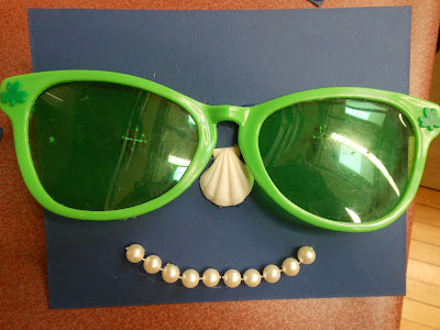
Photo suite 72 -- fourth-graders' junk art faces


The most popular format for junk art among the fourth-graders in my workshop last week was a face.  Here are some of the kids' artworks.