Thursday, June 20, 2019
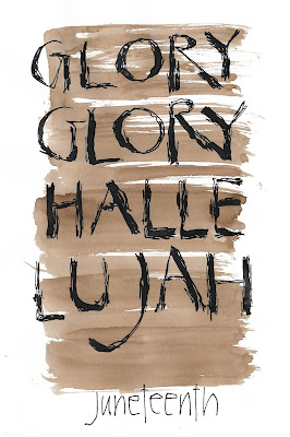
Calligraphy update -- brut style
The other night I was intrigued by the label on our wine bottle, what you might describe as calligraphy brut.
Always searching for new ideas for my daily calligraphy, I took this one home and tried it out a few times.
I like it! Legible, but not beautiful. (Legibility is not a requirement for successful calligraphy, in my opinion, but it's OK in its place.)
I keep searching for a calligraphic style that would let me use letters in a more abstract way, more like art and less like writing. Maybe this is a first step in that direction, but I'll have to work on it. It's still too pretty, and I want a little more grit.
Different sizes of letters? Overlapping letters? Letters going in different orientations? Script? Less legibility, more brutalism?
I'll try again this evening.
Subscribe to:
Post Comments (Atom)


On the more-like-art-less-like-letters front: if you haven't already you might check out Arabic calligraphy. I frequently find it exquisite, and as a non-arabic speaker I'm drawn to it simply for the artistic forms. It's interesting, almost after-the-fact, to realize those are letters. It might give you some thoughts on some directions for your letters.
ReplyDelete